Chapter 6. Component Libraries
If you are building an application of any size, you are likely to need a component library. The data types that native HTML supports are somewhat limited, and the implementations can vary from browser to browser. For example, a date input field looks very different on Chrome, Firefox, and Edge browsers.
Component libraries allow you to create a consistent feel for your application. They will often adapt well when switching between desktop and mobile clients. Most importantly, component libraries often give your application a usability boost. They have been either generated from design standards that have been thoroughly tested (such as Material Design) or developed over several years. Any rough corners have generally been smoothed out.
Be aware: there is no such thing as the perfect component library. They all have strengths and weaknesses, and you need to choose a library that best meets your needs. If you have a large UX team and a robust set of preexisting design standards, you will likely want a library that allows for a lot of tweaking to adapt the library to match your corporate themes. An example would be Material-UI, which allows you to modify its components quite significantly. If you have a small UX team or no UX team at all, you would probably want to consider something like Semantic UI, which is clean and functional and gets you up and running quickly.
Whichever library you choose, always remember that the essential thing in UX is not how your application looks but how it behaves. Users will soon ignore whatever flashy graphics you add to the interface, but they will never forget (or forgive) some part of the interface that irritates them each time they use it.
Use Material Design with Material-UI
Problem
Many applications are now available on both the web and as native applications on mobile devices. Google created Material Design to provide a seamless experience across all platforms. Material Design will seem familiar to your users if they also use Android phones or anything created by Google. Material Design is just a specification, and there are several implementations available. One such is the Material-UI library for React. But what are the steps involved in using Material-UI, and how do you install it?
Solution
Let’s begin by installing the core Material-UI library:
$ npm install @material-ui/coreThe core library includes the main components, but it omits one notable feature: the standard typeface. To make Material-UI feel the same as it does in a native mobile application, you should also install Google’s Roboto typeface:
$ npm install fontsource-robotoMaterial Design also specifies a large set of standard icons. These provide a common visual language for standard tasks such as editing tasks, creating new items, sharing content, etc. To use high-quality versions of these icons, you should also install the Material-UI icon library:
$ npm install @material-ui/iconsNow that we have Material-UI up and running, what can we do with it? We can’t look in detail at all of the available components here, but we will look at some of the more popular features.1
We’ll begin by looking at the basics of styling within Material-UI. To ensure that Material-UI components look the same across
different browsers, they have included a CssBaseline component, which will normalize the basic styling of your application. It
will remove margins and apply standard background colors. You should add a CssBaseline component somewhere near the start of your
application. For example, if you are using create-react-app, you should probably add it to your App.js:
importCssBaselinefrom'@material-ui/core/CssBaseline'...functionApp(){// ...return(<divclassName="App"><CssBaseline/>...</div>)}exportdefaultApp
Next, we’ll take a look at the Material Design AppBar and Toolbar components. These provide the standard heading you see in most
Material Design applications and are where other features such as hamburger menus and drawer panels will appear.
We’ll place an AppBar at the top of the screen and put a Toolbar inside. This will give us a chance to look at the way that
typography is handled inside Material-UI:
<divclassName="App"><CssBaseline/><AppBarposition='relative'><Toolbar><Typographycomponent='h1'variant='h6'color='inherit'noWrap>Material-UIGallery</Typography></Toolbar></AppBar><main>{/* Main content goes here...*/}</main></div>
Although you can insert ordinary textual content inside Material-UI applications, it is generally better to display it inside
Typography. A Typography component will ensure that the text matches the Material Design standards. We can also use it to
display text inside the appropriate markup elements. In this case, we’re going to display the text in the Toolbar as an h1
element. That’s what the Typography component attribute specifies: the HTML element that should be used to wrap the text.
However, we can also tell Material-UI to style the text as if it’s an h6 heading. That will make it a little smaller and less
overpowering as a page heading.
Next, let’s look at how Material-UI styles the output. It uses themes. A theme is a JavaScript object that defines a hierarchy of CSS styles. You can define themes centrally, and this allows you to control the overall appearance of your application.
Themes are extensible. We’ll import a function called makeStyles, which will allow us to create a modified version of the default
theme:
import{makeStyles}from'@material-ui/core/styles'
We’re going to make our example application display a gallery of images, so we will want to create styles for gallery items,
descriptions, and so on. We can create styles for these different screen elements with makeStyles:
constuseStyles=makeStyles((theme)=>({galleryGrid:{paddingTop:theme.spacing(4),},galleryItemDescription:{overflow:'hidden',textOverflow:'ellipsis',whiteSpace:'nowrap',},}))
In this simplified example, we extend the base theme to include styles for the classes galleryGrid and galleryItemDescription.
Either we can add CSS attributes literally or (in the case of paddingTop in the galleryGrid) we can reference some
value in the current theme: in this case theme.spacing(4). So, we can defer parts of the styling to a centralized theme, where we
can change it later.
The useStyles returned by makeStyles is a hook that will generate a set of CSS classes and then return their names so we can
refer to them inside our component.
For example, we will want to display a grid of images, using Container and Grid components.2 We can attach the styles to them from the theme like this:
constclasses=useStyles()return(<divclassName="App">...<main><ContainerclassName={classes.galleryGrid}><Gridcontainerspacing="4"><Griditem>...</Grid><Griditem>...</Grid>...</Grid></Container></main></div>)
Each Grid component is either a container or an item. We will display a gallery image within each item.
In Material Design, we show significant items inside cards. A card is a rectangular panel that appears to float slightly above
the background. If you’ve ever used the Google Play Store, you will have seen cards used to display applications, music tracks, or
other things you might want to download. We will place a card inside each Grid item and use it to display a preview, a text
description, and a button that can show a more detailed version of the image. You can see the cards in the example application in
Figure 6-1.
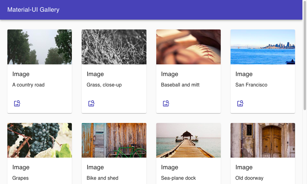
Figure 6-1. Cards are inside grid items, which are inside a container
Material-UI also has extensive support for dialog windows. Here is an example of a custom dialog:
importDialogfrom'@material-ui/core/Dialog'importDialogTitlefrom'@material-ui/core/DialogTitle'importTypographyfrom'@material-ui/core/Typography'importDialogContentfrom'@material-ui/core/DialogContent'importDialogActionsfrom'@material-ui/core/DialogActions'importButtonfrom'@material-ui/core/Button'importCloseIconfrom'@material-ui/icons/Close'constMyDialog=({onClose,open,title,children})=>{return(<Dialogopen={open}onClose={onClose}><DialogTitle><Typographycomponent="h1"variant="h5"color="inherit"noWrap>{title}</Typography></DialogTitle><DialogContent>{children}</DialogContent><DialogActions><Buttonvariant="outlined"startIcon={<CloseIcon/>}onClick={onClose}>Close</Button></DialogActions></Dialog>)}exportdefaultMyDialog
Notice that we are importing an SVG icon from the Material-UI icons library that we installed earlier. The DialogTitle appears at
the top of the dialog. The
DialogActions are the buttons that appear at the base of the dialog. You define the main body of the dialog in the DialogContent.
Here is the complete code for App.js:
import'./App.css'importCssBaselinefrom'@material-ui/core/CssBaseline'importAppBarfrom'@material-ui/core/AppBar'import{Toolbar}from'@material-ui/core'importContainerfrom'@material-ui/core/Container'importGridfrom'@material-ui/core/Grid'importCardfrom'@material-ui/core/Card'importCardMediafrom'@material-ui/core/CardMedia'importCardContentfrom'@material-ui/core/CardContent'importCardActionsfrom'@material-ui/core/CardActions'importTypographyfrom'@material-ui/core/Typography'import{makeStyles}from'@material-ui/core/styles'import{useState}from'react'importMyDialogfrom'./MyDialog'importImageSearchIconfrom'@material-ui/icons/ImageSearch'importgalleryfrom'./gallery.json'importIconButtonfrom'@material-ui/core/IconButton'constuseStyles=makeStyles((theme)=>({galleryGrid:{paddingTop:theme.spacing(4),},galleryItem:{height:'100%',display:'flex',flexDirection:'column',// maxWidth: '200px'},galleryImage:{paddingTop:'54%',},galleryItemDescription:{overflow:'hidden',textOverflow:'ellipsis',whiteSpace:'nowrap',},}))functionApp(){const[showDetails,setShowDetails]=useState(false)const[selectedImage,setSelectedImage]=useState()constclasses=useStyles()return(<divclassName="App"><CssBaseline/><AppBarposition="relative"><Toolbar><Typographycomponent="h1"variant="h6"color="inherit"noWrap>Material-UIGallery</Typography></Toolbar></AppBar><main><ContainerclassName={classes.galleryGrid}><Gridcontainerspacing="4">{gallery.map((item,i)=>{return(<Griditemkey={`photo-${i}`}xs={12}sm={3}lg={2}><CardclassName={classes.galleryItem}><CardMediaimage={item.image}className={classes.galleryImage}title="A photo"/><CardContent><TypographygutterBottomvariant="h6"component="h2">Image</Typography><TypographyclassName={classes.galleryItemDescription}>{item.description}</Typography></CardContent><CardActions><IconButtonaria-label="delete"onClick={()=>{setSelectedImage(item)setShowDetails(true)}}color="primary"><ImageSearchIcon/></IconButton></CardActions></Card></Grid>)})}</Grid></Container></main><MyDialogopen={showDetails}title="Details"onClose={()=>setShowDetails(false)}><imgsrc={selectedImage&&selectedImage.image}alt="From PicSum"/><Typography>{selectedImage&&selectedImage.description}</Typography></MyDialog></div>)}exportdefaultApp
Discussion
Material-UI is a great library to use and is one of the most popular libraries currently used with React. Users coming to your application will almost certainly have used it elsewhere, which will increase your application’s usability. Before launching into using Material-UI in your application, it is worth spending some time understanding the Material Design principles. That way, you will create an application that is not only attractive but also easy to use and accessible to users.
You can download the source for this recipe from the GitHub site.
Create a Simple UI with React Bootstrap
Problem
The most popular CSS library of the last 10 years is probably Twitter’s Bootstrap library. It’s also a good choice if you are creating a new application and have very little time to worry about creating a custom UI and simply want something easy-to-use and familiar to the vast number of users.
But Bootstrap comes from a time before frameworks like React existed. Bootstrap includes CSS resources and a set of JavaScript libraries designed for web pages containing a small amount of handcrafted client code. The base Bootstrap library doesn’t play well with a framework like React.
How do you use Bootstrap when you’re creating a React application?
Solution
There are several ports of the Bootstrap library for use with React. In this recipe, we will look at React Bootstrap. React Bootstrap works alongside the standard Bootstrap CSS libraries, but it extends the Bootstrap JavaScript to make it more React-friendly.
Let’s begin by first installing the React Bootstrap components and the Bootstrap JavaScript libraries:
$ npm install react-bootstrap bootstrapThe React Bootstrap library does not include any CSS styling of its own. You will need to include a copy of that yourself. The most
common way of doing this is by downloading it from a content distribution network (CDN) in your HTML. For example, if you are using
create-react-app, you should include something like this in your public/index.html file:
<linkrel="stylesheet"href="https://maxcdn.bootstrapcdn.com/bootstrap/4.5.0/css/bootstrap.min.css"integrity="sha384-9aIt2nRpC12Uk9gS9baDl411NQApFmC26EwAOH8WgZl5MYYxFfc+NcPb1dKG"crossorigin="anonymous"/>
It would be best if you replaced this with the latest stable version of Bootstrap that’s available. You will need to manage the version of Bootstrap manually; it will not update when you upgrade your JavaScript libraries.
Bootstrap is a good, general-purpose library, but its support for forms is particularly strong. Good form layout can take time and
can be tedious. Bootstrap handles all of the hard work for you and allows you to focus on the functionality of your form. For
example, the React Bootstrap Form component contains almost everything you need to create a form. The Form.Control component
will generate an input by default. The Form.Label will generate a label, and a Form.Group will associate the two together
and lay them out appropriately:
<Form.GroupcontrolId="startupName"><Form.Label>Startupname</Form.Label><Form.Controlplaceholder="No names ending in ...ly, please"/></Form.Group>
Form fields are normally displayed on a single line and take up the available width. If you want more than one field to appear on a
line, then you can use a Form.Row:
<Form.Row><Form.Groupas={Col}controlId="startupName"><Form.Label>Startupname</Form.Label><Form.Controlplaceholder="No names ending in ...ly, please"/></Form.Group><Form.Groupas={Col}controlId="market"><Form.Label>Market</Form.Label><Form.Controlplaceholder="e.g. seniors on Tik-Tok"/></Form.Group></Form.Row>
The Col component ensures that the labels and fields are sized appropriately. If you want a form field that’s something other than
an input, you can use the as attribute:
<Form.Controlas="select"defaultValue="Choose..."><option>Progressivewebapplication</option><option>Conservativewebapplication</option><option>Androidnative</option><option>iOSnative</option><option>NewJerseynative</option><option>VT220</option></Form.Control>
This will generate a Bootstrap-styled select element.
Putting the whole thing together leads to the form you can see in Figure 6-2:
importFormfrom'react-bootstrap/Form'importColfrom'react-bootstrap/Col'importButtonfrom'react-bootstrap/Button'importAlertfrom'react-bootstrap/Alert'import{useState}from'react'import'./App.css'functionApp(){const[submitted,setSubmitted]=useState(false)return(<divclassName="App"><h1>VCFundingRegistration</h1><Form><Form.Row><Form.Groupas={Col}controlId="startupName"><Form.Label>Startupname</Form.Label><Form.Controlplaceholder="No names ending in ...ly, please"/></Form.Group><Form.Groupas={Col}controlId="market"><Form.Label>Market</Form.Label><Form.Controlplaceholder="e.g. seniors on Tik-Tok"/></Form.Group><Form.Groupas={Col}controlId="appType"><Form.Label>Typeofapplication</Form.Label><Form.Controlas="select"defaultValue="Choose..."><option>Progressivewebapplication</option><option>Conservativewebapplication</option><option>Androidnative</option><option>iOSnative</option><option>NewJerseynative</option><option>VT220</option></Form.Control></Form.Group></Form.Row><Form.Row><Form.Groupas={Col}controlId="description"><Form.Label>Description</Form.Label><Form.Controlas="textarea"/></Form.Group></Form.Row><Form.Groupid="technologiesUsed"><Form.Label>Technologiesused(checkatleast3)</Form.Label><Form.Controlas="select"multiple><option>Blockchain</option><option>Machinelearning</option><option>Quantumcomputing</option><option>Autonomousvehicles</option><option>For-loops</option></Form.Control></Form.Group><Buttonvariant="primary"onClick={()=>setSubmitted(true)}>Submit</Button></Form><Alertshow={submitted}variant="success"onClose={()=>setSubmitted(false)}dismissible><Alert.Heading>We'llbeintouch!</Alert.Heading><p>Oneofourpartnerswillbeintouchshortly.</p></Alert></div>)}exportdefaultApp
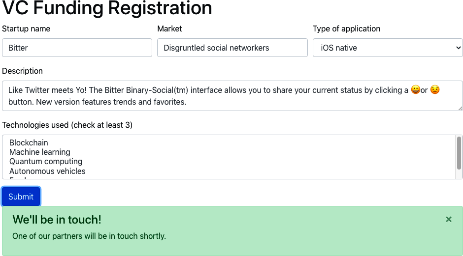
Figure 6-2. A React bootstrap form and alert box
Discussion
Bootstrap is a much older UI toolkit than Material Design, but there are still markets where it feels more appropriate. If you’re building an application that has to feel more like a traditional website, then Bootstrap will give it that more traditional feel. If you want to build something that feels more like a cross-platform application, you should consider Material-UI.3
You can download the source for this recipe from the GitHub site.
View Data Sets with React Window
Problem
Some applications need to display a seemingly endless quantity of data. If you are writing an application like Twitter, you don’t want to download all of the tweets in the user’s timeline because it would probably take several hours, days, or months. The solution is to window the data. When you window a list of items, you keep only the items in memory that are currently on display. As you scroll up or down, the application downloads the data needed for the current view.
But creating this windowing logic is quite complex. Not only does it involve meticulous tracking of what’s currently visible,4 but if you’re not careful, you can quickly run into memory issues if you fail to cache the windowing data efficiently.
How do you implement windowing code inside a React application?
Solution
The React Window library is a set of components for applications that need to scroll a large amount of data. We’ll look at how to create a large, fixed-size list.5
To start, we need to create a component that will show the details for a single item. In our example application, we’re going to
create a set of 10,000 date strings. We will render each date with a component called DateRow, which will be our item-renderer.
React Window works by rendering only the items that are visible in the current viewport. As the user scrolls up or down the list, it
will create new items as they come into view and remove them as they disappear.
When React Window calls an item renderer, it passes it two properties: an item number, which begins at 0, and a style object.
This is our DateRow item-renderer:
importmomentfrom'moment'constDateRow=({index,style})=>(<divclassName={`aDate${index%2&&'aDate-odd'}`}style={style}>{moment().add(index,'d').format('dddd, MMMM Do YYYY')}</div>)exportdefaultDateRow
This component calculates a date index days in the future. In a more realistic application, this component would probably download
an item of data from a backend server.
To generate the list itself, we will use a FixedSizeList. We need to give the list a fixed width and height. React Window
calculates how many items are visible using the height of the list and the height of each item, using the value from the itemSize
attribute. If the height is 400 and the itemHeight is 40, then the list will only need to display 10 or 11 DateRow components
(see Figure 6-3).
Here is the final version of the code. Notice that the FixedSizeList does not include an instance of the DateRow component.
That’s because it wants to use the DateRow function to create multiple items dynamically as we scroll the list. So instead of
using <DateRow/>, the list uses the {DateRow} function itself:
import{FixedSizeList}from'react-window'importDateRowfrom'./DateRow'import'./App.css'functionApp(){return(<divclassName="App"><FixedSizeListheight={400}itemCount={10000}itemSize={40}width={300}>{DateRow}</FixedSizeList></div>)}exportdefaultApp
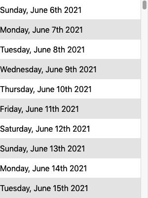
Figure 6-3. The list contains only visible items
One final point to note is that because the items are dynamically added to and removed from the list, you have to be careful
using the nth-child selector in CSS:
.aDate:nth-child(even){/* This won't work */background-color:#eee;}
Instead, you need to dynamically check the current index for an item and check if it’s odd using a little modulo-2 math, as we do in the example:
<divclassName={`aDate${index%2&&'aDate-odd'}`}...>
Discussion
React Window is a narrowly focused component library but valuable if you need to present a vast data set. You are still responsible for downloading and caching the data that appears in the list, but this is a relatively simple task compared to the windowing magic that React Window performs.
You can download the source for this recipe from the GitHub site.
Create Responsive Dialogs with Material-UI
Problem
If you’re using a component library, there’s a good chance that at some point you will display a dialog window. Dialogs allow you to add UI detail without making the user feel they are traveling to another page. They work well for content creation or as a quick way of displaying more detail about an item.
However, dialogs don’t play well with mobile devices. Mobiles have a small display screen, and dialogs frequently waste a lot of space around the edges to display the background page.
How can you create responsive dialogs, which act like floating windows when you are using a desktop machine but look like separate full-screen pages on a mobile device?
Solution
The Material-UI library includes a higher-order function that can tell when you are on a mobile device and display dialogs as full-screen windows:
import{withMobileDialog}from'@material-ui/core'...constResponsiveDialog=withMobileDialog()(({fullScreen})=>{// Return some component using the fullScreen (true/false) property})
The withMobileDialog gives any component it wraps an extra property called fullScreen, which is set to true or false. A
Dialog component can use this property to change its behavior. If you pass fullScreen to a Dialog like this:
import{withMobileDialog}from'@material-ui/core'importDialogfrom'@material-ui/core/Dialog'importDialogTitlefrom'@material-ui/core/DialogTitle'importTypographyfrom'@material-ui/core/Typography'importDialogContentfrom'@material-ui/core/DialogContent'importDialogActionsfrom'@material-ui/core/DialogActions'importButtonfrom'@material-ui/core/Button'importCloseIconfrom'@material-ui/icons/Close'constResponsiveDialog=withMobileDialog()(({onClose,open,title,fullScreen,children})=>{return(<Dialogopen={open}fullScreen={fullScreen}onClose={onClose}><DialogTitle><Typographycomponent="h1"variant="h5"color="inherit"noWrap>{title}</Typography></DialogTitle><DialogContent>{children}</DialogContent><DialogActions><Buttonvariant="outlined"startIcon={<CloseIcon/>}onClick={onClose}>Close</Button></DialogActions></Dialog>)})exportdefaultResponsiveDialog
the dialog will change its behavior when running on a mobile or desktop device.
Let’s say we modify the application we created in “Convert Network Calls to Hooks”. In our original application, a dialog appears when the user clicked an image in a gallery. The dialog is shown on a mobile device in Figure 6-4.
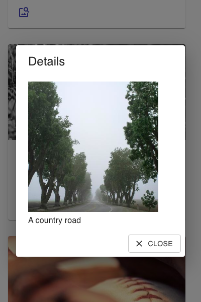
Figure 6-4. By default, a dialog on a mobile device has space around the edge
If you replace this dialog with a ResponsiveDialog, it will look the same on a large screen. But on a small screen, the dialog
will fill the display, as you can see in Figure 6-5. This not only gives you more space for the contents of the dialog, but it will
simplify the experience of mobile users. Instead of it working like a pop-up window, it will feel more like a separate page.

Figure 6-5. On a mobile device, the responsive dialog fills the screen
Discussion
For more ideas on how to deal with responsive interfaces, see “Create Interfaces with Responsive Routes”.
You can download the source for this recipe from the GitHub site.
Build an Admin Console with React Admin
Problem
Developers can spend so long creating and maintaining end-user applications that one important task is often left neglected: admin consoles. Customers don’t use admin consoles; they are used by back-office staff and administrators to look at the current data set and to investigate and resolve data issues in an application. Some data storage systems like Firebase have quite advanced admin consoles built-in. But that’s not the case for most backend services. Instead, developers often have to dig into data problems by directly accessing the databases, which live behind several layers of cloud infrastructure.
How can we create an admin console for almost any React application?
Solution
We’re going to look at the React Admin, and although this chapter is about component libraries, React Admin contains far more than components. It’s an application framework that makes it easy to build interfaces to allow administrators to examine and maintain the data in your application.
Different applications will use different network service layers. They might use REST, GraphQL, or one of many other systems. But in most cases, data is accessed as a set of resources held on the server. React Admin has most of the pieces in place for creating an admin application that will allow you to browse through each resource. It lets you create, maintain, and search data. It can also export the data to an external application.
To show how react-admin works, we’re going to create an admin console for the message board application we created in Chapter 5
(see Figure 6-6).
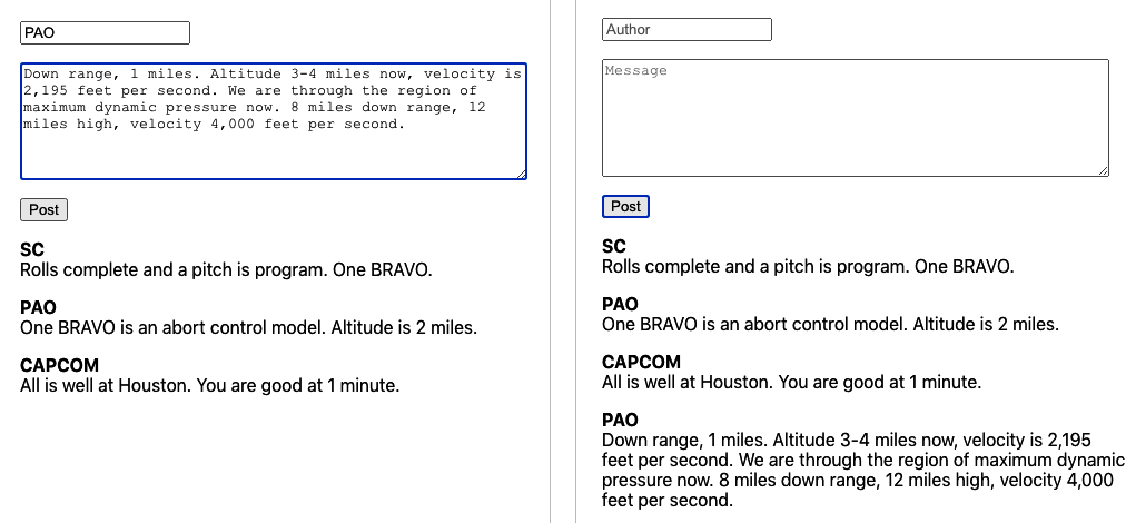
Figure 6-6. The original message board application
The backend for the application is a simple GraphQL server. The GraphQL server has a relatively simple schema, which defines messages in the schema language like this:
typeMessage{id:ID!author:String!text:String!}
Each message had a unique id. Strings record the text of the message and the name of the author.
There was only one type of change that a user could make to the data: they could add a message. There was one type of query they could run: they could read all of the messages.
To create a react-admin application, you first need to create a new React application and then install the react-admin library:
$ npm install react-adminThe main component of the library is called Admin. This will form the shell of our entire application:
<AdmindataProvider={...}>...UI for separate resources goes here...</Admin>
An Admin component needs a data provider. A data provider is an adapter that will connect the application to the backend service. Our backend service uses GraphQL, so we need a GraphQL data provider:
$ npm install graphql$ npm install ra-data-graphql-simple
There are data providers available for most backend services. See the React Admin website for
more details. We’ll need to initialize our data provider before we can use it. GraphQL is configured with a buildGraphQLProvider
function that is asynchronous, so we need to be careful that it’s ready before we use it:
import{Admin}from'react-admin'importbuildGraphQLProviderfrom'ra-data-graphql-simple'import{useEffect,useState}from'react'functionApp(){const[dataProvider,setDataProvider]=useState()useEffect(()=>{letdidCancel=false;(async()=>{constdp=awaitbuildGraphQLProvider({clientOptions:{uri:'http://localhost:5000'},})if(!didCancel){setDataProvider(()=>dp)}})()return()=>{didCancel=true}},[])return(<divclassName="App">{dataProvider&&(<AdmindataProvider={dataProvider}>...resourceUIhere...</Admin>)}</div>)}exportdefaultApp
The data provider connects to our GraphQL server running on port 5000.6 The data provider will first download the schema for the application,
which will tell it what resources (just a single resource, Messages, in our case) are available and what operations it can perform
on them.
If we try to run the application now, it won’t do anything. That’s because even though it knows that there’s a Messages resource
on the server, it doesn’t know that we want to do anything with it. So, let’s add the Messages resource to the application.
If we want the application to list all the messages on the server, we will need to create a simple component called
ListMessages. This will use some of the ready-made components in react-admin to build its interface:
constListMessages=(props)=>{return(<List{...props}><Datagrid><TextFieldsource="id"/><TextFieldsource="author"/><TextFieldsource="text"/></Datagrid></List>)}
This will create a table with columns for message id, author, and text. We can now tell the admin system about the new
component by passing a Resource to the Admin component:
<AdmindataProvider={dataProvider}><Resourcename="Message"list={ListMessages}/></Admin>
The Admin component will see the new Resource, contact the server to read the messages, and then render them with a ListMessages component (see Figure 6-7).
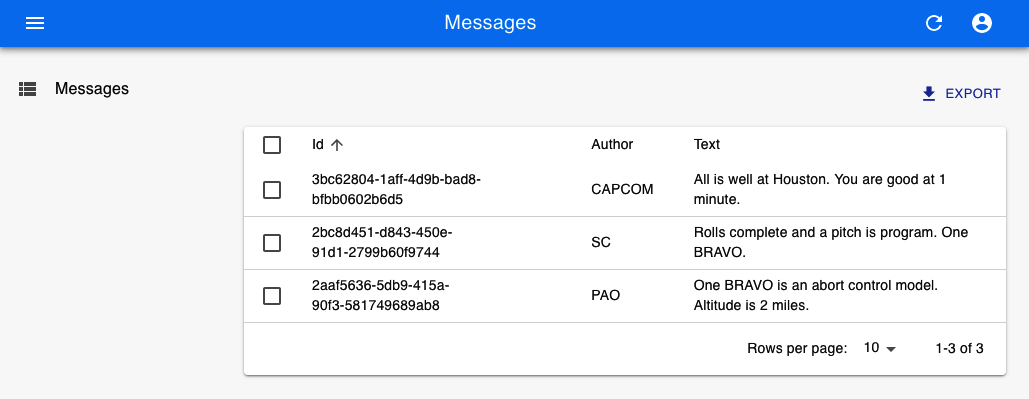
Figure 6-7. Displaying the messages from the server
The screen update appears to work by magic, but it’s because the server has to follow certain conventions so that the GraphQL
adapter knows which service to call. In this case, it will find a query called allMessages, which returns messages:
typeQuery{Message(id:ID!):MessageallMessages(page:Int,perPage:Int,sortField:String,sortOrder:String,filter:MessageFilter):[Message]}
As a result, you might need to change your backend API to meet the requirements of your data provider. However, the services that you add will probably be useful in your main application.
The allMessages query allows the admin interface to page through the data from your server. It can accept a property called
filter, which it uses to search for the data. The MessageFilter in the example schema will allow the admin console to find
messages containing strings for author and text. It will also allow the admin console to send a general search string (q),
which it will use to find messages that contain a string in any field.
Here is the GraphQL schema definition of the MessageFilter object. You will need to create something similar for each resource in your application:
inputMessageFilter{q:Stringauthor:Stringtext:String}
To enable filtering and searching in the frontend, we will first need to create some filtering fields in a React component we’ll call MessageFilter. This is quite distinct from the MessageFilter in the schema, although you will notice it contains matching fields:
constMessageFilter=(props)=>(<Filter{...props}><TextInputlabel="Author"source="author"/><TextInputlabel="Text"source="text"/><TextInputlabel="Search"source="q"alwaysOn/></Filter>)
We can now add the MessageFilter to the ListMessages component, and we will suddenly find that we can page, search, and filter
messages in the admin console (see Figure 6-8):
constListMessages=(props)=>{return(<List{...props}filters={<MessageFilter/>}><Datagrid><TextFieldsource="id"/><TextFieldsource="author"/><TextFieldsource="text"/></Datagrid></List>)}
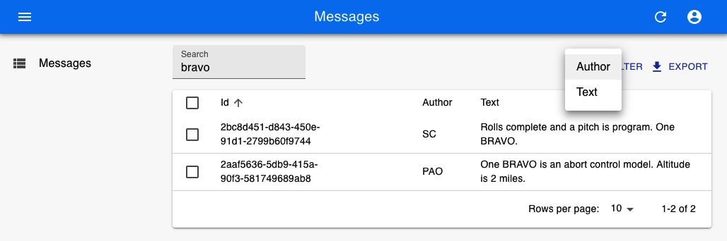
Figure 6-8. Filtering the messages table by author or text
We can also add the ability to create new messages by adding a CreateMessage
component:
constCreateMessage=(props)=>{return(<Createtitle="Create a Message"{...props}><SimpleForm><TextInputsource="author"/><TextInputmultilinesource="text"/></SimpleForm></Create>)}
and then adding the CreateMessage component to the Resource (see Figure 6-9):
<Resourcename="Message"list={ListMessages}create={CreateMessage}/>
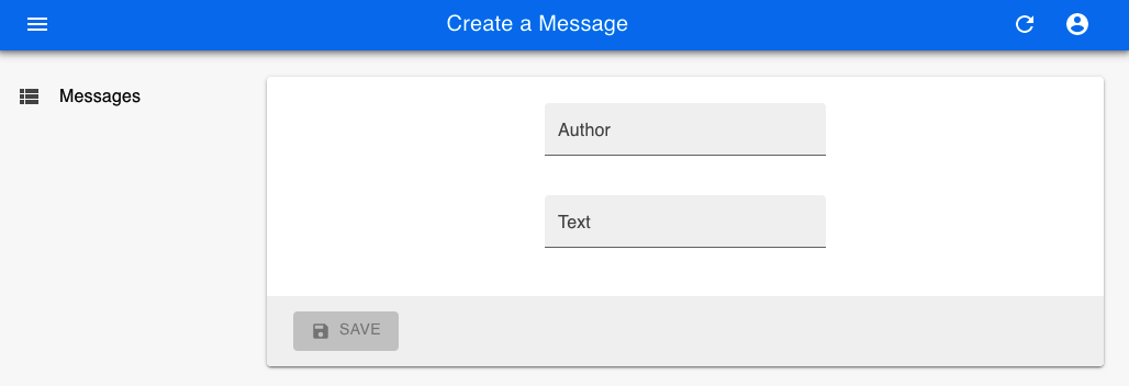
Figure 6-9. Creating messages on the console
The GraphQL data provider will create messages by passing the contents of the
CreateMessage form to a mutation called
CreateMessage:
typeMutation{createMessage(author:String!text:String!):Message}
Similarly, you can add the ability to update or delete messages. If you have a complex schema with subresources, react-admin can
display subitems within a table. It can also handle different display types. It can show images and links. There are components
available that can display resources on calendars
or in charts (see Figure 6-10 for examples from the online demo application).7 Admin consoles can also work with your existing security system.
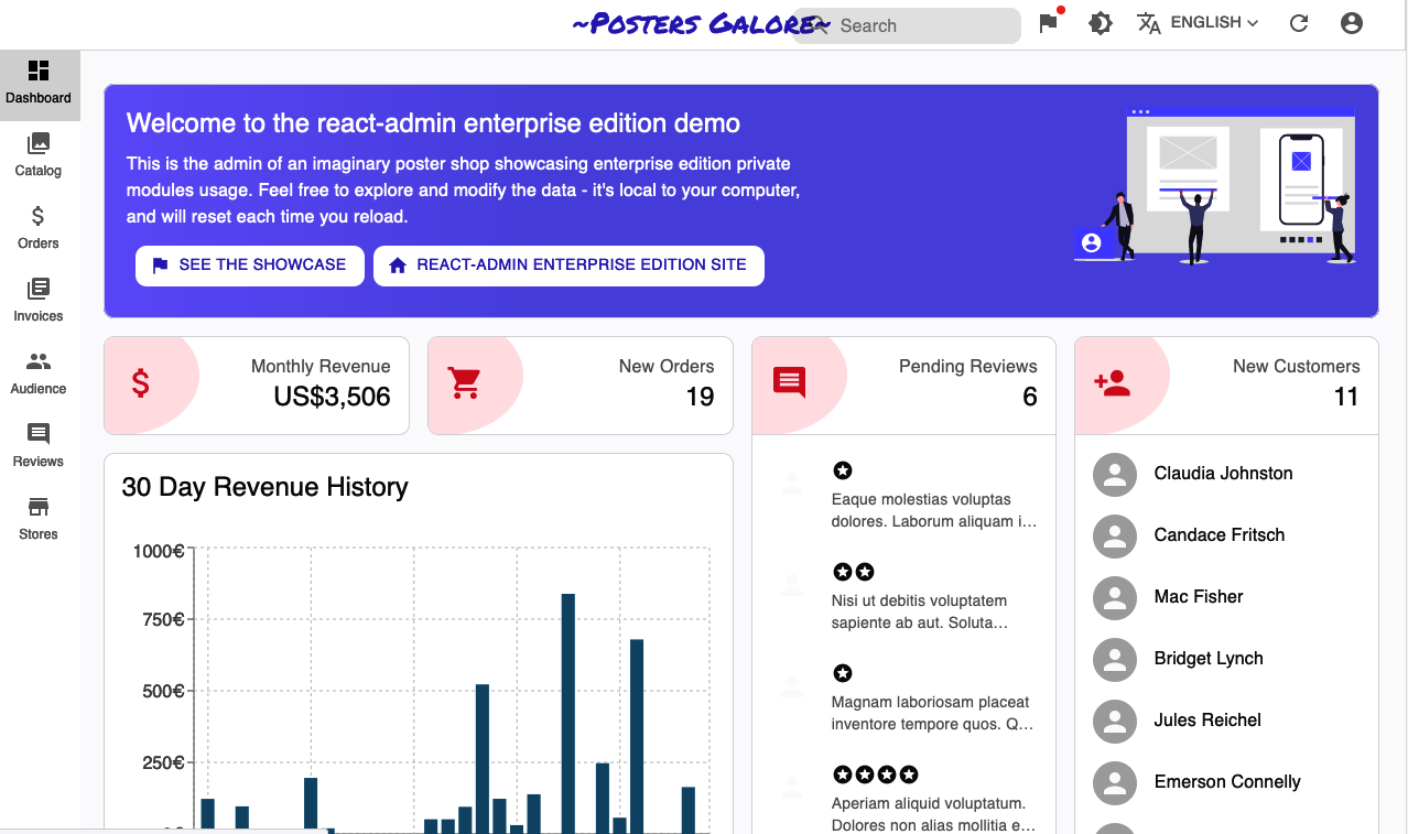
Figure 6-10. Different view types in the online demo
Discussion
Although you will have to make some additional changes to your backend services to make react-admin work for you, there is an
excellent chance that these additional services will also be helpful for your main application. Even if they aren’t, the building
blocks that react-admin provides will likely slash the development time needed to create a back-office system.
You can download the source for this recipe from the GitHub site.
No Designer? Use Semantic UI
Problem
Well-designed styling can add a lot of visual appeal to an application. But poor styling can make even a good application appear cheap and amateurish. Many developers have a limited sense of design.8 In cases where you have little or no access to professional design help, a simple, clear UI component library can allow you to focus on the application’s functionality without spending endless hours tweaking the location of buttons and borders.
Tried-and-tested frameworks like Bootstrap can provide a good, no-gloss foundation for most applications.9 But even they often require a lot of focus on visual appearance. If you want to focus on the functionality of an application and want to get a clear functional visual appearance, then the Semantic UI library is a good choice.
But the Semantic UI library is old, coming from the days when jQuery ruled the roost. At the time of writing, it has not been updated in more than two years. What do you do if you want to use a reliable and well-established library like Semantic UI with React?
Solution
The Semantic UI React library is a wrapper that makes the Semantic UI library available for React users.
As the name suggests, Semantic UI focuses on the meaning of the interface. You manage its visual appearance with CSS rather than components. Instead, Semantic UI components focus on functionality. When you create a form, for example, you say which fields to include, rather than saying anything about their layout. That leads to a clean, consistent appearance, which needs little or no visual adjustment.
To get started, let’s install the Semantic library and its styling support:
$ npm install semantic-ui-react semantic-ui-cssIn addition, we also need to include a reference to the stylesheet in the index.js file of the application:
importReactfrom'react'importReactDOMfrom'react-dom'import'./index.css'importAppfrom'./App'importreportWebVitalsfrom'./reportWebVitals'import'semantic-ui-css/semantic.min.css'ReactDOM.render(<React.StrictMode><App/></React.StrictMode>,document.getElementById('root'))// If you want to start measuring performance in your app, pass a function// to log results (for example: reportWebVitals(console.log))// or send to an analytics endpoint. Learn more: https://bit.ly/CRA-vitalsreportWebVitals()
We’re going to re-create our message posting application. We’ll need a form with a text field for the author’s name and a text area
for posting a message. Semantic components are designed to be as similar to simple HTML elements as possible. So if we’re building a
form, we’ll import a Form, Input, TextArea, and Button to post the message:
import{Button,Form,Input,TextArea}from'semantic-ui-react'import'./App.css'import{useState}from'react'functionApp(){const[author,setAuthor]=useState('')const[text,setText]=useState('')const[messages,setMessages]=useState([])return(<divclassName="App"><Form><Form.Field><labelhtmlFor="author">Author</label><Inputvalue={author}id="author"onChange={(evt)=>setAuthor(evt.target.value)}/></Form.Field><Form.Field><labelhtmlFor="text">Message</label><TextAreavalue={text}id="text"onChange={(evt)=>setText(evt.target.value)}/></Form.Field><ButtonbasiconClick={()=>{setMessages((m)=>[{icon:'pencil',date:newDate().toString(),summary:author,extraText:text,},...m,])setAuthor('')setText('')}}>Post</Button></Form></div>)}exportdefaultApp
This code should feel familiar. The Form component does have a Field helper, which makes it a little easier to group labels
and fields, but beyond that, the code looks similar to an elementary HTML form.
In the example application, we’re “posting” messages by adding them to an array called messages. You may have noticed that we’re
adding messages to the array in a particular object structure:
setMessages((m)=>[{icon:'pencil',date:newDate().toString(),summary:author,extraText:text,},...m,])
We did not choose these attributes by accident. Although most of the components in Semantic are simple, there are some more
complex components, which are there to support some common use cases. One such example is the Feed component. The Feed component
is there to render a social message stream, such as you might see on Twitter or Instagram. It will render a clean series of
messages, with date stamps, headlines, icons, and so on. Here’s what our final code looks like with the Feed included:
import{Button,Form,Input,TextArea,Feed,}from'semantic-ui-react'import'./App.css'import{useState}from'react'functionApp(){const[author,setAuthor]=useState('')const[text,setText]=useState('')const[messages,setMessages]=useState([])return(<divclassName="App"><Form><Form.Field><labelhtmlFor="author">Author</label><Inputvalue={author}id="author"onChange={(evt)=>setAuthor(evt.target.value)}/></Form.Field><Form.Field><labelhtmlFor="text">Message</label><TextAreavalue={text}id="text"onChange={(evt)=>setText(evt.target.value)}/></Form.Field><ButtonbasiconClick={()=>{setMessages((m)=>[{icon:'pencil',date:newDate().toString(),summary:author,extraText:text,},...m,])setAuthor('')setText('')}}>Post</Button></Form><Feedevents={messages}/></div>)}exportdefaultApp
When you run the application, the interface is clean and unfussy (see Figure 6-11).
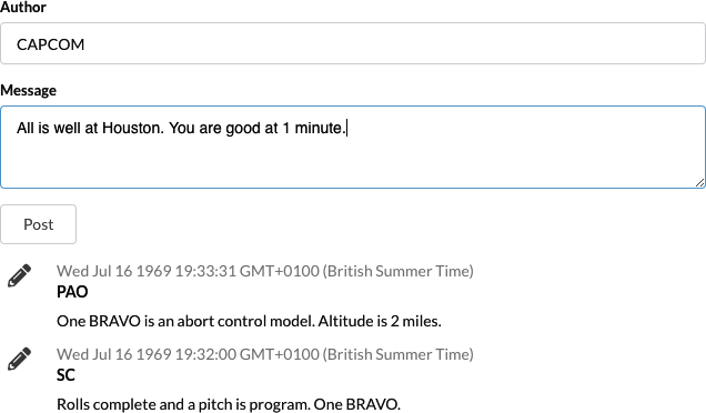
Figure 6-11. The Semantic UI interface in action
Discussion
Semantic UI is an old library. But that’s not a bad thing. Its battle-tested interface is clean and functional and is one of the best ways of getting your application up and running without the support of a visual designer. It’s particularly useful if you’re creating a Lean Startup and want to throw something together quickly to test if there is a market for your product.10
You can download the source for this recipe from the GitHub site.
1 For full details of the entire component set, see the Material-UI site.
2 For more information on these components, see the Material-UI site.
3 See “Convert Network Calls to Hooks” for more information.
4 Including dealing with all the nasty edge cases that occur if the viewport changes size.
5 You can use the library for variable and fixed-sized lists and grids. See the documentation for more details.
6 You will find the server in the source code for this chapter. You can run the server by typing node ./server.js.
7 Some of them are available only if you subscribe to the Enterprise edition.
8 Including at least one of the authors…
9 See “Create a Simple UI with React Bootstrap” for guidance on how to use Bootstrap with your application.
10 For more details, see The Lean Startup by Eric Ries (Crown Business).