Chapter 2. Routing
This chapter looks at recipes using React routes and the react-router-dom library.
react-router-dom uses declarative routing, which means you treat routes as you would any other React component. Unlike buttons,
text fields, and blocks of text, React routes have no visual appearance. But in most other ways, they are similar to buttons
and blocks of text. Routes live in the virtual DOM tree of components. They listen for changes in the current browser location and
allow you to switch on and switch off parts of the interface. They are what give SPAs the appearance of multipage applications.
Used well, they can make your application feel like any other website. Users will be able to bookmark sections of your application, as they might bookmark a page from Wikipedia. They can go backward and forward in their browser history, and your interface will behave properly. If you are new to React, then it is well worth your time to look deeply into the power of routing.
Create Interfaces with Responsive Routes
Problem
People use most applications on both mobile and laptop computers, which means you probably want your React application to work well across all screen sizes. Making your application responsive involves relatively simple CSS changes to adjust the sizing of text and screen layout, and more substantial changes, which can give mobile and desktop users very different experiences when navigating around your site.
Our example application shows the names and addresses of a list of people. In Figure 2-1, you can see the application running on a desktop machine.
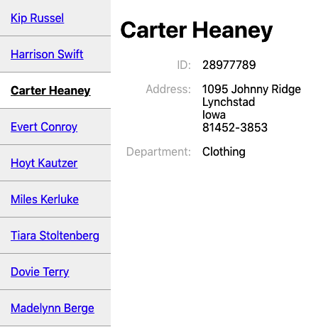
Figure 2-1. The desktop view of the app
But this layout won’t work very well on a mobile device, which might have space to display either the list of people or the details of one person, but not both.
What can we do in React to provide a custom navigation experience for both mobile and desktop users without creating two completely separate versions of the application?
Solution
We’re going to use responsive routes. A responsive route changes according to the size of the user’s display. Our existing application uses a single route for displaying the information for a person: /people/:id.
When you navigate to this route, the browser shows the page in Figure 2-1. You can see the people listed down the left side. The page highlights the selected person and displays their details on the right.
We’re going to modify our application to cope with an additional route at /people. Then we will make the routes responsive so that the user will see different things on different devices:
| Route | Mobile | Desktop |
|---|---|---|
/people |
Shows list of people |
Redirects to people:someId |
people:id |
Shows details for :id |
Shows list of people and details of :id |
What ingredients will we need to do this? First, we need to install react-router-dom if our application does not already have it:
$ npm install react-router-domThe react-router-dom library allows us to coordinate the browser’s current location with the state of our application. Next, we
will install the react-media library, which allows us to create React components that respond to changes in the display screen
size:
$ npm install react-mediaNow we’re going to create a responsive PeopleContainer component that will manage the routes we want to create. On small screens,
our component will display either a list of people or the details of a single person. On large screens, it will show a combined
view of a list of people on the left and the details of a single person on the right.
The PeopleContainer will use the Media component from react-media. The Media component performs a similar job to the CSS
@media rule: it allows you to generate output for a specified range of screen sizes. The Media component accepts a queries
property that allows you to specify a set of screen sizes. We’re going to define a single screen size—small—that we’ll use as the
break between mobile and desktop screens:
<Mediaqueries={{small:"(max-width: 700px)"}}>...</Media>
The Media component takes a single child component, which it expects to be a function. This function is given a size object
that can be used to tell what the current screen size is. In our example, the size object will have a small attribute, which we
can use to decide what other components to display:
<Mediaqueries={{small:"(max-width: 700px)"}}>{size=>size.small?[SMALLSCREENCOMPONENTS]:[BIGSCREENCOMPONENTS]}</Media>
Before we look at the details of what code we are going to return for large and small screens, it’s worth taking a look at how we
will mount the PeopleContainer in our application. The following code is going to be our main App component:
import{BrowserRouter,Link,Route,Switch}from'react-router-dom'importPeopleContainerfrom'./PeopleContainer'functionApp(){return(<BrowserRouter><Switch><Routepath="/people"><PeopleContainer/></Route><Linkto="/people">People</Link></Switch></BrowserRouter>)}exportdefaultApp
We are using the BrowserRouter from react-router-dom, which links our code and the HTML5 history API in the browser. We need to
wrap all of our routes in a Router to give them access to the browser’s current address.
Inside the BrowserRouter, we have a Switch. The Switch looks at the components inside it, looking for a Route that matches
the current location. Here we have a single Route matching paths that begin with /people. If that’s true, we display the PeopleContainer. If no route matches, we fall through to the end of the Switch and render a Link to the /people path. So
when someone goes to the front page of the application, they see only a link to the People page.
The code will match routes beginning with the specified path, unless the exact attribute is specified, in which case a
route will be displayed only if the entire path matches.
So we know if we’re in the PeopleContainer, we’re already on a route that begins with /people/…. If we’re on a small
screen, we need to either show a list of people or display the details of a single person, but not both. We can do this with
Switch:
<Mediaqueries={{small:"(max-width: 700px)"}}>{size=>size.small?[SMALLSCREENCOMPONENTS]<Switch><Routepath='/people/:id'><Person/></Route><PeopleList/></Switch>:[BIGSCREENCOMPONENTS]}</Media>
On a small device, the Media component will call its child function with a value that means size.small is true. Our code will
render a Switch that will show a Person component if the current path contains an id. Otherwise, the Switch will fail to
match that Route and will instead render a PeopleList.
Ignoring the fact that we’ve yet to write the code for large screens, if we were to run this code right now on a mobile device and
hit the People link on the front page, we would navigate to people, which could cause the application to render the
PeopleList component. The PeopleList component displays a set of links to people with paths of the form /people/id.1 When someone selects a person from the list, our components are re-rendered, and this
time PeopleContainer displays the details of a single person (see Figure 2-2).
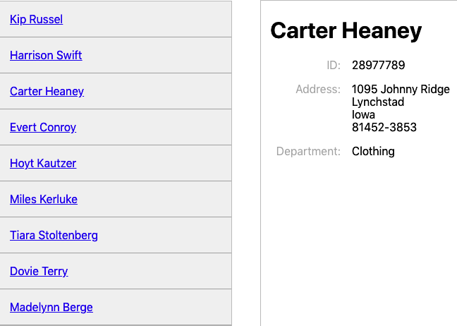
Figure 2-2. In mobile view: the list of people (left) that links to a person’s details (right)
So far, so good. Now we need to make sure that our application still works for larger screens. We need to generate responsive routes
in PeopleContainer for when size.small is false. If the current route is of the form /people/id, we can display the
PeopleList component on the left and the Person component on the right:
<divstyle={{display:'flex'}}><PeopleList/><Person/></div>
Unfortunately, that doesn’t handle the case where the current path is /people. We need another Switch that either will
display the details for a single person or will redirect to /people/first-person-id for the first person in the list of
people.
<divstyle={{display:'flex'}}><PeopleList/><Switch><Routepath='/people/:id'><Person/></Route><Redirectto={`/people/${people[0].id}`}/></Switch></div>
The Redirect component doesn’t perform an actual browser redirect. It simply updates the current path to
/people/first-person-id, which causes the PeopleContainer to re-render. It’s similar to making a call to
history.push() in JavaScript, except it doesn’t add an extra page to the browser history. If a person navigates to /people,
the browser will simply change its location to /people/first-person-id.
If we were now to go to /people on a laptop or larger tablet, we would see the list of people next to the details for the first person (Figure 2-3).
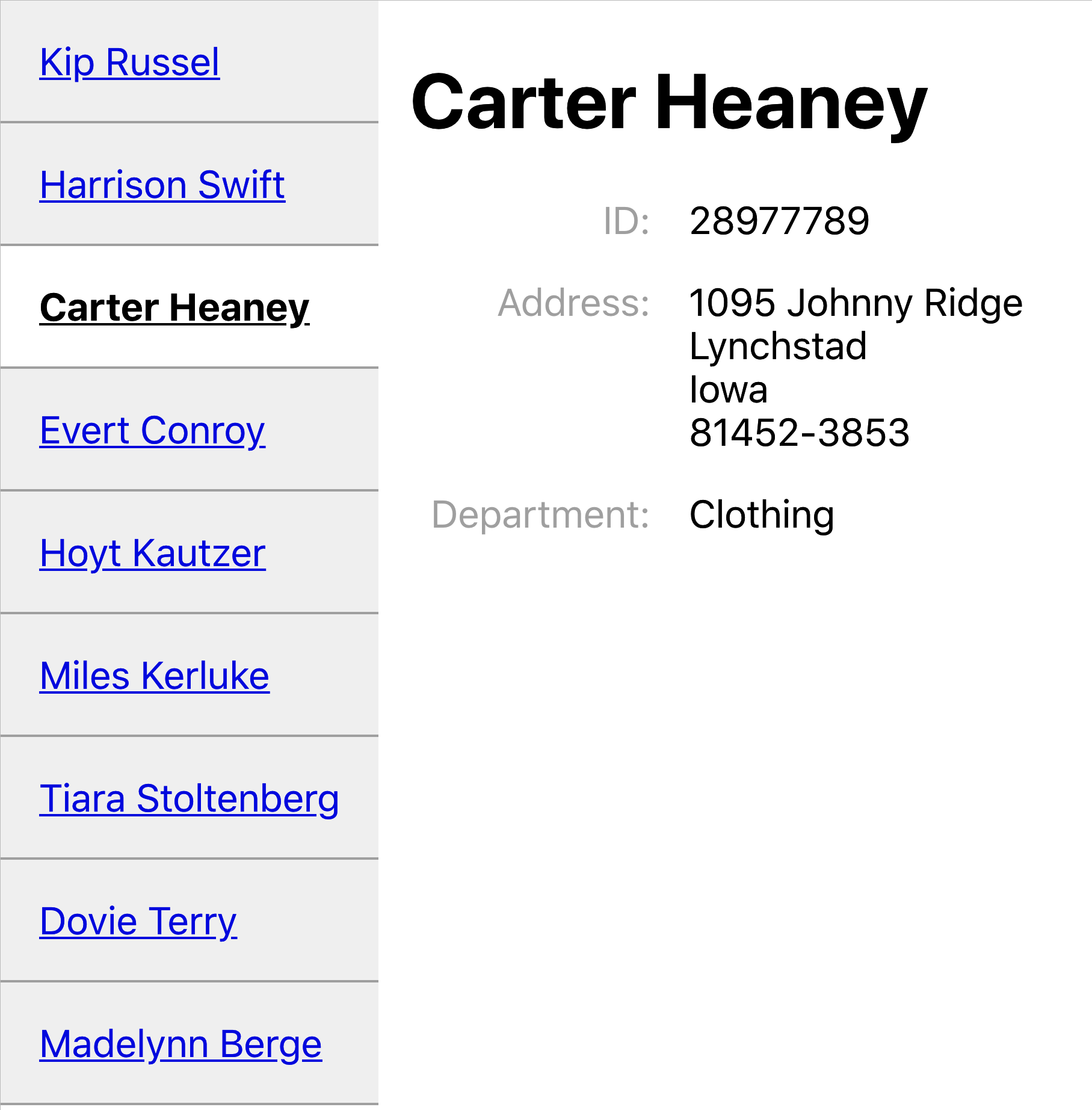
Figure 2-3. What you see at http://localhost:3000/people on a large display
Here is the final version of our PeopleContainer:
importMediafrom'react-media'import{Redirect,Route,Switch}from'react-router-dom'importPersonfrom'./Person'importPeopleListfrom'./PeopleList'importpeoplefrom'./people'constPeopleContainer=()=>{return(<Mediaqueries={{small:'(max-width: 700px)',}}>{(size)=>size.small?(<Switch><Routepath="/people/:id"><Person/></Route><PeopleList/></Switch>):(<divstyle={{display:'flex'}}><PeopleList/><Switch><Routepath="/people/:id"><Person/></Route><Redirectto={`/people/${people[0].id}`}/></Switch></div>)}</Media>)}exportdefaultPeopleContainer
Discussion
Declarative routing inside components can seem an odd thing when you first meet it. Suppose you’ve used a centralized routing model before. In that case, declarative routes may at first seem messy because they spread the wiring of your application across several components rather than in a single file. Instead of creating clean components that know nothing of the outside world, you are suddenly giving the intimate knowledge of the paths used in the application, which might make them less portable.
However, responsive routes show the real power of declarative routing. If you’re concerned about your components knowing too much about the paths in your application, consider extracting the path strings into a shared file. That way, you will have the best of both worlds: components that modify their behavior based upon the current path and a centralized set of path configurations.
You can download the source for this recipe from the GitHub site.
Move State into Routes
Problem
It is often helpful to manage the internal state of a component using the route that displays it. For example, this is a React component that displays two tabs of information: one for /people and one for /offices:
import{useState}from'react'importPeoplefrom'./People'importOfficesfrom'./Offices'import'./About.css'constOldAbout=()=>{const[tabId,setTabId]=useState('people')return(<divclassName="About"><divclassName="About-tabs"><divonClick={()=>setTabId('people')}className={tabId==='people'?'About-tab active':'About-tab'}>People</div><divonClick={()=>setTabId('offices')}className={tabId==='offices'?'About-tab active':'About-tab'}>Offices</div></div>{tabId==='people'&&<People/>}{tabId==='offices'&&<Offices/>}</div>)}exportdefaultOldAbout
When a user clicks a tab, an internal tabId variable is updated, and the People or Offices component is displayed (see Figure 2-4).
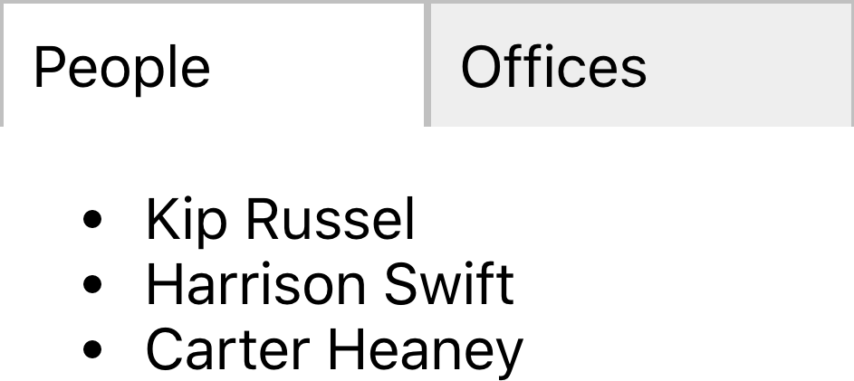
Figure 2-4. By default, the OldAbout component shows people’s details
What’s the problem? The component works, but if we select the Offices tab and then refresh the page, the component resets to the People tab. Likewise, we can’t bookmark the page when it’s on the Offices tab. We can’t create a link anywhere else in the application, which takes us directly to Offices. Accessibility hardware is less likely to notice that the tabs are working as hyperlinks because they are not rendered in that way.
Solution
We are going to move the tabId state from the component into the current browser location. So instead of rendering the component
at /about and then using onClick events to change the internal state, we are instead going to have routes to
/about/people and /about/offices, which display one tab or the other. The tab selection will survive a browser
refresh. We can bookmark the page on a given tab or create a link to a given tab. And we make the tabs actual hyperlinks, which will
be recognized as such by anyone navigating with a keyboard or screen reader.
What ingredients do we need? Just one: react-router-dom:
$ npm install react-router-domreact-router-dom will allow us to synchronize the current browser URL with the components that we render on the screen.
Our existing application is already using react-router-dom to display the OldAbout component at path /oldabout as you can
see from this fragment of code from the App.js file:
<Switch><Routepath="/oldabout"><OldAbout/></Route><p>Chooseanoption</p></Switch>
You can see the complete code for this file at the GitHub repository.
We’re going to create a new version of the OldAbout component called About, and we’re going to mount it at its own route:
<Switch><Routepath="/oldabout"><OldAbout/></Route><Routepath="/about/:tabId?"><About/></Route><p>Chooseanoption</p></Switch>
This addition allows us to open both versions of the code in the example application.
Our new version is going to appear to be virtually identical to the old component. We’ll extract the tabId from the component and
move it into the current path.
Setting the path of the Route to /about/:tabId? means that
/about,
/about/offices, and
/about/people will all mount our component. The ? indicates that the tabId parameter is optional.
We’ve now done the first part: we’ve put the component’s state into the path that displays it. We now need to update the component to interact with the route rather than an internal state variable.
In the OldAbout component, we had onClick listeners on each of the tabs:
<divonClick={()=>setTabId("people")}className={tabId==="people"?"About-tab active":"About-tab"}>People</div><divonClick={()=>setTabId("offices")}className={tabId==="offices"?"About-tab active":"About-tab"}>Offices</div>
We’re going to convert these into Link components, going to /about/people and
/about/offices. In fact, we’re
going to convert them into NavLink components. A NavLink is like a link, except it has the ability to set an additional class
name, if the place it’s linking to is the current location. This means we don’t need the className logic in the original code:
<NavLinkto="/about/people"className="About-tab"activeClassName="active">People</NavLink><NavLinkto="/about/offices"className="About-tab"activeClassName="active">Offices</NavLink>
We no longer set the value of a tabId variable. We instead go to a new location with a new tabId value in the path.
But what do we do to read the tabId value? The OldAbout code displays the current tab contents like this:
{tabId==="people"&&<People/>}{tabId==="offices"&&<Offices/>}
This code can be replaced with a Switch and a couple of Route components:
<Switch><Routepath='/about/people'><People/></Route><Routepath='/about/offices'><Offices/></Route></Switch>
We’re now almost finished. There’s just one step remaining: deciding what to do if the path is /about and contains no
tabId.
The OldAbout sets a default value for tabId when it first creates the state:
const[tabId,setTabId]=useState("people")
We can achieve the same effect by adding a Redirect to the end of our Switch. The Switch will process its child components in order until it finds a matching Route. If no Route matches the current path, it will reach the Redirect, which will
change the address to /about/people. This will cause a re-render of the About component, and the People tab will be
selected by default:
<Switch><Routepath='/about/people'><People/></Route><Routepath='/about/offices'><Offices/></Route><Redirectto='/about/people'/></Switch>
You can make Redirect conditional on the current path by giving it a from attribute. In this case, we could set from to
/about so that only routes matching /about are redirected to /about/people.
This is our completed About component:
import{NavLink,Redirect,Route,Switch}from'react-router-dom'import'./About.css'importPeoplefrom'./People'importOfficesfrom'./Offices'constAbout=()=>(<divclassName="About"><divclassName="About-tabs"><NavLinkto="/about/people"className="About-tab"activeClassName="active">People</NavLink><NavLinkto="/about/offices"className="About-tab"activeClassName="active">Offices</NavLink></div><Switch><Routepath="/about/people"><People/></Route><Routepath="/about/offices"><Offices/></Route><Redirectto="/about/people"/></Switch></div>)exportdefaultAbout
We no longer need an internal tabId variable, and we now have a purely declarative component (see Figure 2-5).
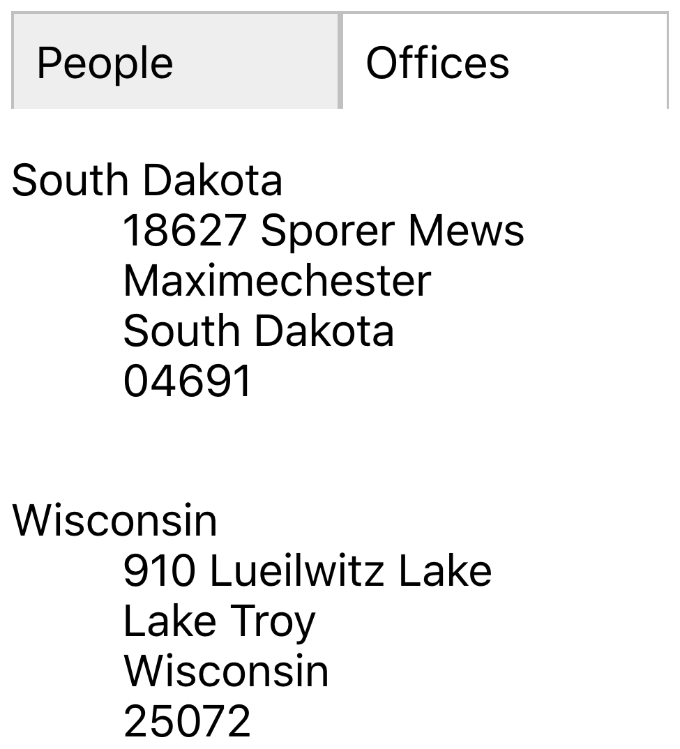
Figure 2-5. Going to http://localhost/about/offices with the new component
Discussion
Moving state out of your components and into the address bar can simplify your code, but this is merely a fortunate side effect. The real value is that your application starts to behave less like an application and more like a website. We can bookmark pages, and the browser’s Back and Forward buttons work correctly. Managing more state in routes is not an abstract design decision; it’s a way of making your application less surprising to users.
You can download the source for this recipe from the GitHub site.
Use MemoryRouter for Unit Testing
Problem
We use routes in React applications so that we make more of the facilities of the browser. We can bookmark pages, create deep links into an app, and go backward and forward in history.
However, once we use routes, we make the component dependent upon something outside itself: the browser location. That might not seem like too big an issue, but it does have consequences.
Let’s say we want to unit test a route-aware component. As an example, let’s create a unit test for the About component we built
in “Move State into Routes”:2
describe('About component',()=>{it('should show people',()=>{render(<About/>)expect(screen.getByText('Kip Russel')).toBeInTheDocument()})})
This unit test renders the component and then checks that it can find the name “Kip Russel” appearing in the output. When we run this test, we get the following error:
console.error node_modules/jsdom/lib/jsdom/virtual-console.js:29
    Error: Uncaught [Error: Invariant failed: You should not use <NavLink>
        outside a <Router>]
The error occurred because a NavLink could not find a Router higher in the component tree. That means we need to wrap the
component in a Router before we test it.
Also, we might want to write a unit test that checks that the About component works when we mount it on a specific route. Even if
we provide a Router component, how will we fake a particular route?
It’s not just an issue with unit tests. If we’re using a library tool like Storybook,3 we might want to show an example of how a component appears when we mount it on a given path.
We need something like an actual browser router but that allows us to specify its behavior.
Solution
The react-router-dom library provides just such a router: MemoryRouter. The
MemoryRouter appears to the outside world just
like BrowserRouter. The difference is that while the BrowserRouter is an interface to the underlying browser history API, the
MemoryRouter has no such dependency. It can keep track of the current location, and it can go backward and forward in history, but
it achieves this through simple memory structures.
Let’s take another look at that failing unit test. Instead of just rendering the About component, let’s wrap it in a
MemoryRouter:
describe('About component',()=>{it('should show people',()=>{render(<MemoryRouter><About/></MemoryRouter>)expect(screen.getByText('Kip Russel')).toBeInTheDocument()})})
Now, when we run the test, it works. That’s because the MemoryRouter injects a mocked-up version of the API into the context. That
makes it available to all of its child components. The About component can now render a Link or Route because the history is
available.
But the MemoryRouter has an additional advantage. Because it’s faking the browser history API, it can be given a completely fake
history, using the initialEntries property. The initialEntries property should be set to an array of history entries. If you
pass a single value array, it will be interpreted as the current location. That allows you to write unit tests that check for
component behavior when it’s mounted on a given route:
describe('About component',()=>{it('should show offices if in route',()=>{render(<MemoryRouterinitialEntries={[{pathname:'/about/offices'}]}><About/></MemoryRouter>)expect(screen.getByText('South Dakota')).toBeInTheDocument()})})
We can use a real BrowserRouter inside Storybook because we’re in a real browser, but the MemoryRouter also allows us to fake the current location, as we do in the
ToAboutOffices Storybook story (see Figure 2-6).
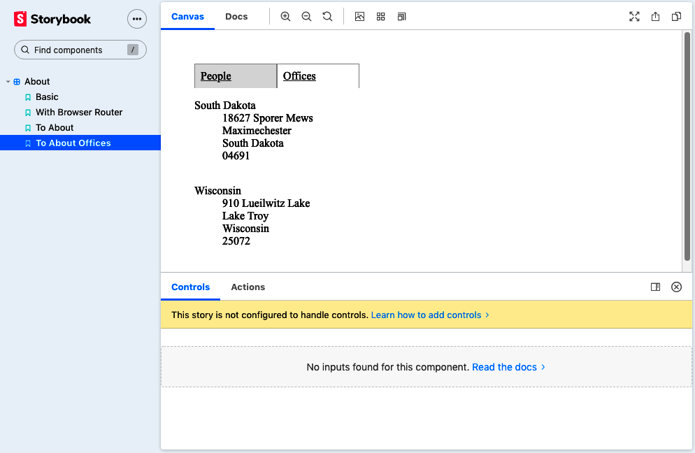
Figure 2-6. Using MemoryRouter, we can fake the /about/offices route
Discussion
Routers let you separate the details of where you want to go from how you’re going to get there. In this recipe, we see one
advantage of this separation: we can create a fake browser location to examine component behavior on different routes. This
separation allows you to change the way the application follows links without breaking. If you convert your SPA
to an SSR application, you swap your BrowserRouter for a
StaticRouter. The links used to make calls into the
browser’s history API will become native hyperlinks that cause the browser to make native page loads. Routers are an excellent
example of the advantages of splitting policy (what you want to do) from mechanisms (how you’re going to do it).
You can download the source for this recipe from the GitHub site.
Use Prompt for Page Exit Confirmations
Problem
Sometimes you need to ask a user to confirm that they want to leave a page if they’re in the middle of editing something. This seemingly simple task can be complicated because it relies on spotting when the user clicks the Back button and then finding a way to intercept the move back through history and potentially canceling it (see Figure 2-7).
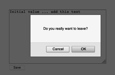
Figure 2-7. Asking for a confirmation before leaving
What if there are several pages in the application that need the same feature? Is there a simple way to create this feature across any component that needs it?
Solution
The react-router-dom library includes a component called Prompt, which asks users to confirm that they want to leave a page.
The only ingredient we need for this recipe is the react-router-dom library itself:
npminstallreact-router-dom
Let’s say we have a component called Important mounted at /important, which allows a user to edit a piece of text:
importReact,{useEffect,useState}from'react'constImportant=()=>{constinitialValue='Initial value'const[data,setData]=useState(initialValue)const[dirty,setDirty]=useState(false)useEffect(()=>{if(data!==initialValue){setDirty(true)}},[data,initialValue])return(<divclassName="Important"><textareaonChange={(evt)=>setData(evt.target.value)}cols={40}rows={12}>{data}</textarea><br/><buttononClick={()=>setDirty(false)}disabled={!dirty}>Save</button></div>)}exportdefaultImportant
Important is already tracking whether the text in the textarea has changed from the original value. If the text is different,
the value of dirty is true. How do we ask the user to confirm they want to leave the page if they click the Back button when
dirty is true?
We add a Prompt component:
return(<divclassName="Important"><textareaonChange={(evt)=>setData(evt.target.value)}cols={40}rows={12}>{data}</textarea><br/><buttononClick={()=>setDirty(false)}disabled={!dirty}>Save</button><Promptwhen={dirty}message={()=>'Do you really want to leave?'}/></div>)
If the user edits the text and then hits the Back button, the Prompt appears (see Figure 2-8).
Figure 2-8. The Prompt asks the user to confirm they want to leave
Adding the confirmation is easy, but the default prompt interface is a simple JavaScript dialog. It would be helpful to decide for ourselves how we want the user to confirm they’re leaving.
To demonstrate how we can do this, let’s add the Material-UI component library to the application:
$ npm install '@material-ui/core'The Material-UI library is a React implementation of Google’s Material Design standard. We’ll use it as an example of how to replace
the standard Prompt interface with something more customized.
The Prompt component does not render any UI. Instead, the Prompt component asks the current Router to show the confirmation.
By default, BrowserRouter shows the default JavaScript dialog, but you can replace this with your own code.
When the BrowserRouter is added to the component tree, we can pass it a property called getUserConfirmation:
<divclassName="App"><BrowserRoutergetUserConfirmation={(message,callback)=>{// Custom code goes here}}><Switch><Routepath='/important'><Important/></Route></Switch></BrowserRouter></div>
The getUserConfirmation property is a function that accepts two parameters: the message it should display and a callback function.
When the user clicks the Back button, the Prompt component will run getUserConfirmation and then wait for the callback function
to be called with the value true or false.
The callback function returns the user’s response asynchronously. The Prompt component will wait while we ask the user what they
want to do. That allows us to create a custom interface.
Let’s create a custom Material-UI dialog called Alert. We’ll show this instead of the default JavaScript modal:
importButtonfrom'@material-ui/core/Button'importDialogfrom'@material-ui/core/Dialog'importDialogActionsfrom'@material-ui/core/DialogActions'importDialogContentfrom'@material-ui/core/DialogContent'importDialogContentTextfrom'@material-ui/core/DialogContentText'importDialogTitlefrom'@material-ui/core/DialogTitle'constAlert=({open,title,message,onOK,onCancel})=>{return(<Dialogopen={open}onClose={onCancel}aria-labelledby="alert-dialog-title"aria-describedby="alert-dialog-description"><DialogTitleid="alert-dialog-title">{title}</DialogTitle><DialogContent><DialogContentTextid="alert-dialog-description">{message}</DialogContentText></DialogContent><DialogActions><ButtononClick={onCancel}color="primary">Cancel</Button><ButtononClick={onOK}color="primary"autoFocus>OK</Button></DialogActions></Dialog>)}exportdefaultAlert
Of course, there is no reason why we need to display a dialog. We could show a countdown timer or a snackbar message or
automatically save the user’s changes. But we will display a custom Alert dialog.
How will we use the Alert component in our interface? The first thing we’ll need to do is create our own getUserConfirmation
function. We’ll store the message and the callback function and then set a Boolean value saying that we want to open the Alert
dialog:
const[confirmOpen,setConfirmOpen]=useState(false)const[confirmMessage,setConfirmMessage]=useState()const[confirmCallback,setConfirmCallback]=useState()return(<divclassName="App"><BrowserRoutergetUserConfirmation={(message,callback)=>{setConfirmMessage(message)// Use this setter form because callback is a functionsetConfirmCallback(()=>callback)setConfirmOpen(true)}}>.....
It’s worth noting that when we store the callback function, we use setConfirmCallback(() => callback) instead of simply writing setConfirmCallback(callback). That’s because the setters returned by the useState hook will execute any function passed to them,
rather than store them.
We can then use the values of confirmMessage, confirmCallback, and confirmOpen to render the Alert in the interface.
This is the complete App.js file:
import{useState}from'react'import'./App.css'import{BrowserRouter,Link,Route,Switch}from'react-router-dom'importImportantfrom'./Important'importAlertfrom'./Alert'functionApp(){const[confirmOpen,setConfirmOpen]=useState(false)const[confirmMessage,setConfirmMessage]=useState()const[confirmCallback,setConfirmCallback]=useState()return(<divclassName="App"><BrowserRoutergetUserConfirmation={(message,callback)=>{setConfirmMessage(message)// Use this setter form because callback is a functionsetConfirmCallback(()=>callback)setConfirmOpen(true)}}><Alertopen={confirmOpen}title="Leave page?"message={confirmMessage}onOK={()=>{confirmCallback(true)setConfirmOpen(false)}}onCancel={()=>{confirmCallback(false)setConfirmOpen(false)}}/><Switch><Routepath="/important"><Important/></Route><div><h1>Homepage</h1><Linkto="/important">Gotoimportantpage</Link></div></Switch></BrowserRouter></div>)}exportdefaultApp
Now when a user backs out of an edit, they see the custom dialog, as shown in Figure 2-9.
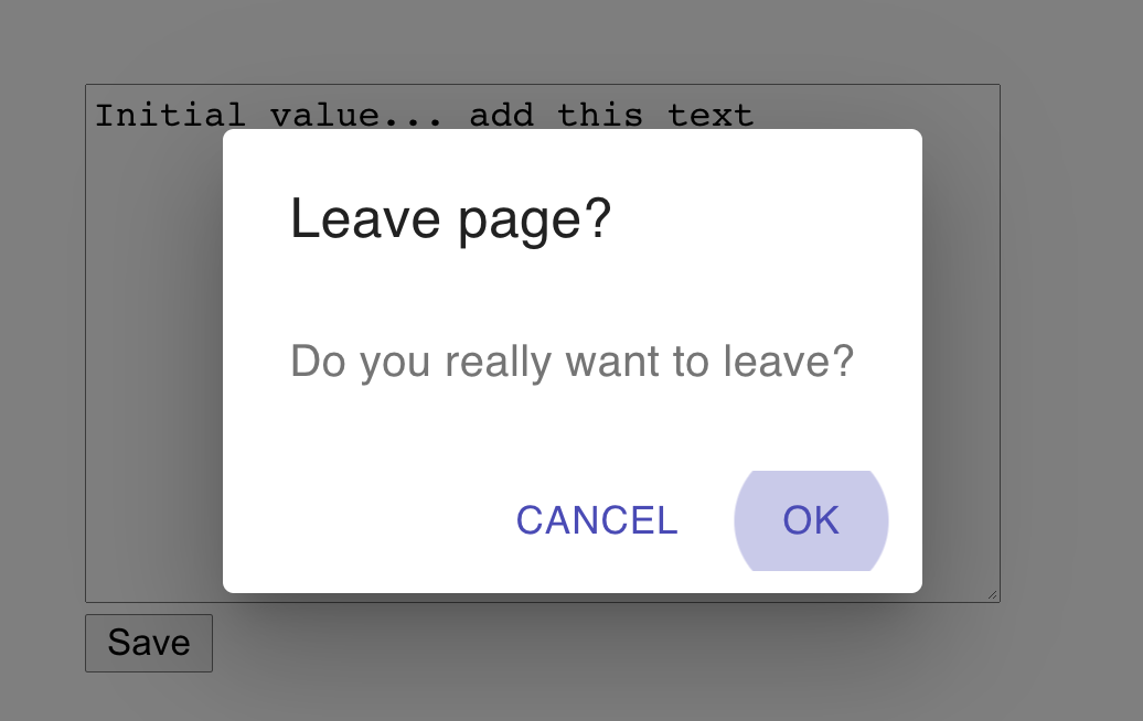
Figure 2-9. The custom Alert appears when the user clicks the Back button
Discussion
In this recipe, we have re-implemented the Prompt modal using a component library, but you don’t need to be limited to just
replacing one dialog box with another. There is no reason why, if someone leaves a page, that you couldn’t do something else: such
as store the work-in-progress somewhere so that they could return to it later. The asynchronous nature of the getUserConfirmation
function allows this flexibility. It’s another example of how react-router-dom abstracts away a cross-cutting concern.
You can download the source for this recipe from the GitHub site.
Create Transitions with React Transition Group
Problem
Native and desktop applications often use animation to connect different elements visually. If you tap an item in a list, it expands to show you the details. Swiping left or right can be used to indicate whether a user accepts or rejects an option.
Animations, therefore, are often used to indicate a location change. They zoom in on the details. They take you to the next person on the list. We reflect a change in the URL with a matching animation.
But how do we create an animation when we move from one location to another?
Solution
For this recipe, we’re going to need the react-router-dom library and the react-transition-group library:
$ npm install react-router-dom$ npm install react-transition-group
We’re going to animate the About component that we’ve used previously.4 The About
component has two tabs called People and Offices, which are displayed for the routes /about/people and /about/offices.
When someone clicks one of the tabs, we’re going to fade out the old tab’s content and then fade in the content of the new tab. Although we’re using a fade, there’s no reason why we couldn’t use a more complex animation, such as sliding the tab contents left or right.5 However, a simple fade animation will more clearly demonstrate how it works.
Inside the About component, the tab contents are rendered by People and Offices components within distinct routes:
import{NavLink,Redirect,Route,Switch}from'react-router-dom'import'./About.css'importPeoplefrom'./People'importOfficesfrom'./Offices'constAbout=()=>(<divclassName="About"><divclassName="About-tabs"><NavLinkto="/about/people"className="About-tab"activeClassName="active">People</NavLink><NavLinkto="/about/offices"className="About-tab"activeClassName="active">Offices</NavLink></div><Switch><Routepath="/about/people"><People/></Route><Routepath="/about/offices"><Offices/></Route><Redirectto="/about/people"/></Switch></div>)exportdefaultAbout
We need to animate the components inside the Switch component. We’ll need two things to do this:
-
Something to track when the location has changed
-
Something to animate the tab contents when that happens
How do we know when the location has changed? We can get the current location from the useLocation hook from react-router-dom:
constlocation=useLocation()
Now on to the more complex task: the animation itself. What follows is quite a complex sequence of events, but taking time to understand it is worth it.
When we are animating from one component to another, we need to keep both components on the page. As the Offices component fades
out, the People component fades in.6 We can do this by keeping both components in a transition group. A transition group is a set of components, some
of which are appearing and others are
disappearing.
We can create a transition group by wrapping our animation in a TransitionGroup component. We also need a CSSTransition
component to coordinate the details of the CSS animation.
Our updated code wraps the Switch in both a TransitionGroup and a
CSSTransition:
import{NavLink,Redirect,Route,Switch,useLocation,}from'react-router-dom'importPeoplefrom'./People'importOfficesfrom'./Offices'import{CSSTransition,TransitionGroup,}from'react-transition-group'import'./About.css'import'./fade.css'constAbout=()=>{constlocation=useLocation()return(<divclassName="About"><divclassName="About-tabs"><NavLinkto="/about/people"className="About-tab"activeClassName="active">People</NavLink><NavLinkto="/about/offices"className="About-tab"activeClassName="active">Offices</NavLink></div><TransitionGroupclassName="About-tabContent"><CSSTransitionkey={location.key}classNames="fade"timeout={500}><Switchlocation={location}><Routepath="/about/people"><People/></Route><Routepath="/about/offices"><Offices/></Route><Redirectto="/about/people"/></Switch></CSSTransition></TransitionGroup></div>)}exportdefaultAbout
Notice that we pass the location.key to the key of the CSSTransition group, and we pass the location to the Switch
component. The location.key is a hash value of the current location. Passing the location.key to the transition group will keep
the CSSTransition in the virtual DOM until the animation is complete. When the user clicks one of the tabs, the location changes,
which refreshes the About component. The TransitionGroup will keep the existing CSSTransition in the tree of components until
its timeout occurs: in 500 milliseconds. But it will now also have a second CSSTransition component.
Each of these CSSTransition components will keep their child components alive (see Figure 2-10).
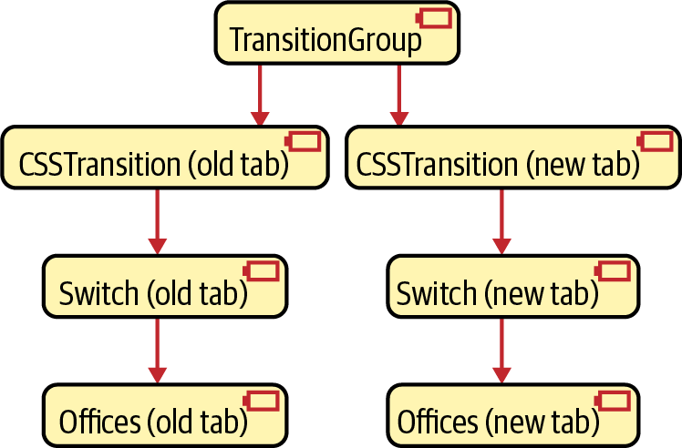
Figure 2-10. The TransitionGroup keeps both the old and new components in the virtual DOM
We need to pass the location value to the Switch components: we need the Switch for the old tab, and we need the Switch for the new
tab to keep rendering their routes.
So now, on to the animation itself. The CSSTransition component accepts a property called classNames, which we have set to the
value fade. Note that classNames is a plural to distinguish it from the standard className attribute.
CSSTransition will use classNames to generate four distinct class names:
-
fade-enter -
fade-enter-active -
fade-exit -
fade-exit-active
The fade-enter class is for components that are about to start to animate into view. The fade-enter-active class is applied to
components that are actually animating. fade-exit and fade-exit-active are for components that are beginning or animating their
disappearance.
The CSSTransition component will add these class names to their immediate children. If we are animating from the Offices tab to
the People tab, then the old
CSSTransition will add the fade-enter-active class to the People HTML and will add the
fade-exit-active to the Offices HTML.
All that’s left to do is define the CSS animations themselves:
.fade-enter{opacity:0;}.fade-enter-active{opacity:1;transition:opacity250msease-in;}.fade-exit{opacity:1;}.fade-exit-active{opacity:0;transition:opacity250msease-in;}
The fade-enter- classes use CSS transitions to change the opacity of the component from 0 to 1. The fade-exit- classes animate
the opacity from 1 back to 0. It’s generally a good idea to keep the animation class definitions in a separate CSS file. That way,
we can reuse them for other animations.
The animation is complete. When the user clicks a tab, they see the contents cross-fade from the old data to the new data (Figure 2-11).
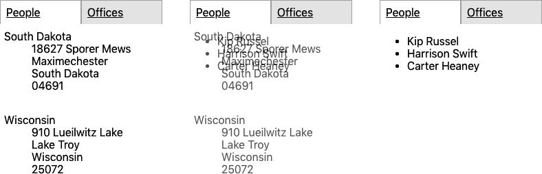
Figure 2-11. The contents of the tab fade from offices to people
Discussion
Animations can be pretty irritating when used poorly. Each animation you add should have some intent. If you find that you want to add an animation just because you think it will be attractive, you will almost certainly find users will dislike it. Generally, it is best to ask a few questions before adding an animation:
-
Will this animation clarify the relationship between the two routes? Are you zooming in to see more detail or moving across to look at a related item?
-
How short should the animation be? Any longer than half a second is probably too much.
-
What is the impact on performance? CSS transitions usually have minimal effect if the browser hands the work off to the GPU. But what happens in an old browser on a mobile device?
You can download the source for this recipe from the GitHub site.
Create Secured Routes
Problem
Most applications need to prevent access to particular routes until a person logs in. But how do you secure some routes and not others? Is it possible to separate the security mechanisms from the user interface elements for logging in and logging out? And how do you do it without writing a vast amount of code?
Solution
Let’s look at one way to implement route-based security in a React application. This application contains a home page (/), it has a public page with no security (/public), and it also has two private pages (/private1 and /private2) that we need to secure:
importReactfrom'react'import'./App.css'import{BrowserRouter,Route,Switch}from'react-router-dom'importPublicfrom'./Public'importPrivate1from'./Private1'importPrivate2from'./Private2'importHomefrom'./Home'functionApp(){return(<divclassName="App"><BrowserRouter><Switch><Routeexactpath="/"><Home/></Route><Routepath="/private1"><Private1/></Route><Routepath="/private2"><Private2/></Route><Routeexactpath="/public"><Public/></Route></Switch></BrowserRouter></div>)}exportdefaultApp
We’re going to build the security system using a context. A context is where data can be stored by a component and made available to
the component’s children. A BrowserRouter uses a context to pass routing information to the Route components within it.
We’re going to create a custom context called SecurityContext:
importReactfrom'react'constSecurityContext=React.createContext({})exportdefaultSecurityContext
The default value of our context is an empty object. We need something that will add functions into the context for logging in and
logging out. We’ll do that by creating a SecurityProvider:
import{useState}from'react'importSecurityContextfrom'./SecurityContext'constSecurityProvider=(props)=>{const[loggedIn,setLoggedIn]=useState(false)return(<SecurityContext.Providervalue={{login:(username,password)=>{// Note to engineering team:// Maybe make this more secure...if(username==='fred'&&password==='password'){setLoggedIn(true)}},logout:()=>setLoggedIn(false),loggedIn,}}>{props.children}</SecurityContext.Provider>)}exportdefaultSecurityProvider
The code would be very different in a real system. You would probably create a component that logged in and logged out using a web
service or third-party security
system. But in our example, the SecurityProvider keeps track of whether we have logged in using a
simple loggedIn Boolean value. The SecurityProvider puts three things into the context:
-
A function for logging in (
login) -
A function for logging out (
logout) -
A Boolean value saying whether we have logged in or out (
loggedIn)
These three things will be available to any components placed inside a SecurityProvider component. To allow any component inside a
SecurityProvider to access these functions, we’ll add a custom hook called useSecurity:
importSecurityContextfrom'./SecurityContext'import{useContext}from'react'constuseSecurity=()=>useContext(SecurityContext)exportdefaultuseSecurity
Now that we have a SecurityProvider, we need to use it to secure a subset of the routes. We’ll create another component, called
SecureRoute:
importLoginfrom'./Login'import{Route}from'react-router-dom'importuseSecurityfrom'./useSecurity'constSecureRoute=(props)=>{const{loggedIn}=useSecurity()return(<Route{...props}>{loggedIn?props.children:<Login/>}</Route>)}exportdefaultSecureRoute
The SecureRoute component gets the current loggedIn status from the SecurityContext (using the useSecurity hook), and if the user is logged in, it renders the contents of the route. If the user is not logged in, it displays a login form.7
The LoginForm calls the login function, which—if successful—will re-render the SecureRoute and then show the secured data.
How do we use all of these new components? Here is an updated version of the App.js file:
import'./App.css'import{BrowserRouter,Route,Switch}from'react-router-dom'importPublicfrom'./Public'importPrivate1from'./Private1'importPrivate2from'./Private2'importHomefrom'./Home'importSecurityProviderfrom'./SecurityProvider'importSecureRoutefrom'./SecureRoute'functionApp(){return(<divclassName="App"><BrowserRouter><SecurityProvider><Switch><Routeexactpath="/"><Home/></Route><SecureRoutepath="/private1"><Private1/></SecureRoute><SecureRoutepath="/private2"><Private2/></SecureRoute><Routeexactpath="/public"><Public/></Route></Switch></SecurityProvider></BrowserRouter></div>)}exportdefaultApp
The SecurityProvider wraps our whole routing system, making login(), logout(), and loggedIn available to each SecureRoute.
You can see the application running in Figure 2-12.
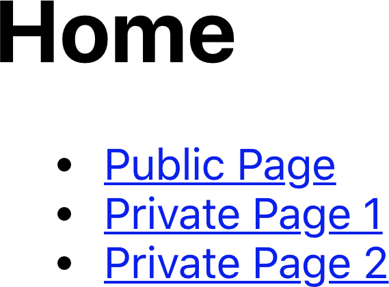
Figure 2-12. The home page has links to the other pages
If we click the Public Page link, the page appears (see Figure 2-13).

Figure 2-13. The public page is available without logging in
But if we click Private Page 1, we’re presented with the login screen (Figure 2-14).
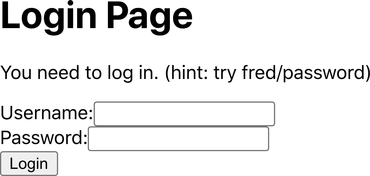
Figure 2-14. You need to log in before you can see Private Page 1
If you log in with the username fred and password password, you will then see the private content (see Figure 2-15).
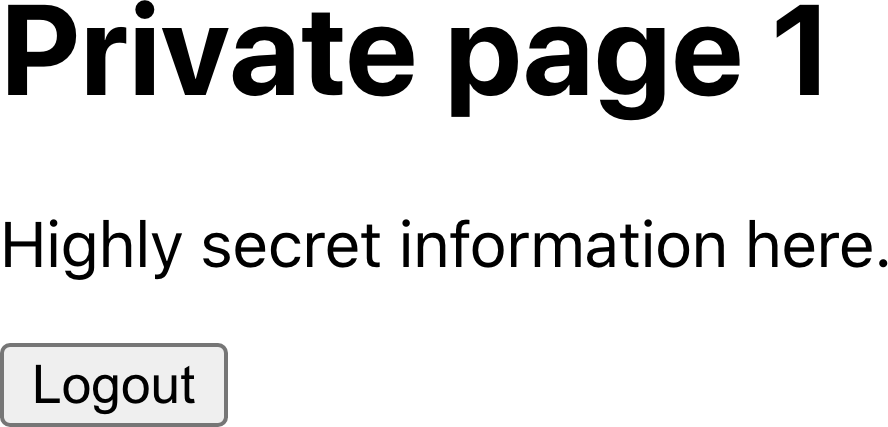
Figure 2-15. The content of Private Page 1 after login
Discussion
Real security is only ever provided by secured backend services. However, secured routes prevent a user from stumbling into a page that can’t read data from the server.
A better implementation of the SecurityProvider would defer to some third-party OAuth tool or other security services. But by
splitting the SecurityProvider from the security UI (Login and Logout) and the main application, you can modify the security
mechanisms over time without changing a lot of code in your application.
If you want to see how your components behave when people log in and out, you can always create a mocked version of the
SecurityProvider for use in unit tests.
You can download the source for this recipe from the GitHub site.
1 We won’t show the code for the PeopleList here, but it is available on GitHub.
2 We are using the React Testing Library in this example.
3 See “Use Storybook for Component Development”.
5 This is a common feature of third-party tabbed components. The animation reinforces in the user’s mind that they are moving left and right through the tabs.
6 The code uses relative positioning to place both components in the same position during the fade.
7 We’ll omit the contents of the Login component here, but the code is available on the GitHub repository.