Chapter 4. Interaction Design
In this chapter, we look at some recipes that address a bunch of typical interface problems. How do you deal with errors? How do you help people use your system? How do you create complex input sequences without writing a bunch of spaghetti code?
This is a collection of tips that we’ve found useful, time and again. At the end of the chapter, we look at various ways of adding animation to your application. We take a low-tech approach where possible, and ideally, the recipes we include will add meaning to your interface designs with a minimum of fuss.
Build a Centralized Error Handler
Problem
It’s hard to define precisely what makes good software good. But one thing that most excellent software has in common is how it responds to errors and exceptions. There will always be exceptional, unexpected situations when people are running your code: the network can disappear, the server can crash, the storage can become corrupted. It’s important to consider how you should deal with these situations when they occur.
One approach that is almost certain to fail is to ignore the fact that error conditions occur and to hide the gory details of what went wrong. Somewhere, somehow, you need to leave a trail of evidence that you can use to prevent that error from happening again.
When we’re writing server code, we might log the error details and return an appropriate message to a request. But if we’re writing client code, we need a plan for how we’ll deal with local errors. We might choose to display the crash’s details to the user and ask them to file an error report. We might use a third-party service like Sentry.io to log the details remotely.
Whatever our code does, it should be consistent. But how can we handle exceptions consistently in a React application?
Solution
In this recipe, we’re going to look at one way of creating a centralized error handler. To be clear: this code won’t automatically
capture all exceptions. It still needs to be added explicitly to JavaScript catch blocks. It’s also not a replacement for dealing
with any error from which we can otherwise recover. If an order fails because the server is down for maintenance, it is much better
to ask the user to try again later.
But this technique helps catch any errors for which we have not previously planned.
As a general principle, when something goes wrong, there are three things that you should tell the user:
-
What happened
-
Why it happened
-
What they should do about it
In the example we show here, we’re going to handle errors by displaying a dialog box that shows the details of a JavaScript Error
object and asks the user to email the contents to systems support. We want a simple error-handler function that we can call when an
error happens:
setVisibleError('Cannot do that thing',errorObject)
If we want to make the function readily available across the entire application, the usual way is by using a context. A context is a kind of scope that we can wrap around a set of React components. Anything we put into that context is available to all the child components. We will use our context to store the error-handler function that we can run when an error occurs.
We’ll call our context ErrorHandlerContext:
importReactfrom'react'constErrorHandlerContext=React.createContext(()=>{})exportdefaultErrorHandlerContext
To allow us to make the context available to a set of components, let’s create an
ErrorHandlerProvider component that will create
an instance of the context and make it available to any child components we pass to it:
importErrorHandlerContextfrom'./ErrorHandlerContext'letsetError=()=>{}constErrorHandlerProvider=(props)=>{if(props.callback){setError=props.callback}return(<ErrorHandlerContext.Providervalue={setError}>{props.children}</ErrorHandlerContext.Provider>)}exportdefaultErrorHandlerProvider
Now we need some code that says what to do when we call the error-handler function. In our case, we need some code that will respond to an error report by displaying a dialog box containing all of the error details. If you want to handle errors differently, this is the code you need to modify:
import{useCallback,useState}from'react'importErrorHandlerProviderfrom'./ErrorHandlerProvider'importErrorDialogfrom'./ErrorDialog'constErrorContainer=(props)=>{const[error,setError]=useState()const[errorTitle,setErrorTitle]=useState()const[action,setAction]=useState()if(error){console.error('An error has been thrown',errorTitle,JSON.stringify(error))}constcallback=useCallback((title,err,action)=>{console.error('ERROR RAISED ')console.error('Error title: ',title)console.error('Error content',JSON.stringify(err))setError(err)setErrorTitle(title)setAction(action)},[])return(<ErrorHandlerProvidercallback={callback}>{props.children}{error&&(<ErrorDialogtitle={errorTitle}onClose={()=>{setError(null)setErrorTitle('')}}action={action}error={error}/>)}</ErrorHandlerProvider>)}exportdefaultErrorContainer
The ErrorContainer displays the details using an ErrorDialog. We won’t go into the details of the code for ErrorDialog
here as this is the code that you are most likely to replace with your implementation.1
We need to wrap the bulk of our application in an ErrorContainer. Any components inside the ErrorContainer will be able to call
the error handler:
import'./App.css'importErrorContainerfrom'./ErrorContainer'importClockInfrom'./ClockIn'functionApp(){return(<divclassName="App"><ErrorContainer><ClockIn/></ErrorContainer></div>)}exportdefaultApp
How does a component use the error handler? We’ll create a custom hook called useErrorHandler(), which will get the error-handler
function out of the context and return it:
importErrorHandlerContextfrom'./ErrorHandlerContext'import{useContext}from'react'constuseErrorHandler=()=>useContext(ErrorHandlerContext)exportdefaultuseErrorHandler
That’s quite a complex set of code, but now we come to use the error handler; it’s very simple. This example code makes a network request when a user clicks a button. If the network request fails, then the details of the error are passed to the error handler:
importuseErrorHandlerfrom'./useErrorHandler'importaxiosfrom'axios'constClockIn=()=>{constsetVisibleError=useErrorHandler()constdoClockIn=async()=>{try{awaitaxios.put('/clockTime')}catch(err){setVisibleError('Unable to record work start time',err)}}return(<><h1>ClickButtontoRecordStartTime</h1><buttononClick={doClockIn}>Startwork</button></>)}exportdefaultClockIn
You can see what the app looks like in Figure 4-1.

Figure 4-1. The time-recording app
When you click the button, the network request fails because the server code doesn’t exist. Figure 4-2 shows the error dialog that appears. Notice that it shows what went wrong, why it went wrong, and what the user should do about it.
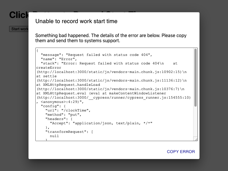
Figure 4-2. When the network request throws an exception, we pass it to the error handler
Discussion
Of all the recipes that we’ve created over the years, this one has saved the most time. During development, code often breaks, and if the only evidence of a failure is a stack trace hidden away inside the JavaScript console, you are likely to miss it.
Significantly, when some piece of infrastructure (networks, gateways, servers, databases) fails, this small amount of code can save you untold hours tracking down the cause.
You can download the source for this recipe from the GitHub site.
Create an Interactive Help Guide
Problem
Tim Berners-Lee deliberately designed the web to have very few features. It has a simple protocol (HTTP), and it originally had a straightforward markup language (HTML). The lack of complexity meant that new users of websites immediately knew how to use them. If you saw something that looked like a hyperlink, you could click on it and go to another page.
But rich JavaScript applications have changed all that. No longer are web applications a collection of hyperlinked web pages. Instead, they resemble old desktop applications; they are more powerful and feature-rich, but the downside is that they are now far more complex to use.
How do you build an interactive guide into your application?
Solution
We’re going to build a simple help system that you can overlay onto an existing application. When the user opens the help, they will see a series of pop-up notes that describe how to use the various features they can see on the page, as shown in Figure 4-3.
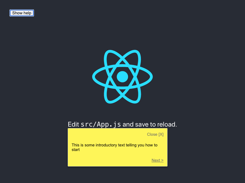
Figure 4-3. Show a sequence of help messages when the user asks
We want something that will be easy to maintain and will provide help only for visible components. That sounds like quite a big task, so let’s begin by first constructing a component that will display a pop-up help message:
import{Popper}from'@material-ui/core'import'./HelpBubble.css'constHelpBubble=(props)=>{constelement=props.forElement?document.querySelector(props.forElement):nullreturnelement?(<PopperclassName="HelpBubble-container"open={props.open}anchorEl={element}placement={props.placement||'bottom-start'}><divclassName="HelpBubble-close"onClick={props.onClose}>Close[X]</div>{props.content}<divclassName="HelpBubble-controls">{props.previousLabel?(<divclassName="HelpBubble-control HelpBubble-previous"onClick={props.onPrevious}><{props.previousLabel}</div>):(<div> </div>)}{props.nextLabel?(<divclassName="HelpBubble-control HelpBubble-next"onClick={props.onNext}>{props.nextLabel}></div>):(<div> </div>)}</div></Popper>):null}exportdefaultHelpBubble
We’re using the Popper component from the @material-ui library. The Popper component can be anchored on the page, next to
some other component. Our HelpBubble takes a forElement string, which will represent a CSS selector such as
.class-name or #some-id. We will use selectors to associate things on the screen with pop-up messages.
Now that we have a pop-up message component, we’ll need something that coordinates a sequence of HelpBubbles. We’ll call this the
HelpSequence:
import{useEffect,useState}from'react'importHelpBubblefrom'./HelpBubble'functionisVisible(e){return!!(e.offsetWidth||e.offsetHeight||e.getClientRects().length)}constHelpSequence=(props)=>{const[position,setPosition]=useState(0)const[sequence,setSequence]=useState()useEffect(()=>{if(props.sequence){constfilter=props.sequence.filter((i)=>{if(!i.forElement){returnfalse}constelement=document.querySelector(i.forElement)if(!element){returnfalse}returnisVisible(element)})setSequence(filter)}else{setSequence(null)}},[props.sequence,props.open])constdata=sequence&&sequence[position]useEffect(()=>{setPosition(0)},[props.open])constonNext=()=>setPosition((p)=>{if(p===sequence.length-1){props.onClose&&props.onClose()}returnp+1})constonPrevious=()=>setPosition((p)=>{if(p===0){props.onClose&&props.onClose()}returnp-1})return(<divclassName="HelpSequence-container">{data&&(<HelpBubbleopen={props.open}forElement={data.forElement}placement={data.placement}onClose={props.onClose}previousLabel={position>0&&'Previous'}nextLabel={position<sequence.length-1?'Next':'Finish'}onPrevious={onPrevious}onNext={onNext}content={data.text}/>)}</div>)}exportdefaultHelpSequence
The HelpSequence takes an array of JavaScript objects like this:
[{forElement:"p",text:"This is some introductory text telling you how to start"},{forElement:".App-link",text:"This will show you how to use React"},{forElement:".App-nowhere",text:"This help text will never appear"},]
and converts it into a dynamic sequence of HelpBubbles. It will show a HelpBubble only if it can find an element that matches
the forElement selector. It then places the HelpBubble next to the element and shows the help text.
Let’s add a HelpSequence to the default App.js code generated by create-react-app:
import{useState}from'react'importlogofrom'./logo.svg'importHelpSequencefrom'./HelpSequence'import'./App.css'functionApp(){const[showHelp,setShowHelp]=useState(false)return(<divclassName="App"><headerclassName="App-header"><imgsrc={logo}className="App-logo"alt="logo"/><p>Edit<code>src/App.js</code>andsavetoreload.</p><aclassName="App-link"href="https://reactjs.org"target="_blank"rel="noopener noreferrer">LearnReact</a></header><buttononClick={()=>setShowHelp(true)}>Showhelp</button><HelpSequencesequence={[{forElement:'p',text:'This is some introductory text telling you how to start',},{forElement:'.App-link',text:'This will show you how to use React',},{forElement:'.App-nowhere',text:'This help text will never appear',},]}open={showHelp}onClose={()=>setShowHelp(false)}/></div>)}exportdefaultApp
To begin with, we cannot see anything different other than a help button (see Figure 4-4).
Figure 4-4. The application, when it first loads
When the user clicks the help button, the first help topic appears, as shown in Figure 4-5.
Figure 4-5. When the user clicks the help button, the help bubble appears for the first match
Figure 4-6 shows the help moving to the next element when the user clicks Next. The user can continue to move from item to item until there are no more matching elements visible.
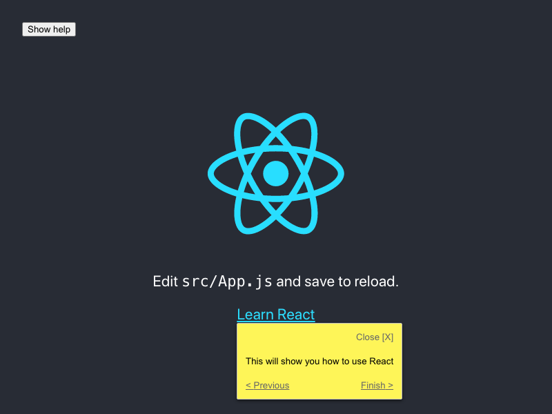
Figure 4-6. The final element has a Finish button
Discussion
Adding interactive help to your application makes your user interface discoverable. Developers spend a lot of their time adding functionality to applications that people might never use, simply because they don’t know that it’s there.
The implementation in this recipe displays the help as simple plain text. You might consider using Markdown, as that will allow for a richer experience, and help topics can then include links to other more expansive help pages.2
The help topics are automatically limited to just those elements that are visible on the page. You could choose to create either a separate help sequence for each page or a single large help sequence that will automatically adapt to the user’s current view of the interface.
Finally, a help system like this is ideally suited for storage in a headless CMS, which will allow you to update help dynamically, without the need to create a new deployment each time.
You can download the source for this recipe from the GitHub site.
Use Reducers for Complex Interactions
Problem
Applications frequently need users to follow a sequence of actions. They might be completing the steps in a wizard, or they might need to log in and confirm some dangerous operation (see Figure 4-7).
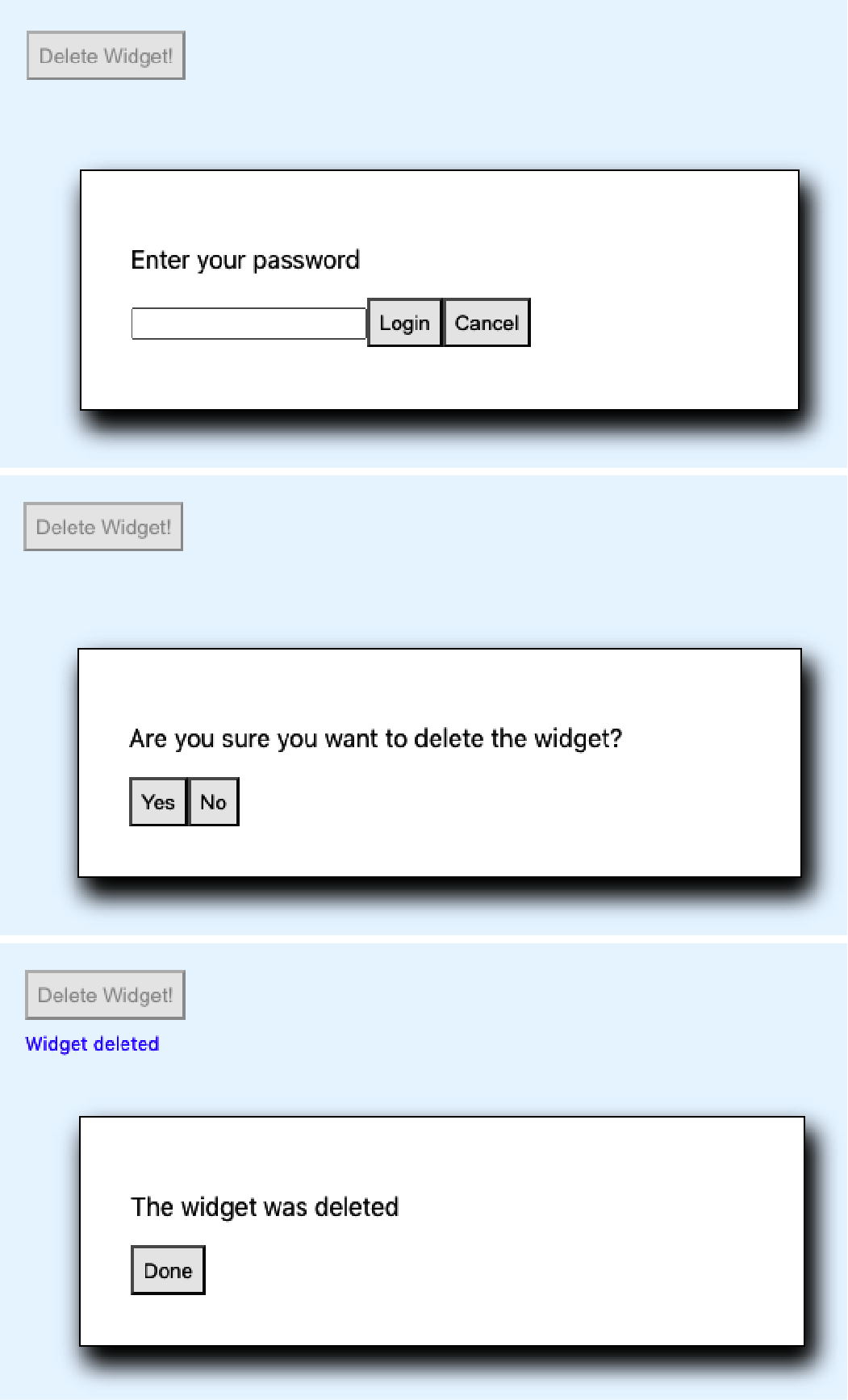
Figure 4-7. This deletion process requires logging in and then confirming the deletion
Not only will the user need to perform a sequence of steps, but the steps might be conditional. If the user has logged in recently, they perhaps don’t need to log in again. They might want to cancel partway through the sequence.
If you model the complex sequences inside your components, you can soon find your application is full of spaghetti code.
Solution
We are going to use a reducer to manage a complex sequence of operations. We introduced reducers for managing state in Chapter 3. A reducer is a function that accepts a state object and an action. The reducer uses the action to decide how to change the state, and it must have no side effects.
Because reducers have no user-interface code, they are perfect for managing gnarly pieces of interrelated state without worrying about the visual appearance. They are particularly amenable to unit testing.
For example, let’s say we implement the deletion sequence mentioned at the start of this recipe. We can begin in classic test-driven style by writing a unit test:
importdeletionReducerfrom'./deletionReducer'describe('deletionReducer',()=>{it('should show the login dialog if we are not logged in',()=>{constactual=deletionReducer({},{type:'START_DELETION'})expect(actual.showLogin).toBe(true)expect(actual.message).toBe('')expect(actual.deleteButtonDisabled).toBe(true)expect(actual.loginError).toBe('')expect(actual.showConfirmation).toBe(false)})})
Here our reducer function is going to be called deletionReducer. We pass it an empty object ({}) and an action that says we want
to start the deletion process ({type: 'START_DELETION'}). We then say that we expect the new version of the state to have a
showLogin value of true, a showConfirmation value of false, and so on.
We can then implement the code for a reducer to do just that:
functiondeletionReducer(state,action){switch(action.type){case'START_DELETION':return{...state,showLogin:true,message:'',deleteButtonDisabled:true,loginError:'',showConfirmation:false,}default:returnnull// Or anything}}
At first, we are merely setting the state attributes to values that pass the test. As we add more and more tests, our reducer improves as it handles more situations.
Eventually, we get something that looks like this:3
functiondeletionReducer(state,action){switch(action.type){case'START_DELETION':return{...state,showLogin:!state.loggedIn,message:'',deleteButtonDisabled:true,loginError:'',showConfirmation:!!state.loggedIn,}case'CANCEL_DELETION':return{...state,showLogin:false,showConfirmation:false,showResult:false,message:'Deletion canceled',deleteButtonDisabled:false,}case'LOGIN':constpasswordCorrect=action.payload==='swordfish'return{...state,showLogin:!passwordCorrect,showConfirmation:passwordCorrect,loginError:passwordCorrect?'':'Invalid password',loggedIn:true,}case'CONFIRM_DELETION':return{...state,showConfirmation:false,showResult:true,message:'Widget deleted',}case'FINISH':return{...state,showLogin:false,showConfirmation:false,showResult:false,deleteButtonDisabled:false,}default:thrownewError('Unknown action: '+action.type)}}exportdefaultdeletionReducer
Although this code is complicated, you can write it quickly if you create the tests first.
Now that we have the reducer, we can use it in our application:
import{useReducer,useState}from'react'import'./App.css'importdeletionReducerfrom'./deletionReducer'functionApp(){const[state,dispatch]=useReducer(deletionReducer,{})const[password,setPassword]=useState()return(<divclassName="App"><buttononClick={()=>{dispatch({type:'START_DELETION'})}}disabled={state.deleteButtonDisabled}>DeleteWidget!</button><divclassName="App-message">{state.message}</div>{state.showLogin&&(<divclassName="App-dialog"><p>Enteryourpassword</p><inputtype="password"value={password}onChange={(evt)=>setPassword(evt.target.value)}/><buttononClick={()=>dispatch({type:'LOGIN',payload:password})}>Login</button><buttononClick={()=>dispatch({type:'CANCEL_DELETION'})}>Cancel</button><divclassName="App-error">{state.loginError}</div></div>)}{state.showConfirmation&&(<divclassName="App-dialog"><p>Areyousureyouwanttodeletethewidget?</p><buttononClick={()=>dispatch({type:'CONFIRM_DELETION',})}>Yes</button><buttononClick={()=>dispatch({type:'CANCEL_DELETION',})}>No</button></div>)}{state.showResult&&(<divclassName="App-dialog"><p>Thewidgetwasdeleted</p><buttononClick={()=>dispatch({type:'FINISH',})}>Done</button></div>)}</div>)}exportdefaultApp
Most of this code is purely creating the user interface for each of the dialogs in the sequence. There is virtually no logic in this component. It just does what the reducer tells it. It will take the user through the happy path of logging in and confirming the deletion (see Figure 4-8).
Figure 4-8. The final result
But Figure 4-9 shows it also handles all of the edge cases, such as invalid passwords and cancellation.
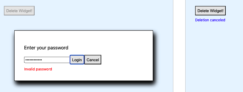
Figure 4-9. The edge cases are all handled by the reducer
Discussion
There are times when reducers can make your code convoluted; if you have few pieces of state with few interactions between them, you probably don’t need a reducer. But if you find yourself drawing a flowchart or a state diagram to describe a sequence of user interactions, that’s a sign that you might need a reducer.
You can download the source for this recipe from the GitHub site.
Add Keyboard Interaction
Solution
We’re going to create a key-listener hook to listen for keydown events at the document level. Still, it could be easily modified
to listen for any other JavaScript event in the DOM. This is the hook:
import{useEffect}from'react'constuseKeyListener=(callback)=>{useEffect(()=>{constlistener=(e)=>{e=e||window.eventconsttagName=e.target.localName||e.target.tagName// Only accept key-events that originated at the body level// to avoid key-strokes in e.g. text-fields being includedif(tagName.toUpperCase()==='BODY'){callback(e)}}document.addEventListener('keydown',listener,true)return()=>{document.removeEventListener('keydown',listener,true)}},[callback])}exportdefaultuseKeyListener
The hook accepts a callback function and registers it for keydown events on the
document object. At the end of the useEffect,
it returns a function that will unregister the callback. If the callback function we pass in changes, we will first unregister the
old function before registering the new one.
How do we use the hook? Here is an example. See if you notice the little coding wrinkle we have to deal with:
import{useCallback,useState}from'react'import'./App.css'importuseKeyListenerfrom'./useKeyListener'constRIGHT_ARROW=39constLEFT_ARROW=37constESCAPE=27functionApp(){const[angle,setAngle]=useState(0)const[lastKey,setLastKey]=useState('')letonKeyDown=useCallback((evt)=>{if(evt.keyCode===LEFT_ARROW){setAngle((c)=>Math.max(-360,c-10))setLastKey('Left')}elseif(evt.keyCode===RIGHT_ARROW){setAngle((c)=>Math.min(360,c+10))setLastKey('Right')}elseif(evt.keyCode===ESCAPE){setAngle(0)setLastKey('Escape')}},[setAngle])useKeyListener(onKeyDown)return(<divclassName="App"><p>Angle:{angle}Lastkey:{lastKey}</p><svgwidth="400px"height="400px"title="arrow"fill="none"strokeWidth="10"stroke="black"style={{transform:`rotate(${angle}deg)`,}}><polylinepoints="100,200 200,0 300,200"/><polylinepoints="200,0 200,400"/></svg></div>)}exportdefaultApp
This code listens for the user pressing the left/right cursor keys. Our onKeyDown function says what should happen when those key
clicks occur, but notice that we’ve wrapped it in a useCallback. If we didn’t do that, the browser would re-create the
onKeyDown function each time it rendered the App component. The new function would do the same as the old onKeyDown function,
but it would live in a different place in memory, and the useKeyListener would keep unregistering and re-registering it.
If you forget to wrap your callback function in a useCallback, it may result in a blizzard of render calls, which might
slow your application down.
By using useCallback, we can ensure that we only create the function if setAngle changes.
If you run the application, you will see an arrow on the screen. If you press the left/right cursor keys (Figure 4-10), you can rotate the image. If you press the Escape key, you can reset it to vertical.
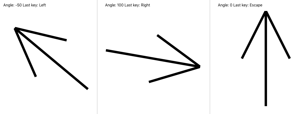
Figure 4-10. Pressing the left/right/Escape keys causes the arrow to rotate
Discussion
We are careful in the useKeyListener function to only listen to events that originated at the body level. If the user clicks the
arrow keys in a text field, the browser won’t send those events to your code.
You can download the source for this recipe from the GitHub site.
Use Markdown for Rich Content
Problem
If your application allows users to provide large blocks of text content, it would be helpful if that content could also include formatted text, links, and so forth. However, allowing users to pass in such horrors as raw HTML can lead to security flaws and untold misery for developers.
How do you allow users to post rich content without undermining the security of your application?
Solution
Markdown is an excellent way of allowing users to post rich content into your application safely. To see how to use Markdown in your application, let’s consider this simple application, which allows a user to post a timestamped series of messages into a list:
import{useState}from'react'import'./Forum.css'constForum=()=>{const[text,setText]=useState('')const[messages,setMessages]=useState([])return(<sectionclassName="Forum"><textareacols={80}rows={20}value={text}onChange={(evt)=>setText(evt.target.value)}/><buttononClick={()=>{setMessages((msgs)=>[{body:text,timestamp:newDate().toISOString(),},...msgs,])setText('')}}>Post</button>{messages.map((msg)=>{return(<dl><dt>{msg.timestamp}</dt><dd>{msg.body}</dd></dl>)})}</section>)}exportdefaultForum
When you run the application (Figure 4-11), you see a large text area. When you post a plain-text message, the app preserves white space and line breaks.
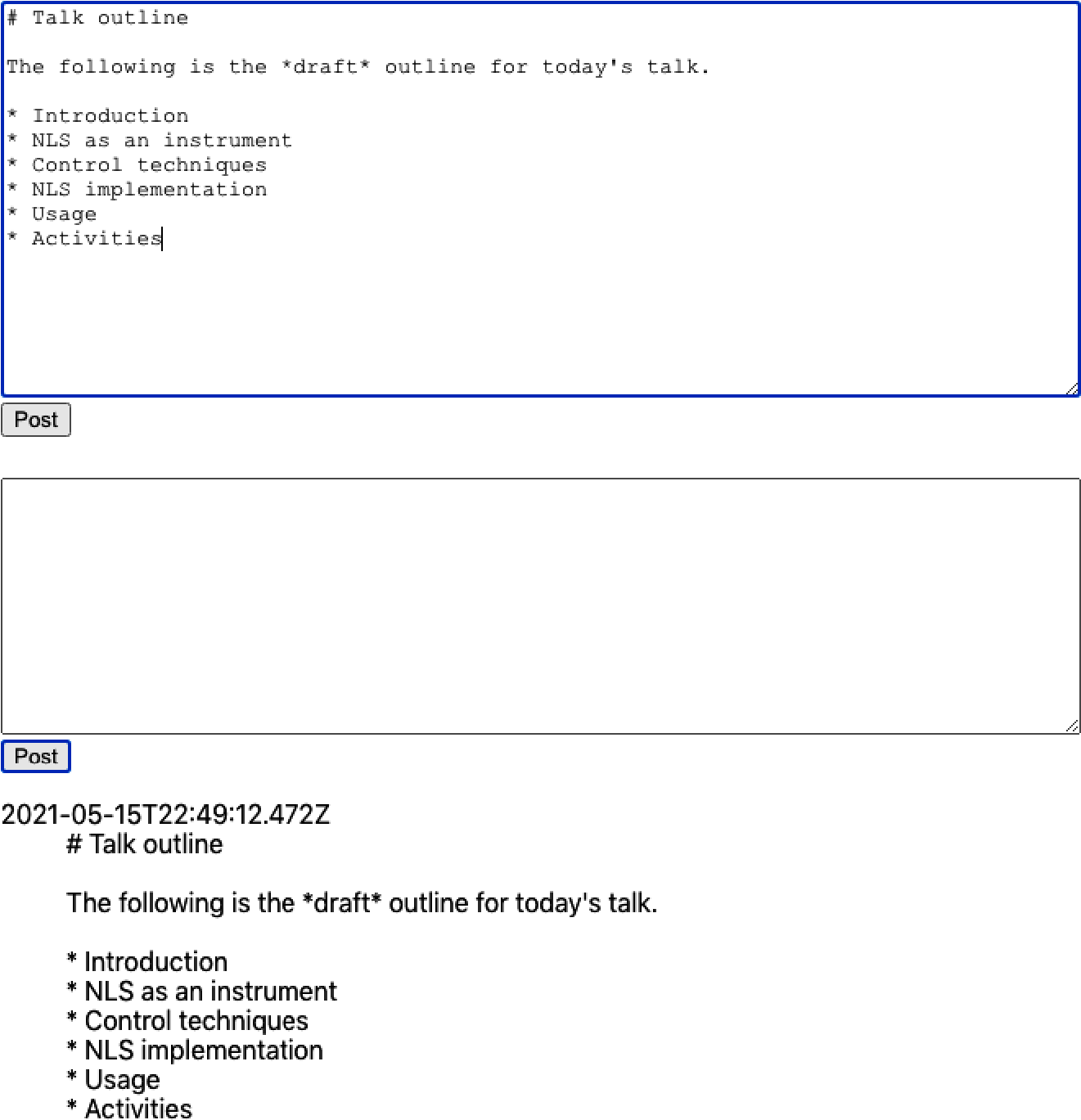
Figure 4-11. A user enters text into a text area, and it gets posted as a plain-text message
If your application contains a text area, it’s worth considering allowing the user to enter Markdown content.
There are many, many Markdown libraries available, but most of them are wrappers for react-markdown or a syntax highlighter like PrismJS or CodeMirror.
We’ll look at a library called react-md-editor that adds extra features to react-markdown and allows you to display Markdown and
edit it. We will begin by installing the library:
$ npm install @uiw/react-md-editorWe’ll now convert our plain-text area to a Markdown editor and convert the posted messages from Markdown to HTML:
import{useState}from'react'importMDEditorfrom'@uiw/react-md-editor'constMarkdownForum=()=>{const[text,setText]=useState('')const[messages,setMessages]=useState([])return(<sectionclassName="Forum"><MDEditorheight={300}value={text}onChange={setText}/><buttononClick={()=>{setMessages((msgs)=>[{body:text,timestamp:newDate().toISOString(),},...msgs,])setText('')}}>Post</button>{messages.map((msg)=>{return(<dl><dt>{msg.timestamp}</dt><dd><MDEditor.Markdownsource={msg.body}/></dd></dl>)})}</section>)}exportdefaultMarkdownForum
Converting plain text to Markdown is a small change with a significant return. As you can see in Figure 4-12, the user can apply rich formatting to a message and choose to edit it full-screen before posting it.
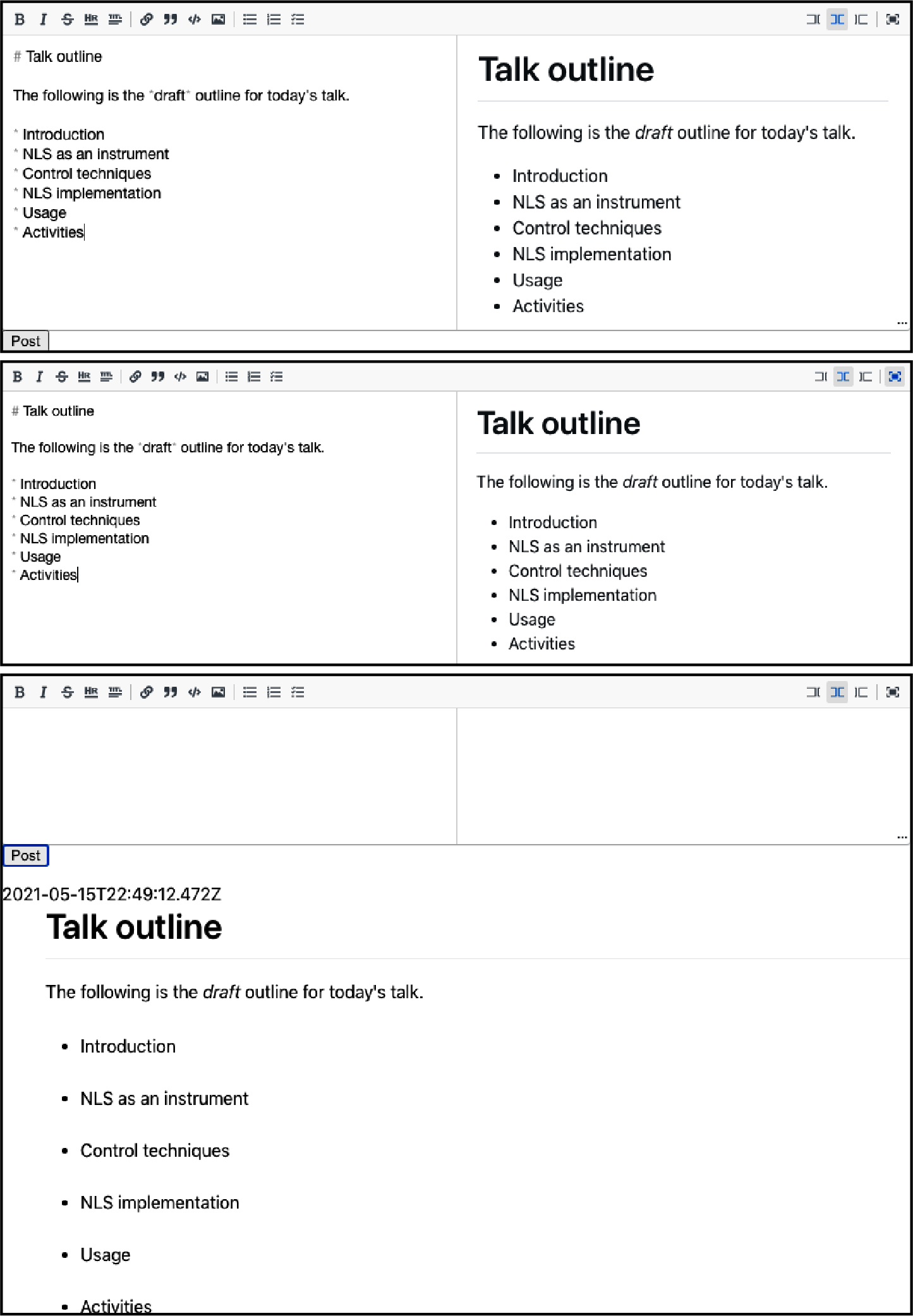
Figure 4-12. The Markdown editor shows a preview as you type and also allows you to work full-screen
Discussion
Adding Markdown to an application is quick and improves the user’s experience with minimal effort. For more details on Markdown, see John Gruber’s original guide.
You can download the source for this recipe from the GitHub site.
Animate with CSS Classes
Solution
Most of the animation you are ever likely to need in a React application will probably not require a third-party animation library. That’s because CSS animation now gives browsers the native ability to animate CSS properties with minimal effort. It takes very little code, and the animation is smooth because the graphics hardware will generate it. GPU animation uses less power, making it more appropriate for mobile devices.
If you are looking to add animation to your React application, begin with CSS animation before looking elsewhere.
How does CSS animation work? It uses a CSS property called transition. Let’s say we want to create an expandable information
panel. When the user clicks the button, the panel opens smoothly. When they click it again, it closes smoothly, as shown in Figure 4-13.
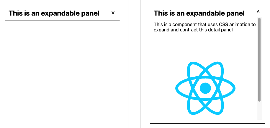
Figure 4-13. Simple CSS animation will smoothly expand and contract the panel
We can create this effect using the CSS transition property:
.InfoPanel-details{height:350px;transition:height0.5s;}
This CSS specifies a height, as well as a transition property. This combination translates to “Whatever your current height,
animate to my preferred height during the next half-second.”
The animation will occur whenever the height of the element changes, such as when an additional CSS rule becomes valid. For
example, if we have an extra CSS class-name with a different height, the transition property will animate the height change when an element switches to a different class:
.InfoPanel-details{height:350px;transition:height0.5s;}.InfoPanel-details.InfoPanel-details-closed{height:0;}
This class name structure is an example of block element modifier (BEM) naming. The block is the component (InfoPanel), the
element is a thing inside the block (details), and the modifier says something about the element’s current state (closed).
The BEM convention reduces the chances of name clashes in your code.
If an InfoPanel-details element suddenly acquires an additional .InfoPanel-details-closed class, the height will change from
350px to 0, and the transition property will smoothly shrink the element. Conversely, if the component loses the
.InfoPanel-details-closed class, the element will expand again.
That means that we can defer the hard work to CSS, and all we need to do in our React code is add or remove the class to an element:
import{useState}from'react'import'./InfoPanel.css'constInfoPanel=({title,children})=>{const[open,setOpen]=useState(false)return(<sectionclassName="InfoPanel"><h1>{title}<buttononClick={()=>setOpen((v)=>!v)}>{open?'^':'v'}</button></h1><divclassName={`InfoPanel-details${open?'':'InfoPanel-details-closed'}`}>{children}</div></section>)}exportdefaultInfoPanel
Discussion
We have frequently seen many projects bundle in third-party component libraries to use some small widget that expands or contracts its contents. As you can see, such animation is trivial to include.
You can download the source for this recipe from the GitHub site.
Animate with React Animation
Problem
CSS animations are very low-tech and will be appropriate for most animations that you are likely to need.
However, they require you to understand a lot about the various CSS properties and the effects of animating them. If you want to illustrate an item being deleted by it rapidly expanding and becoming transparent, how do you do that?
Libraries such as Animate.css contain a whole host of pre-canned CSS animations, but they often require more advanced CSS animation concepts like keyframes and are not particularly tuned for React. How can we add CSS library animations to a React application?
Solution
The React Animations library is a React wrapper for the Animate.css library. It will efficiently add animated styling to your components without generating unnecessary renders or significantly increasing the size of the generated DOM.
It’s able to work so efficiently because React Animations works with a CSS-in-JS library. CSS-in-JS is a technique for coding your
style information directly in your JavaScript code. React will let you add your style attributes as React components, but CSS-in-JS
does this more efficiently, dynamically creating shared style elements in the head of the page.
There are several CSS-in-JS libraries to choose from, but in this recipe, we’re going to use one called Radium.
Let’s begin by installing Radium and React Animations:
$ npm install radium$ npm install react-animations
Our example application (Figure 4-14) will run an animation each time we add an image item to the collection.

Figure 4-14. Clicking the Add button will load a new image from picsum.photos
Likewise, when a user clicks an image, it shows a fade-out animation before removing the images from the list, as shown in Figure 4-15.4

Figure 4-15. If we click the fifth image, it will fade out from the list and disappear
We’ll begin by importing some animations and helper code from Radium:
import{pulse,zoomOut,shake,merge}from'react-animations'importRadium,{StyleRoot}from'radium'conststyles={created:{animation:'x 0.5s',animationName:Radium.keyframes(pulse,'pulse'),},deleted:{animation:'x 0.5s',animationName:Radium.keyframes(merge(zoomOut,shake),'zoomOut'),},}
From React Animations we get pulse, zoomOut, and shake animations. We are going to use the pulse animation when we add an
image. We’ll use a combined animation of zoomOut and shake when we remove an image. We can combine animations using React
Animations’ merge function.
The styles generate all of the CSS styles needed to run each of these half-second animations. The call to Radium.keyframes()
handles all of the animation details for us.
We must know when an animation has completely ended. If we delete an image before the deletion-animation completes, there would be no image to animate.
We can keep track of CSS animations by passing an onAnimationEnd callback to any element we are going to animate. For each item in
our image collection, we are going to track three things:
-
The URL of the image it represents
-
A Boolean value that will be true while the “created” animation is running
-
A Boolean value that will be true while the “deleted” animation is running
Here is the example code to animate images into and out of the collection:
import{useState}from'react'import{pulse,zoomOut,shake,merge}from'react-animations'importRadium,{StyleRoot}from'radium'import'./App.css'conststyles={created:{animation:'x 0.5s',animationName:Radium.keyframes(pulse,'pulse'),},deleted:{animation:'x 0.5s',animationName:Radium.keyframes(merge(zoomOut,shake),'zoomOut'),},}functiongetStyleForItem(item){returnitem.deleting?styles.deleted:item.creating?styles.created:null}functionApp(){const[data,setData]=useState([])letdeleteItem=(i)=>setData((d)=>{constresult=[...d]result[i].deleting=truereturnresult})letcreateItem=()=>{setData((d)=>[...d,{url:`https://picsum.photos/id/${d.length * 3}/200`,creating:true,},])}letcompleteAnimation=(d,i)=>{if(d.deleting){setData((d)=>{constresult=[...d]result.splice(i,1)returnresult})}elseif(d.creating){setData((d)=>{constresult=[...d]result[i].creating=falsereturnresult})}}return(<divclassName="App"><StyleRoot><p>Imagesfrom <ahref="https://picsum.photos/">LoremPicsum</a></p><buttononClick={createItem}>Add</button>{data.map((d,i)=>(<divstyle={getStyleForItem(d)}onAnimationEnd={()=>completeAnimation(d,i)}><imgid={`image${i}`}src={d.url}width={200}height={200}alt="Random"title="Click to delete"onClick={()=>deleteItem(i)}/></div>))}</StyleRoot></div>)}exportdefaultApp
Discussion
When choosing which animation to use, we should first ask: what will this animation mean?
All animation should have meaning. It can show something existential (creation or deletion). It might indicate a change of state (becoming enabled or disabled). It might zoom in to show detail or zoom out to reveal a broader context. Or it might illustrate a limit or boundary (a spring-back animation at the end of a long list) or allow a user to express a preference (swiping left or right).
Animation should also be short. Most animations should probably be over in half a second so that the user can experience the meaning of the animation without being consciously aware of its appearance.
An animation should never be merely attractive.
You can download the source for this recipe from the GitHub site.
Animate Infographics with TweenOne
Problem
CSS animations are smooth and highly efficient. Browsers might defer CSS animations to the graphics hardware at the compositing stage, which means that not only are the animations running at machine-code speeds, but the machine-code itself is not running on the CPU.
However, the downside to running CSS animations on graphics hardware is that your application code won’t know what’s happening
during an animation. You can track when an animation has started, ended, or is repeated (onAnimationStart, onAnimationEnd,
onAnimationIteration), but everything that happens in between is a
mystery.
If you are animating an infographic, you may want to animate the numbers on a bar chart as the bars grow or shrink. Or, if you are writing an application to track cyclists, you might want to show the current altitude as the bicycle animates its way up and down the terrain.
But how do you create animations that you can listen to while they are happening?
Solution
The TweenOne library creates animations with JavaScript, which means you can track them as they happen, frame by frame.
Let’s begin by installing the TweenOne library:
$ npm install rc-tween-oneTweenOne works with CSS, but it doesn’t use CSS animations. Instead, it generates CSS transforms, which it updates many times each second.
You need to wrap the thing you want to animate in a <TweenOne/> element. For example, let’s say we want to animate a rect inside
an SVG:
<TweenOnecomponent='g'animation={...detailshere}><rectwidth="2"height="6"x="3"y="-3"fill="white"/></TweenOne>
TweenOne takes an element name and an object that will describe the animation to perform. We’ll come to what that animation object
looks like shortly.
TweenOne will use the element name (g in this case) to generate a wrapper around the animated thing. This wrapper will have a
style attribute that will include a set of CSS transforms to move and rotate the contents somewhere.
So in our example, at some point in the animation, the DOM might look like this:
<gstyle="transform: translate(881.555px, 489.614px) rotate(136.174deg);"><rectwidth="2"height="6"x="3"y="-3"fill="white"/></g>
Although you can create similar effects to CSS animations, the TweenOne library works differently. Instead of handing the animation to the hardware, the TweenOne library uses JavaScript to create each frame, which has two consequences. First, it uses more CPU power (bad), and second, we can track the animation while it’s happening (good).
If we pass TweenOne an onUpdate callback, we will be sent information about the animation on every single frame:
<TweenOnecomponent='g'animation={...detailshere}onUpdate={info=>{...}}><rectwidth="2"height="6"x="3"y="-3"fill="white"/></TweenOne>
The info object passed to onUpdate has a ratio value between 0 and 1, representing the proportion of the way the TweenOne
element is through an animation. We can use the ratio to animate text that is associated with the graphics.
For example, if we build an animated dashboard that shows vehicles on a race track, we can use onUpdate to show each car’s speed
and distance as it animates.
We’ll create the visuals for this example in SVG. First, let’s create a string containing an SVG path, which represents the track:
exportdefault'm 723.72379,404.71306 ... -8.30851,-3.00521 z'
This is a greatly truncated version of the actual path that we’ll use. We can import the path string from track.js like this:
importpathfrom'./track'
To display the track inside a React component, we can render an svg element:
<svgheight="600"width="1000"viewBox="0 0 1000 600"style={{backgroundColor:'black'}}><pathstroke='#444'strokeWidth={10}fill='none'd={path}/></svg>
We can add a couple of rectangles for the vehicle—a red one for the body and a white one for the windshield:
<svgheight="600"width="1000"viewBox="0 0 1000 600"style={{backgroundColor:'black'}}><pathstroke='#444'strokeWidth={10}fill='none'd={path}/><rectwidth={24}height={16}x={-12}y={-8}fill='red'/><rectwidth={2}height={6}x={3}y={-3}fill='white'/></svg>
Figure 4-16 shows the track with the vehicle at the top-left corner.

Figure 4-16. The static image with a tiny vehicle at the top left
But how do we animate the vehicle around the track? TweenOne makes this easy because it contains a plugin to generate animations that follow SVG path strings.
importPathPluginfrom'rc-tween-one/lib/plugin/PathPlugin'TweenOne.plugins.push(PathPlugin)
We’ve configured TweenOne for use with SVG path animations. That means we can look at how to describe an animation for TweenOne. We do it with a simple JavaScript object:
importpathfrom'./track'constfollowAnimation={path:{x:path,y:path,rotate:path},repeat:-1,}
We tell TweenOne two things with this object: first, we’re telling it to generate translates and rotations that follow the path
string that we’ve imported from track.js. Second, we’re saying that we want the animation to loop infinitely by setting the
repeat count to –1.
We can use this as the basis of animation for our vehicle:
<svgheight="600"width="1000"viewBox="0 0 1000 600"style={{backgroundColor:'black'}}><pathstroke='#444'strokeWidth={10}fill='none'd={path}/><TweenOnecomponent='g'animation={{...followAnimation,duration:16000}}><rectwidth={24}height={16}x={-12}y={-8}fill='red'/><rectwidth={2}height={6}x={3}y={-3}fill='white'/></TweenOne></svg>
Notice that we’re using the spread operator to provide an additional animation parameter: duration. A value of 16000 means we want
the animation to take 16
seconds.
We can add a second vehicle and use the onUpdate callback method to create a very rudimentary set of faked telemetry statistics
for each one as they move around the track. Here is the completed code:
import{useState}from'react'importTweenOnefrom'rc-tween-one'importDetailsfrom'./Details'importpathfrom'./track'importPathPluginfrom'rc-tween-one/lib/plugin/PathPlugin'importgridfrom'./grid.svg'import'./App.css'TweenOne.plugins.push(PathPlugin)constfollowAnimation={path:{x:path,y:path,rotate:path},repeat:-1,}functionApp(){const[redTelemetry,setRedTelemetry]=useState({dist:0,speed:0,lap:0,})const[blueTelemetry,setBlueTelemetry]=useState({dist:0,speed:0,lap:0,})consttrackVehicle=(info,telemetry)=>({dist:info.ratio,speed:info.ratio-telemetry.dist,lap:info.ratio<telemetry.dist?telemetry.lap+1:telemetry.lap,})return(<divclassName="App"><h1>Nürburgring</h1><DetailsredTelemetry={redTelemetry}blueTelemetry={blueTelemetry}/><svgheight="600"width="1000"viewBox="0 0 1000 600"style={{backgroundColor:'black'}}><imagehref={grid}width={1000}height={600}/><pathstroke="#444"strokeWidth={10}fill="none"d={path}/><pathstroke="#c0c0c0"strokeWidth={2}strokeDasharray="3 4"fill="none"d={path}/><TweenOnecomponent="g"animation={{...followAnimation,duration:16000,onUpdate:(info)=>setRedTelemetry((telemetry)=>trackVehicle(info,telemetry)),}}><rectwidth={24}height={16}x={-12}y={-8}fill="red"/><rectwidth={2}height={6}x={3}y={-3}fill="white"/></TweenOne><TweenOnecomponent="g"animation={{...followAnimation,delay:3000,duration:15500,onUpdate:(info)=>setBlueTelemetry((telemetry)=>trackVehicle(info,telemetry)),}}><rectwidth={24}height={16}x={-12}y={-8}fill="blue"/><rectwidth={2}height={6}x={3}y={-3}fill="white"/></TweenOne></svg></div>)}exportdefaultApp
Figure 4-17 shows the animation. The vehicles follow the path of the race track, rotating to face the direction of travel.
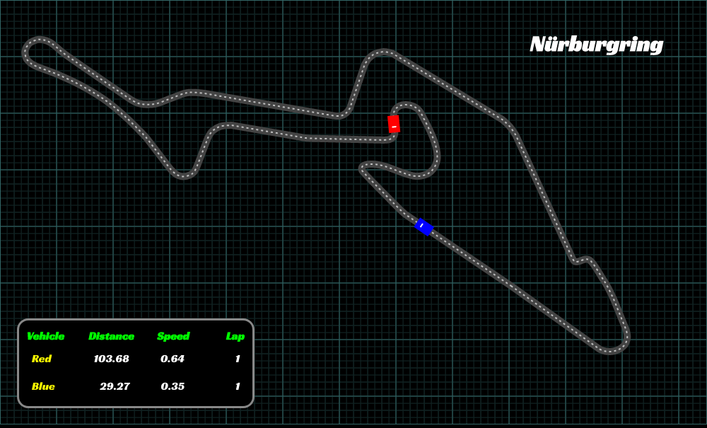
Figure 4-17. Our final animation with telemetry generated from the current animation state
Discussion
CSS animations are what you should use for most UI animation. However, in the case of infographics, you often need to synchronize the text and the graphics. TweenOne makes that possible, at the cost of greater CPU usage.
You can download the source for this recipe from the GitHub site.
1 You can download all source code for this recipe on the GitHub repository.
2 See “Use Markdown for Rich Content” for details on how to use Markdown in your application.
3 See the GitHub repository for the tests we used to drive out this code.
4 Paper books are beautiful things, but to fully experience the animation effect, see the complete code on GitHub.