Chapter 9. Accessibility
This was a challenging chapter to write because other than wearing glasses and contact lenses, neither of us needs to use special accessibility equipment or software. We have tried to bring together a collection of tools and techniques in this chapter that will ideally help you find some of the more obvious accessibility problems in your code.
We look at how you can use landmarks and ARIA roles, which will add meaning and structure to your pages that would otherwise come only from visual grouping. We then have several recipes that show how to run manual and automated audits on your application, look for glitches in code with static analysis, and find runtime errors by automating browsers.
We then look at some of the more technical issues involved in creating custom dialogs (hint: try to use prebuilt ones from libraries), and finally, we build a simple screen reader.
For a more in-depth look at accessibility, be sure to check the Web Content Accessibility Guidelines (WCAG), which provide three conformance levels: A, AA, and AAA. AAA is the highest level of conformance.
If you are writing professional software, you will ideally find these recipes helpful. But nothing can replace the experience of someone who has to live with the issues caused by inaccessible software every day of their lives. Accessible software is simply good software. It maximizes your market and forces you to think more deeply about design. We would recommend, at the least, having an accessibility audit run on your code. You can contact organizations like AbilityNet in the UK, or just search for accessibility software testing wherever you are, and you will find that is the most efficient way to track down problems with your code.
Use Landmarks
Problem
Let’s consider the application in Figure 9-1. It’s a simple application for creating and managing tasks.
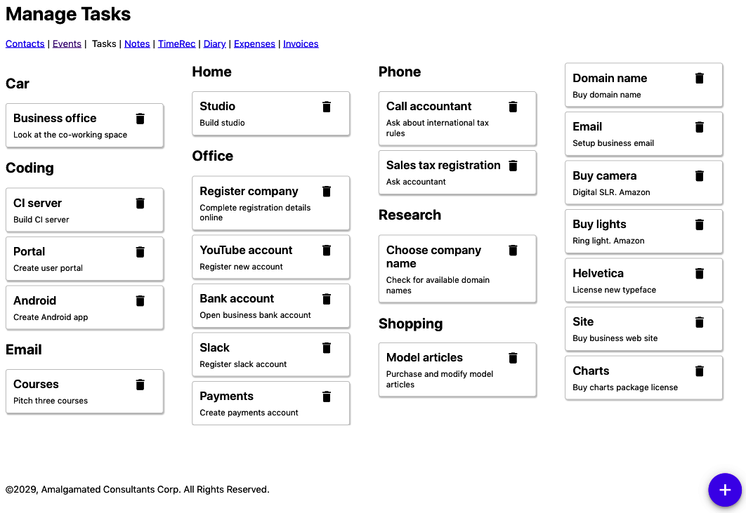
Figure 9-1. The example tasks application
If someone can see the application, they will easily distinguish between the main content (the tasks) and all of the other stuff around the edge: the links to other pages, the headings, the copyright, etc.
Let’s look at the code for the main App component of this application:
constApp=()=>{...return(<><h1>ManageTasks</h1><ahref='/contacts'>Contacts</a> | <ahref='/events'>Events</a> | Tasks | <ahref='/notes'>Notes</a> | <ahref='/time'>TimeRec</a> | <ahref='/diary'>Diary</a> | <ahref='/expenses'>Expenses</a> | <ahref='/invoices'>Invoices</a><buttonclassName='addButton'onClick={()=>setFormOpen(true)}>+</button><TaskContexts.../>©2029,AmalgamatedConsultantsCorp.AllRightsReserved.<TaskForm.../><ModalQuestion...>Areyousureyouwanttodeletethistask?</ModalQuestion></>)}
The problem is that if you rely on a device to read the page to you, it can be hard to understand the page’s structure. Which parts are the navigation links? Where is the main content on the page? The parsing that the human eye performs (see Figure 9-2) is difficult to replicate if you can’t assess the spatial grouping of the interface.
So, how can we get around this problem? What can we use instead of visual grouping to make the structure of a page more understandable?
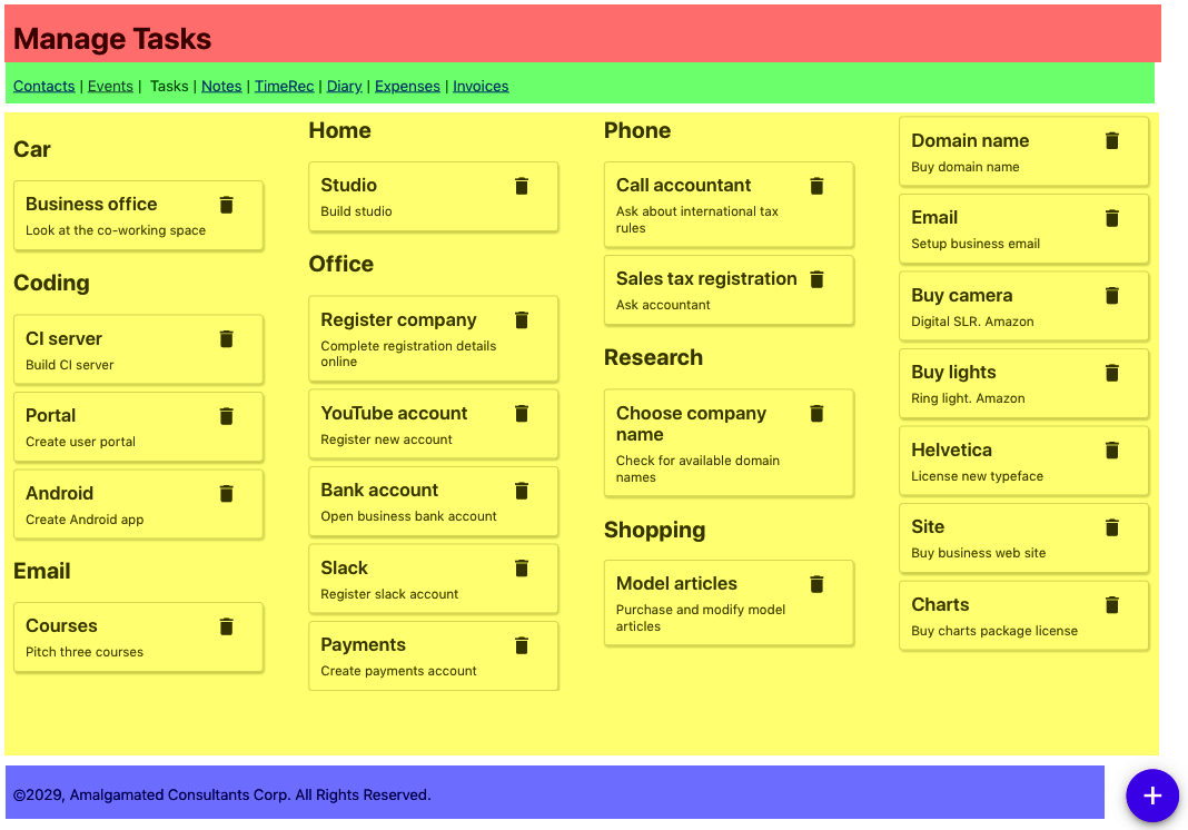
Figure 9-2. Sighted viewers can quickly identify the sections of the page spatially
Solution
We are going to introduce landmarks to our code. Landmarks are HTML elements that we can use to group parts of our interface structurally to mirror how they’re grouped visually. Landmarks are also helpful when designing a page because they force you to think about the functions of the various types of page content.
Let’s begin by highlighting the header. This part of the page identifies what the page is about. We would typically use an
h1 heading for this, but we might also include commonly used tools, or perhaps a logo. We can identify the header using the
header tag:
<header><h1>ManageTasks</h1></header>
We should always have an h1 heading on the page, and we should use lower-level headings to structure the content of the rest
of the page without skipping any levels. For example, you should never have an h1 heading and an h3 heading without an h2 heading
somewhere between the two. Headings are a handy navigation device for people using screen readers, including functions that allow
the user to skip backward and forward between headings.
Next, we need to think about navigation. Navigation can come in many forms. It might be a list of links (as here), or it could be a series of menus or a sidebar. The navigation is a block of components that allow you to visit the major parts of a website. You will almost certainly have other links on the page that are not part of the navigation.
We can use the nav landmark to identify the navigation of our page:
<nav><ahref='/contacts'>Contacts</a> | <ahref='/events'>Events</a> | Tasks | <ahref='/notes'>Notes</a> | <ahref='/time'>TimeRec</a> | <ahref='/diary'>Diary</a> | <ahref='/expenses'>Expenses</a> | <ahref='/invoices'>Invoices</a></nav>
The crucial part of a page is the content. In our tasks application, the content is the collection of tasks. The main content is what the user primarily wants to read and interact with on the page. Occasionally, the main content might also include tools—such as the floating “add” button in the tasks application—but these don’t have to be in the main content, and we can move them to somewhere in the header.
We can group together the main content of the page with the main tag:
<main><buttonclassName='addButton'onClick={()=>setFormOpen(true)}>+</button><TaskContextscontexts={contexts}tasks={tasks}onDelete={setTaskToRemove}onEdit={task=>{setEditTask(task)setFormOpen(true)}}/></main>
Finally, we have the web page’s metadata: the data about data. In the task application, the copyright notice at the bottom of the
page is an example of metadata. You will often find metadata placed in a group at the bottom of a page, and so it is grouped in a
footer tag:
<footer>©2029,AmalgamatedConsultantsCorp.AllRightsReserved.</footer>
There are still a couple things left from our original App component:
<TaskForm.../><ModalQuestion...>Areyousureyouwanttodeletethistask?</ModalQuestion>
The TaskForm is a modal dialog that appears when the user wants to create or edit a task (see Figure 9-3).
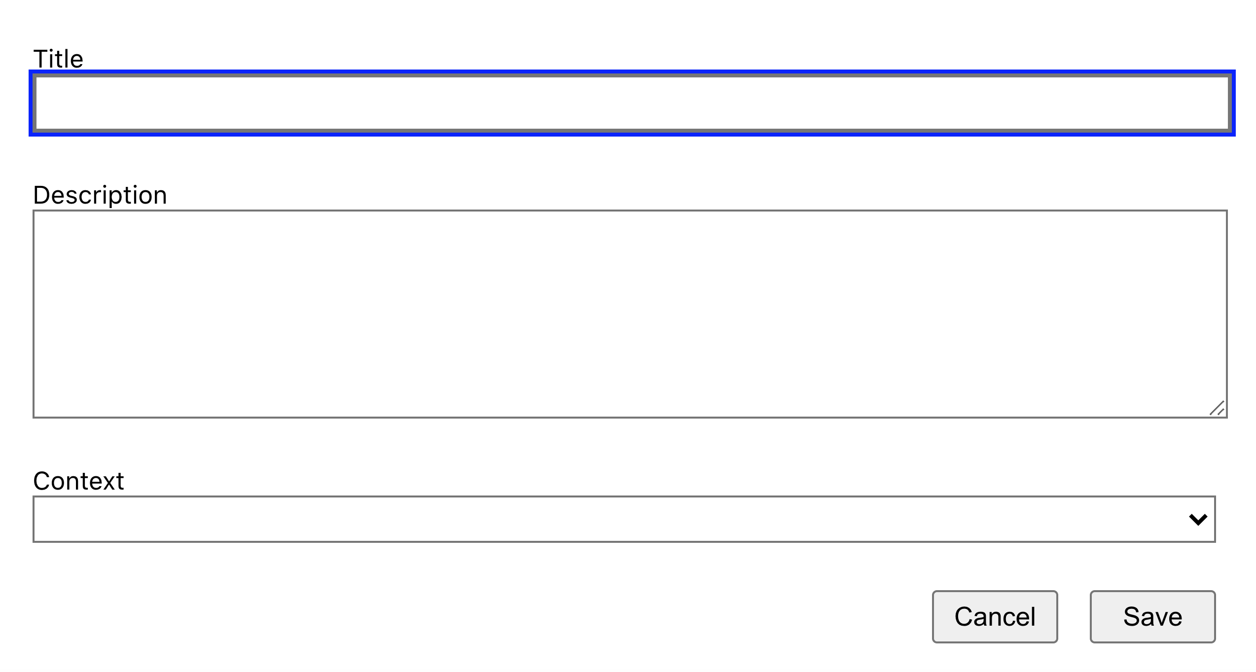
Figure 9-3. The TaskForm is a modal dialog that appears above other content
The ModalQuestion is a confirmation box that appears if a user tries to delete a task (see Figure 9-4).
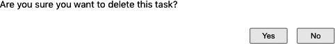
Figure 9-4. A modal question box asks the user to confirm the deletion of a task
These two components will appear only when needed. When the page is in its normal state, the modals will not appear in the page’s structure, so they don’t have to be included in a landmark. We will see elsewhere in this chapter that there are other ways of dealing with dynamic content, such as modals, that will make them more accessible to your audience.
This is what the final form of our App component looks like:
constApp=()=>{....return(<><header><h1>ManageTasks</h1></header><nav><ahref='/contacts'>Contacts</a> | <ahref='/events'>Events</a> | Tasks | <ahref='/notes'>Notes</a> | <ahref='/time'>TimeRec</a> | <ahref='/diary'>Diary</a> | <ahref='/expenses'>Expenses</a> | <ahref='/invoices'>Invoices</a></nav><main><buttonclassName='addButton'onClick={()=>setFormOpen(true)}>+</button><TaskContexts.../></main><footer>©2029,AmalgamatedConsultantsCorp.AllRightsReserved.</footer><TaskForm.../><ModalQuestion...>Areyousureyouwanttodeletethistask?</ModalQuestion></>)}
Discussion
Landmarks are part of HTML5 and so are natively supported in browsers. This means that you can start using them without needing to add special tooling or support libraries.
You will find that some automated accessibility tools might complain about landmarks rendered by React applications. The standard
guidelines state that all content in the body of a web page should be inside a landmark. But most React applications render their
content (including any landmarks) inside a single div, which instantly breaks the rules.
It is probably safe to ignore the issue. So long as the landmarks exist and they are all at the same level, it shouldn’t matter
that they are wrapped in an additional div.
You can download the source for this recipe from the [GitHub site].
Apply Roles, Alts, and Titles
Problem
It’s common to have components in applications that behave like buttons, even if they’re not buttons. Likewise, you might have
components that look like pop-up dialog boxes without actually being dialog boxes. Or you might have collections of data structurally similar
to lists that don’t use the ol and ul tags.
Creating components that behave like standard UI elements isn’t a problem if you can see the visual styling of the component. If something looks like a button to a user, they will treat it as a button, regardless of its implementation.
But there’s a problem if someone can’t see the visual styling of a component. Instead, you need to describe the purpose of a component for people who can’t see it.
Solution
We’re going to look at using roles within the application. The role describes the meaning of a component: it tells the user what purpose it serves. Roles are part of the semantics of a web page and so are similar to the semantic landmarks that we discuss in “Use Landmarks”.
Here is a list of some typical roles that you can apply to rendered HTML:
| Role name | Purpose |
|---|---|
alert |
Tells the user that something has happened. |
article |
Large block of text content, like a news story. |
button |
Something you can click to do something. |
checkbox |
A user-selectable true/false value. |
comment |
Like a user-submitted comment or reaction. |
complementary |
Additional information, perhaps in a sidebar. |
contentinfo |
Copyright notices, author names, publication dates. |
dialog |
Something floats over the other content. Often modal. |
feed |
Common in blogs. It’s a list of articles. |
figure |
An illustration. |
list |
A sequential group of things. |
listitem |
Each of the things in a list. |
search |
A search field. |
menu |
A sequence of options, typically used for navigation. |
menuitem |
An item on a menu. |
You apply roles to elements with the role attribute. Let’s consider the Task component from the example application in this
chapter. The Task component renders each of the tasks as a small panel, with a Delete button:
importDeleteIconfrom'./delete-24px.svg'import'./Task.css'constTask=({task,onDelete,onEdit})=>{return(<divclassName="Task"><divclassName="Task-contents"...><divclassName="Task-details"><divclassName="Task-title">{task.title}</div><divclassName="Task-description">{task.description}</div></div><divclassName="Task-controls"><imgsrc={DeleteIcon}width={24}height={24}title="Delete"onClick={(evt)=>{evt.stopPropagation()onDelete()}}alt="Delete icon"/></div></div></div>)}
We group tasks on the page under headings that describe the context in which a person would perform the task. For example, you might have a series of tasks grouped under the heading Phone (see Figure 9-5).
Figure 9-5. Each group contains a list of tasks
So, the tasks appear to match the listitem role. They are things that appear inside an ordered collection. We could therefore add that
role to the first div:
return<divrole='listitem'className='Task'><divclassName='Task-details'>....
If we stopped there, we would have a problem. Roles have rules. You cannot apply the listitem role to a component unless it
appears inside something with a list role. So if we are going to mark our Task components as listitems, we will also need to
give the TaskList parent a list role:
importTaskfrom'../Task'import'./TaskList.css'functionTaskList({tasks,onDelete,onEdit}){return(<divrole="list"className="TaskList">{tasks.map((t)=>(<Taskkey={t.id}task={t}onDelete={()=>onDelete(t)}onEdit={()=>onEdit(t)}/>))}</div>)}exportdefaultTaskList
Using list and listitem roles is perfectly valid. But it is probably far better in practice if we have HTML that behaves like a
list to change the markup and use real ul and li tags. From an accessibility point of view, it probably makes no difference. But
it is always good to avoid filling your HTML with endless div tags. In general, if you can use a real HTML tag instead of a role,
it’s probably best to do so.
Let’s remove the list role from TaskList and make a real ul:
importTaskfrom'../Task'import'./TaskList.css'functionTaskList({tasks,onDelete,onEdit}){return(<ulclassName="TaskList">{tasks.map((t)=>(<Taskkey={t.id}task={t}onDelete={()=>onDelete(t)}onEdit={()=>onEdit(t)}/>))}</ul>)}exportdefaultTaskList
Then we can replace the listitem role in Task with a li tag:
import'./Task.css'constTask=({task,onDelete,onEdit})=>{return(<liclassName="Task"><divclassName="Task-contents"...><divclassName="Task-details">...</div><divclassName="Task-controls">...</div></div></li>)}exportdefaultTask
Using li tags will mean that we have to make a few CSS style changes to remove the list bullet points, but the code will be easier
to read for any developer (and it may be you) who looks at it in the future.
Next, let’s take a look at the navigation section of the example application. It has a series of links that you might almost think of as a menu of options:
<nav><ahref='/contacts'>Contacts</a> | <ahref='/events'>Events</a> | Tasks | <ahref='/notes'>Notes</a> | <ahref='/time'>TimeRec</a> | <ahref='/diary'>Diary</a> | <ahref='/expenses'>Expenses</a> | <ahref='/invoices'>Invoices</a></nav>
So, should you apply the menu and menuitem roles here? The answer to this is: almost certainly no.
Menus and menu items have expected behavior. A user who arrives at a menu will probably expect it to pop up if they select it. Once the menu is visible, they will probably use the arrow keys to navigate the options rather than move around with the Tab key.1
Now let’s take a look at the + button in our example application that allows a user to create a new task by displaying a pop-up task form (see Figure 9-6).
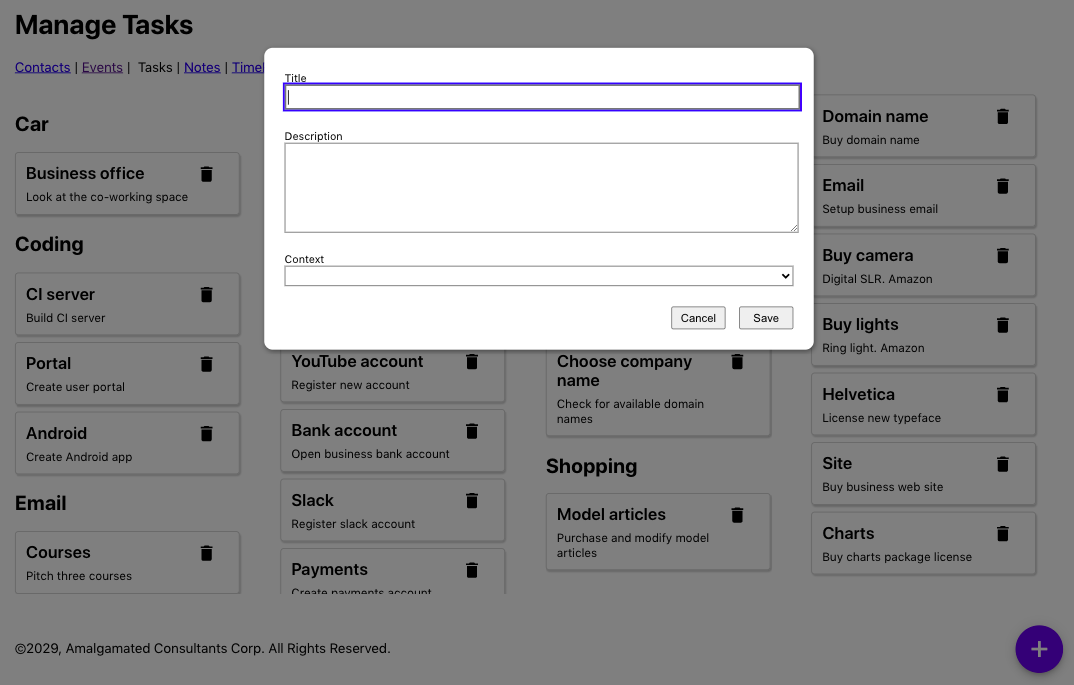
Figure 9-6. A new task form appears when the user clicks the + button
This is the code for the button:
<buttonclassName='addButton'onClick={()=>setFormOpen(true)}>+</button>
Do we need to apply the button role? No. The element is already a button. But we can provide some additional information about
what the user can expect to happen if they click the button. A pop-up will appear. We can make that explicit in the HTML with the
aria-haspopup attribute:
<buttonaria-haspopup='dialog'className='addButton'onClick={()=>setFormOpen(true)}>+</button>
The value of the aria-haspopup attribute has to match the role of the component that will appear as a result. In this case,
we’re going to display a dialog. You can also set the aria-haspopup attribute to the value true. Still, a screen reader will
interpret this as a menu because components with associated pop-ups typically are used to open menus.
Because we’ve set aria-haspopup to dialog, we will also need to make sure the TaskForm that appears has the role dialog.
This is the current code for the TaskForm:
constTaskForm=({task,contexts,onCreate,onClose,open})=>{...return<Modalopen={open}onCancel={close}><form>....</form><ModalFooter><buttononClick={...}>Cancel</button><buttononClick={...}>Save</button></ModalFooter></Modal>}
We will wrap the TaskForm in a Modal component, like this:
import'./Modal.css'functionModal({open,onCancel,children}){if(!open){returnnull}return<divclassName='Modal'...><divclassName='Modal-dialog'...>{children}</div></div>}exportdefaultModal
There are two parts to this Modal component:
-
An external
Modalwrapper, which is there to shade the other content of the page and is a semi-transparent layer -
An inner
Modal-dialogdiv, which displays the contents in what looks like a window
Because the Modal class is reusable and might be used in things other than dialogs (such as alerts), we will give the Modal
class an additional title property, which will be applied to the Modal-dialog. The title will make the purpose of the dialog clear to anyone with a
screen reader.
This gives us our updated Modal component:
import'./Modal.css'functionModal({open,onCancel,children,role,title}){if(!open){returnnull}return<divrole='presentation'className='Modal'...><divclassName='Modal-dialog'role={role}title={title}...>{children}</div></div>}exportdefaultModal
Here is our updated TaskForm component:
constTaskForm=({task,contexts,onCreate,onClose,open})=>{...return<Modaltitle='Create or edit a task'role='dialog'open={open}onCancel={close}><form>....</form><ModalFooter><buttononClick={...}>Cancel</button><buttononClick={...}>Save</button></ModalFooter></Modal>}
Finally, let’s consider the Delete button that appears next to each Task and looks like a small trash can:
<imgsrc={DeleteIcon}width={24}height={24}alt='Delete icon'aria-haspopup='dialog'role='button'title='Delete'onClick={evt=>{evt.stopPropagation()evt.preventDefault()onDelete()}}/>
The trash can icon is working as a button, so we’ve given it that role. The trash can already has an aria-haspopup because a dialog will ask the user to confirm the
deletion.
But just like in the case of the lists and list items, it is often better to implement buttons as buttons. We can rewrite this
component as a button wrapping an image:
<buttononClick={evt=>{evt.stopPropagation()evt.preventDefault()onDelete()}}title='Delete'aria-haspopup='dialog'><imgsrc={DeleteIcon}width={24}height={24}alt='Delete icon'/></button>
Not only will this be clearer to developers, but it will also be automatically tabbable.
Discussion
Roles overlap in some ways with landmarks. There are landmark roles available, like main and header. But they serve two
different purposes. Landmarks are, as the name suggests, ways of highlighting major parts of a web page. Roles, in contrast, describe the intended behavior of some part of the interface. In both cases, landmarks and roles are there to provide
additional meaning to a web page.
If your interface contains components that behave like standard HTML elements, such as lists, it is often better to style the standard HTML markup than re-create the elements with custom code.
You can download the source for this recipe from the GitHub site.
Check Accessibility with ESlint
Problem
If you don’t need to use any accessibility equipment, it can be challenging to identify accessibility problems.2 In the heat of development, it’s also easy to acquire regression issues that break the accessibility of code that you’ve previously tested.
What you need is a way to quickly and easily find accessibility problems as you create them. You need a process that is continuously watching your code as you type and flagging them immediately while you still remember what you did.
Solution
We’re going to see how you can configure the eslint tool to find the more obvious accessibility problems in code.
eslint is a tool that performs static analysis on your code. It will find unused variables, missing dependencies in useEffect
calls, and so on. If you created your application with create-react-app, you probably have eslint running continuously on your
application. The development server will rerun eslint each time the code needs recompiling, and any eslint errors will appear
in the server window.
If you don’t already have eslint installed, you can install it with this command:
$ npm install --save-dev eslintOr you can use its yarn equivalent. eslint can be extended with plugins. A plugin is a collection of rules that eslint will apply to
static code as it is saved. There is a plugin specifically created to check for accessibility problems. It’s called jsx-a11y, and
you can install it with the following:
$ npm install --save-dev eslint-plugin-jsx-a11yIf you want to be able to run eslint manually, you can add a script to your package.json file:3
"scripts":{...."lint":"eslint src"},
Before we can use the jsx-a11y plugin, we will need to configure it. We can do this by updating the eslintConfig section of
package.json:
"eslintConfig":{"extends":["react-app""react-app/jest","plugin:jsx-a11y/recommended"],"plugins":["jsx-a11y"],"rules":{}}
This configuration will tell eslint to use the new plugin, and it will also enable a set of recommended accessibility rules.
You can also, if you choose, configure the way each of the rules works by adding additional configuration to the rules section.
And we’re going to do that now, by disabling one of the rules:
"eslintConfig":{"extends":["react-app""react-app/jest","plugin:jsx-a11y/recommended"],"plugins":["jsx-a11y"],"rules":{"jsx-a11y/no-onchange":"off"}}
Disabling rules might seem like a bad idea, but there is a reason why you might want to disable the no-onchange rule specifically.
The jsx-a11y developers created the no-onchange rule because of a problem with old browsers, which implemented onchange in
disparate ways. Some would generate an onChange event every time the user typed a character into an input field. Others would
generate the event only when the user left the field. The different behaviors caused a huge number of problems for people using
accessibility tools.
The solution was to replace all onChange handlers with onBlur handlers, which meant that all browsers would fire field change
events consistently: when the user left the field.
But this rule is entirely out-of-date now and is deprecated in the plugin. If you try to replace all of the onChange handlers in
your React code with onBlur handlers, you will change significantly how your application works. You will also be going away from
the standard way React tracks the state of form fields: to use onChange.
So, in this one case, it is a good idea to disable the rule.
We can now run eslint, with our accessibility rules enabled:
$ npm run lintIn an earlier version of the application, eslint found a number of errors:
$ npm run lint> app@0.1.0 lint app> eslint srcapp/src/Task/Task.js6:9 error Visible, non-interactive elements with click handlersmust have at least one keyboard listenerjsx-a11y/click-events-have-key-events6:9 error Static HTML elements with event handlers require a rolejsx-a11y/no-static-element-interactions✖ 2 problems (2 errors, 0 warnings)
To see what the cause of these errors, let’s take a look at the Task.js source code:
<liclassName="Task"><divclassName="Task-contents"onClick={onEdit}>....</div></li>
The Task component displays the details of a task inside a small card panel (see Figure 9-7).
Figure 9-7. The app displays tasks in separate panels, each with a delete button
If the user clicks a task, they will open a form that will allow them to edit the task’s details. The code that does this is the
onClick handler on the Task-contents div.
To understand why eslint is unhappy, let’s first look at this error:
6:9 error Static HTML elements with event handlers require a rolejsx-a11y/no-static-element-interactions
Elements like
divs are static. They have no built-in interactive behavior. By default, they are just things that layout other things. eslint
is unhappy because the onClick handler suggests that this particular div is actually being used as an active
component. If
someone is using an accessibility device, we will need to tell them the purpose of this component. eslint expects us to do that by
giving the div a role.4
We will give this div a role of button to indicate that the user will use the component by clicking it. When we click a task,
we will display a pop-up edit window, so we will also give the div an aria-haspopup attribute to tell the user that clicking the
task will open a dialog:
<liclassName='Task'><divclassName='Task-contents'role='button'aria-haspopup='dialog'onClick={onEdit}>....</div></li>
It is often better to convert an element to a native button tag rather than use the button role. However, in this case,
the div is wrapping a reasonably large block of HTML text, so it makes more sense to provide a role rather than deal with the
styling consequences of making a gray button look like a card.
If we run eslint again, we still have two errors. But one of them is new:
$ npm run lint> app@0.1.0 lint app> eslint srcapp/src/Task/Task.js6:9 error Visible, non-interactive elements with click handlersmust have at least one keyboard listenerjsx-a11y/click-events-have-key-events6:9 error Elements with the 'button' interactive role must be tabbablejsx-a11y/interactive-supports-focus✖ 2 problems (2 errors, 0 warnings)
We’ve said that the task behaves like a button. But: roles have rules. If we want something to be treated like a button, it must
behave like a button. One thing that buttons can do is be tabbed to. They need to be able to receive focus from the keyboard. We
can do that by adding a tabIndex attribute:
<liclassName='Task'><divclassName='Task-contents'role='button'tabIndex={0}onClick={onEdit}>....</div></li>
Setting tabIndex to 0 means that our task will become part of the tab sequence of the page.
tabIndex can have several values: –1 means that it can be focused programmatically only; 0 means that it is an ordinary
tabbable component. If an element has a tabbable value greater than 0, it means the focus system should give it a higher priority.
It would be best if you generally avoided values greater than 0, as they can cause accessibility problems.5
If we run eslint again, we have just one error:
$ npm run lint> app@0.1.0 lint app> eslint srcapp/src/Task/Task.js6:9 error Visible, non-interactive elements with click handlersmust have at least one keyboard listenerjsx-a11y/click-events-have-key-events1 problems (1 errors, 0 warnings)
This error means that we have an onClick event to say what happens if someone clicks the task with a mouse, but we have no code to
respond to the keyboard. If someone is unable to use the mouse, they will be unable to edit a task.
So we will need to add some sort of key-event handler. We’ll add code to call the edit event if the user presses the Enter key or presses the spacebar:
<liclassName="Task"><divclassName="Task-contents"role="button"tabIndex={0}onClick={onEdit}onKeyDown={(evt)=>{if(evt.key==='Enter'||evt.key===' '){evt.preventDefault()onEdit()}}}>....</div></li>
Adding the keyboard handler will fix the remaining error.
Each of the rules in jsx-a11y has an associated page on GitHub, providing more details about why code might break a rule and what you can do to fix it.
Discussion
jsx-a11y is probably one of the most useful plugins available for eslint. Often, lint rules will check for good programming
practice and can find a few coding issues. But the jsx-a11y plugin can genuinely change the design of your application.
Making sure your application allows keyboard navigation is important not only for people using accessibility tools, but it’s also useful for people who might use your application frequently. If someone uses an application for a long time, they will often prefer to use a keyboard instead of a mouse because a keyboard requires less movement and is more precise.
We’ve also looked at how setting tabIndex can give elements keyboard focus. Some browsers—notably Firefox—provide subtle
indicators to show which elements have keyboard focus. If you want to make it clear to users where the focus currently is, consider
adding some top-level CSS to your application:
:focus-visible{outline:2pxsolidblue;}
This style rule will add a discernible outline to any component with keyboard focus. Some users will be more likely to choose keyboard navigation once they can see it is available.
You can download the source for this recipe from the GitHub site.
Use Axe DevTools at Runtime
Problem
Static code analysis tools, like eslint, can be used to uncover many accessibility problems. But static analysis is limited. It will
often miss errors that occur at runtime.
Code might dynamically behave in a way that a static analysis tool could not predict. We need to check the accessibility of an application when it is up and running in a web browser.
Solution
We’re going to install the axe DevTools plugin. This is available for both Firefox and Chrome.
Once it’s installed, you will have an additional tab in the browser’s developer console (see Figure 9-8).
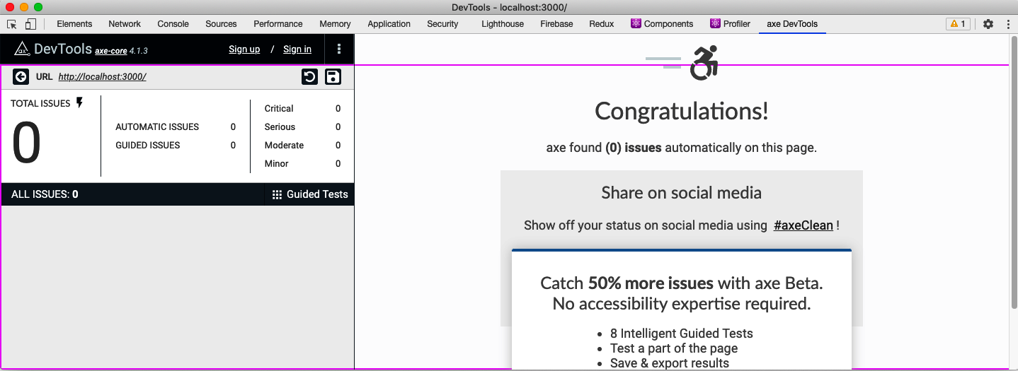
Figure 9-8. The axe DevTools in the developer console
To see how it works, let’s mess up some of the code in the example task application we are using throughout this chapter.
The application includes a pop-up TaskForm component. This component has been given a dialog role, but we can modify it to have
some invalid value:
constTaskForm=({task,contexts,onCreate,onClose,open})=>{...return(<Modaltitle="Create or edit a task"role="fish"open={open}onCancel={close}><form>...</form><ModalFooter>...</ModalFooter></Modal>)}
If you open http://localhost:3000 and click the button to create a task, you will see the task form (see Figure 9-9).
Figure 9-9. The new task form appears when you press the + button
If we now open the developer tools window in the browser, switch to the axe DevTools tab, and run an audit on the page, you will see two errors (see Figure 9-10).
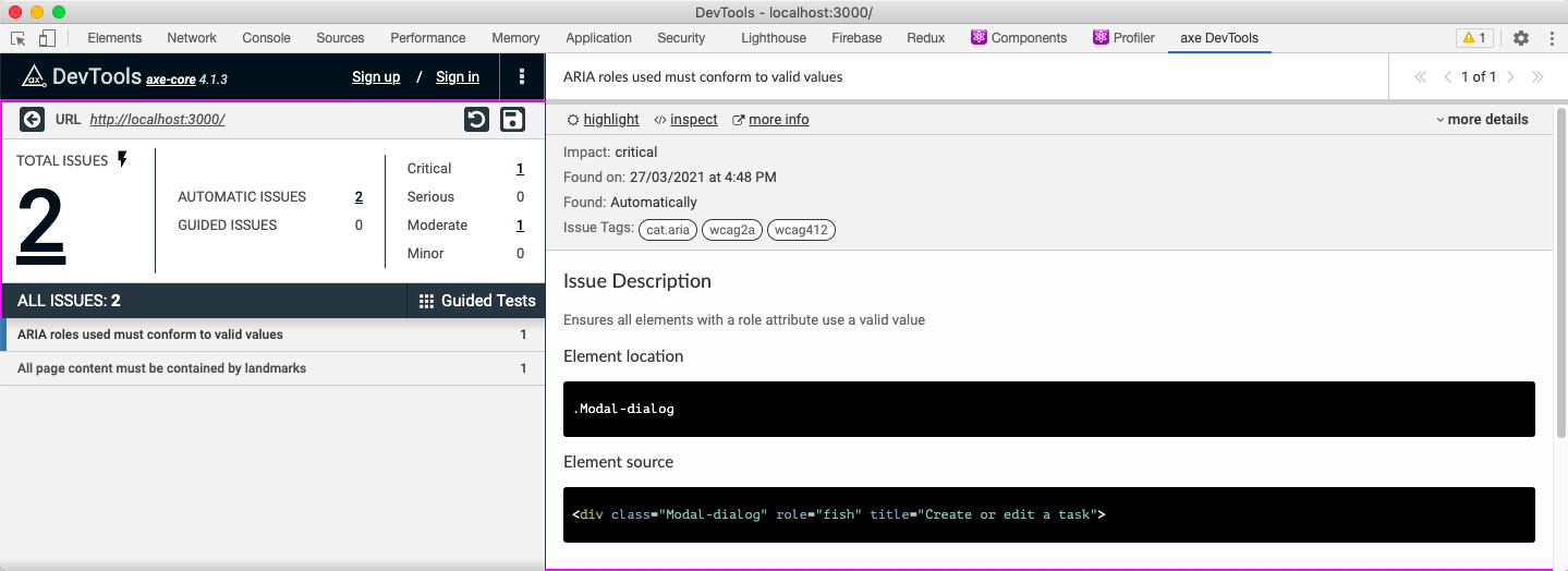
Figure 9-10. Setting an invalid value in the modal causes two errors
There are two errors because, first, the dialog does not contain a valid role. Second, the modal no longer has a dialog role,
which means it no longer acts as a landmark. Some roles, such as dialog, mark an element as a vital landmark element within the
page. Every part of the application must appear inside a landmark.
If you reset the code and refresh the DevTools audit, the errors will disappear.
You could imagine that some future static code analysis might include a scan of all code that checks for invalid role
values.6 However, DevTools can also check for other, more subtle
problems.
In the example application, edit the App.css file, and add some code to change the color of the main heading:
h1{color:#9e9e9e;}
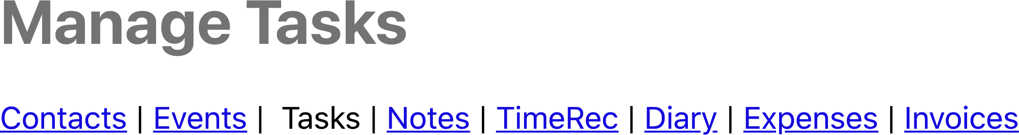
Figure 9-11. The result of changing the color of the first-level heading
The result doesn’t appear to be too drastic (see Figure 9-11), but it does cause DevTools to display this error:
Elements must have sufficient color contrastFix the following:Element has insufficient color contrast of 2.67 (foreground color: #9e9e9e,background color: #ffffff, font size: 24.0pt (32px), font weight: bold).Expected contrast ratio of 3:1
The Chrome browser makes it relatively easy to fix contrast errors from within the developer console. If you inspect the h1
heading, examine the color style of the element, and then click the small color panel, you will see the contrast problem
reported in Figure 9-12.
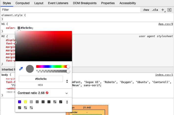
Figure 9-12. View the contrast by clicking the small gray square in the color property
If you now open the Contrast section, you can adjust the color to meet both AA and AAA accessibility standards for contrast (see Figure 9-13).
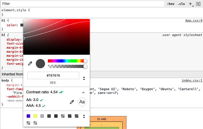
Figure 9-13. Open the contrast ratio to adjust the color to meet accessibility standards
Chrome suggests changing the color from #949494 to #767676. The difference is not hugely noticeable for most people but will be
significantly easier to read for the users who are less sensitive to contrast (see Figure 9-14).
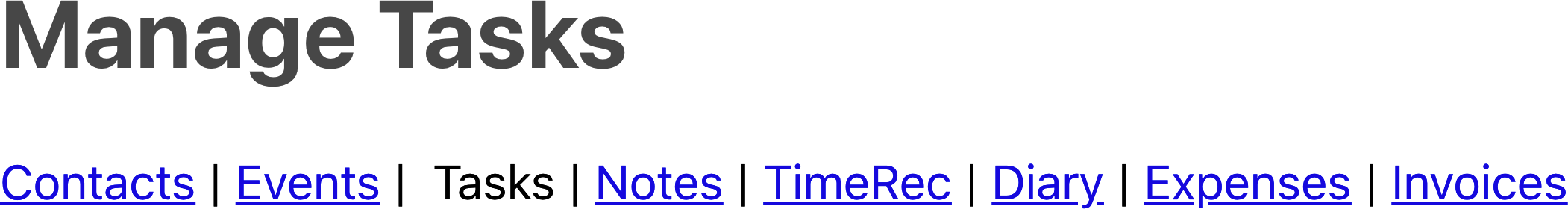
Figure 9-14. The result of changing the contrast to meet the AAA standard
Discussion
The axe DevTools extension is straightforward to use and can find many issues that a static analysis tool will miss.
It does rely on the developer manually checking for errors, but we will see in the next chapter that there are ways of automating browser-based accessibility tests.
You can download the source for this recipe from the GitHub site.
Automate Browser Testing with Cypress Axe
Problem
The previous recipe made clear that some accessibility problems appear only at runtime in a real web browser and so can’t be found with static analysis.
If we rely on manual browser testing, we will likely acquire regression issues. It would be much better to automate the kinds of manual checks that tools like axe DevTools allow us to perform inside a browser.
Solution
We will examine how to automate browser accessibility testing with a plugin for the Cypress testing framework called cypress-axe.
The cypress-axe plugin uses the same axe-core library as axe DevTools. Still, because we can use cypress-axe in browser-level tests,
we can automate the auditing process so that an integration server can instantly find regression errors.
We will need to have Cypress and the axe-core library installed in our application:
$ npm install --save-dev cypress axe-coreWe can then install the cypress-axe extension:
$ npm install --save-dev cypress-axeIf this is the first time you’ve installed Cypress, you will need to run the Cypress application, which will create the appropriate directories and initial code that you can use as the basis of your tests. You can start Cypress with this command:
$ npx cypress openWe’ll need to configure the cypress-axe plugin. Edit the cypress/support/index.js file, and add this line of code:
import'cypress-axe'
We will also need to add a couple of hooks that will allow us to record errors during a test run. We can do this by editing the cypress/plugins/index.js file and adding this code:
module.exports=(on,config)=>{on('task',{log(message){console.log(message)returnnull},table(message){console.table(message)returnnull},})}
You can then remove all of the example tests from the cypress/integration directory and create a new file called cypress/integration/accessibility.js:7
functionterminalLog(violations){cy.task('log',`${violations.length}accessibilityviolation${violations.length===1?'':'s'}${violations.length===1?'was':'were'}detected`)constviolationData=violations.map(({id,impact,description,nodes})=>({id,impact,description,nodes:nodes.length,}))cy.task('table',violationData)console.table(violationData)}describe('can be used',()=>{it('should be accessible when starting',()=>{cy.visit('/')cy.injectAxe()cy.checkA11y(null,null,terminalLog)})})
This is based on the example code from the cypress-axe repository.
The test is inside the describe function. The terminalLog function is used to report errors.
The test has this structure:
-
Opens the page at /.
-
Injects the
axe-corelibrary into the page -
Runs an audit of the page
The axe-core library doing most of the work is the same library used by other tools, such as the axe DevTools browser extension.
The axe-core library will examine the current DOM and check it against its rule base. It will then report
any failures it finds.
The cypress-axe plugin injects the axe-core library into the browser and uses the checkA11y command to run an audit. It sends the
issues to the terminalLog function.
If you run this test in Cypress, by double-clicking accessibility.js, it will pass (see Figure 9-15).
So, let’s create a problem. Let’s add a second test:
it('should be accessible when creating a task',()=>{cy.visit('/')cy.injectAxe()cy.contains('+').click()cy.checkA11y(null,null,terminalLog)})
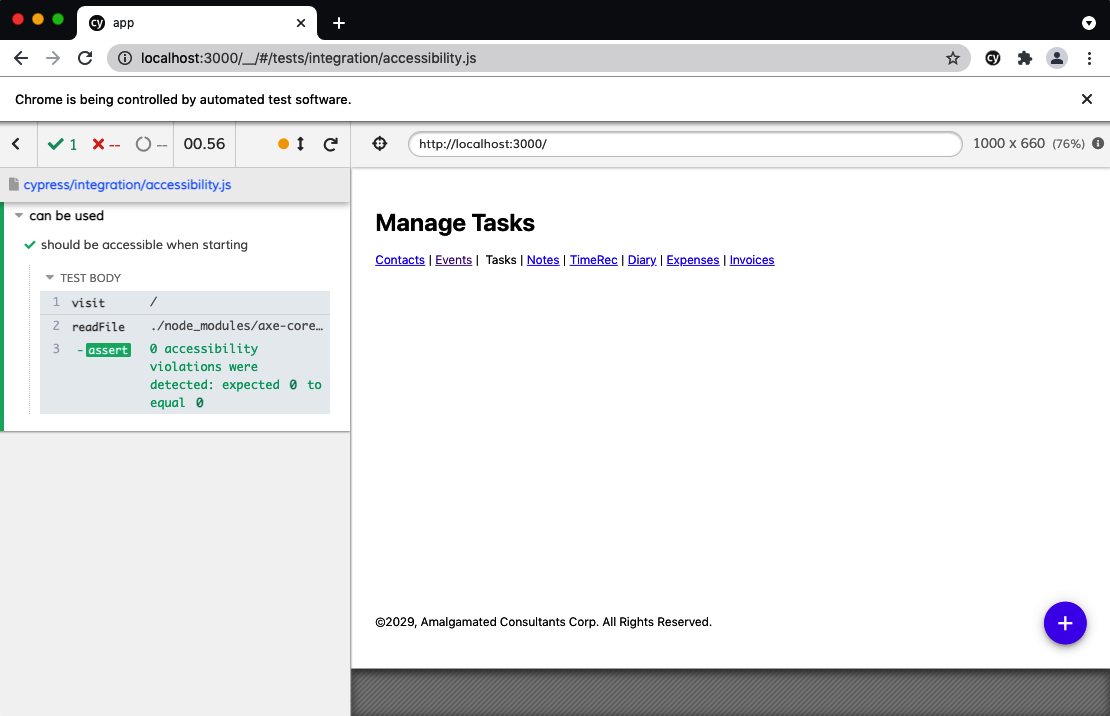
Figure 9-15. The code passing the accessibility test
The test opens the application, clicks the + button to open the form to create a task, and then performs an audit.
In its current form, the application will also pass this test. So, let’s modify the TaskForm in the example application to have an
invalid role value:
constTaskForm=({task,contexts,onCreate,onClose,open})=>{...return(<Modaltitle="Create or edit a task"role="hatstand"open={open}onCancel={close}><form>...</form><ModalFooter>...</ModalFooter></Modal>)}
If you rerun the test, it will now fail. You need to run the test with the JavaScript console open (see Figure 9-16) to see the failure inside a console table.
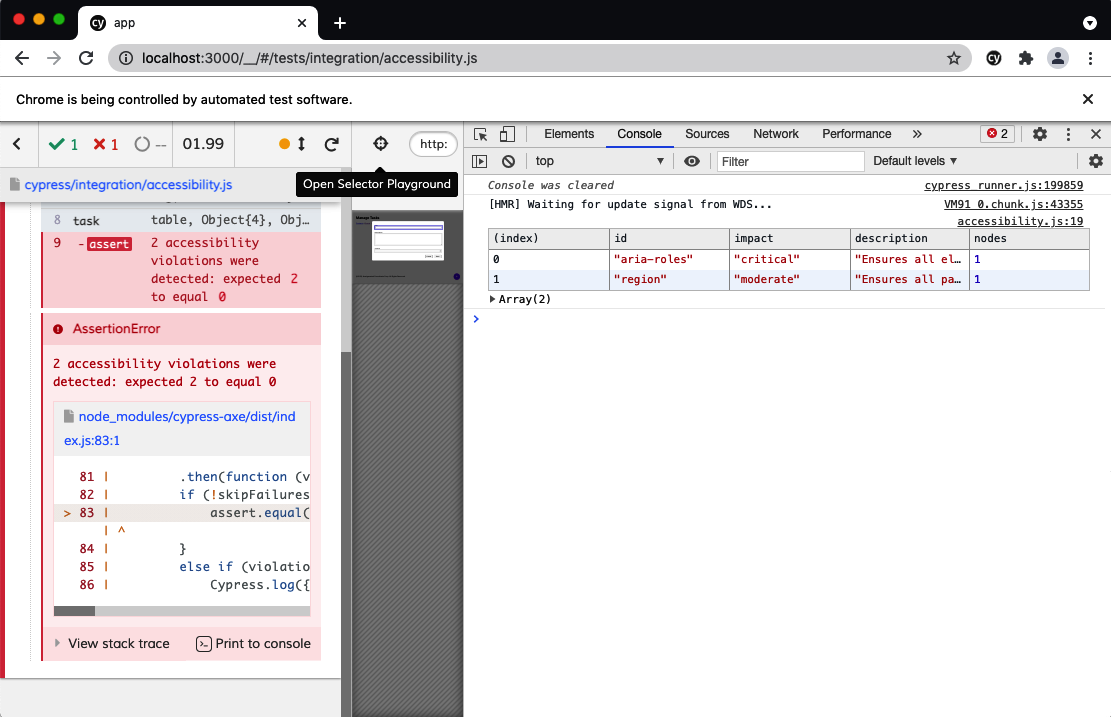
Figure 9-16. You will find the details of failures if the console is open during the test
Discussion
For a great introduction to accessibility audits and cypress-axe testing, see Marcy Sutton’s talk at the ReactJS Girls Conference. The talk first introduced us to the plugin, and we’ve been using it ever since.
You can download the source for this recipe from the GitHub site.
Add Skip Buttons
Problem
Pages often have a bunch of content right at the start. There might navigation links, quick-action menus, links to social media accounts, search fields, etc. If you can use a mouse and see the page, this won’t be a problem. You will probably mentally filter them out and start using the main content of the page.
But if you are using a screen reader, you might have to listen to details of each one of those initial elements on each page you visit. Modern screen reader technology often allows users to automatically navigate through sections and headings, but it can still take some time to figure out where the important things start.
That’s why many websites include hidden links and button that typically include text like “Skip to content” that allows keyboard users to get to the critical start of the page.
One example is YouTube. If you open YouTube and then hit the Tab key a few times, you see a button appear (see Figure 9-17), which will move the keyboard focus to the main content if you hit the spacebar.
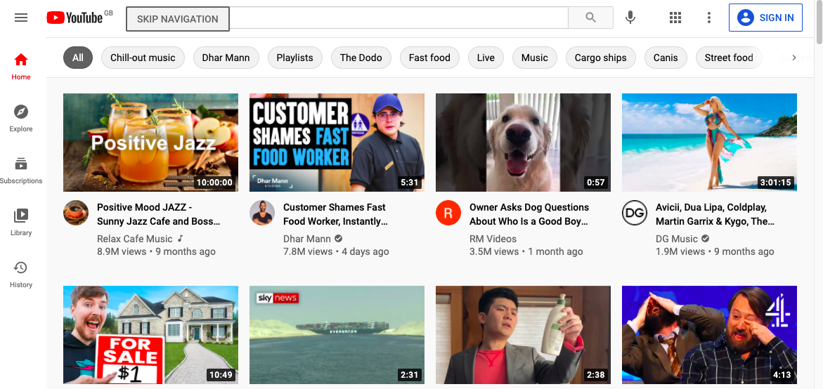
Figure 9-17. YouTube displays a skip button if you press Tab three times
How do you create a button that appears only when you Tab to it?
Solution
This recipe contains a reusable SkipButton component that we can include on pretty much any page without breaking the design or
layout.
It needs to have several features:
-
It needs to be hidden unless we tab into it. We don’t just want a transparent button, just in case the user hits it if they accidentally click that part of the screen.
-
It needs to float above the page content so that we don’t need to leave space for it in the layout.
-
It needs to work as an accessible button. That means it has to be recognized by screen readers and behave how a button behaves. If we hit the Enter key or spacebar when it’s focused, we want it to work.
-
It needs to disappear once we’ve used it.
We’ll add a few other requirements along the way, but this should get us started.
Let’s start by creating a new component, called SkipButton. We’ll make it return a single div and allow it to include any
children that are passed to it:
constSkipButton=(props)=>{const{className,children,...others}=propsreturn(<divclassName={`SkipButton${className||''}`}{...others}>{children}</div>)}
The component will also accept a class name and any other properties that a parent might care to pass.
We want screen readers to see it as an actual button. We could do this by replacing the div with a button, but we’ll keep it
as a div so that the styling is a little easier to apply. However, we will give it a role of button and—because roles have
rules—we will also give it a tabIndex value of 0. That’s something that we’d need to do anyway, because we want the user to be
able to Tab to it:
constSkipButton=(props)=>{const{className,children,...others}=propsreturn(<divclassName={`SkipButton${className||''}`}role="button"tabIndex={0}{...others}>{children}</div>)}
We need the button to do something when it’s clicked. Or rather, we need it to do something when the user presses the Enter key or
the spacebar. So, we’ll allow it to accept a property called onClick, but then we’ll attach it to an event handler that will
trigger if the user presses the Enter key or spacebar:
constSkipButton=(props)=>{const{className,children,onClick,...others}=propsreturn(<divclassName={`SkipButton${className||''}`}role="button"tabIndex={0}{...others}onKeyDown={(evt)=>{if(evt.key==='Enter'||evt.key===' '){evt.preventDefault()onClick(evt)}}}>{children}</div>)}
Of course, we could have named this property onKeyDown, but buttons generally have onClicks, and that will likely be easier to
remember when we come to use it.
There’s one final thing that we’ll do to the component: we’ll allow it to accept a reference, which will be useful when we reuse the component in the next recipe.
You can’t pass references in the same way that you’d pass most other properties. The React renderer uses references to keep track of the generated elements in the DOM.
If we want a component to accept a reference object, we’ll need to wrap everything in a call to React’s forwardRef function. The
forwardRef function returns a wrapped version of your component, extracting the reference from the parent component and passing it
explicitly to the component it wraps. That sounds a little complicated, but it just means this:
import{forwardRef}from'react'import'./SkipButton.css'constSkipButton=forwardRef((props,ref)=>{const{className,children,onClick,...others}=propsreturn(<divclassName={`SkipButton${className||''}`}role="button"tabIndex={0}ref={ref}{...others}onKeyDown={(evt)=>{if(evt.key==='Enter'||evt.key===' '){evt.preventDefault()onClick(evt)}}}>{children}</div>)})
That’s our completed SkipButton, complete with an import of some style information. It’s just a button. The rest is down to
styling in the SkipButton.css file.
We want the button to float above the other content in the page, so we’ll set the z-index to something really high:
.SkipButton{z-index:10000;}
We want to hide the button until the user has tabbed into it. We could try to make it transparent, but that will have two problems.
First, it might position itself in front of something clickable. It would block the clicks unless we also went to the trouble
of setting pointer-events to none. Second, if the button is transparent but still on the screen, it might be seen as extra
screen clutter for a screen reader to handle. If a screen reader is converting the screen spatially into braille, the user would
hear “Skip to content” in the middle of some other piece of text.
So instead, we’ll put the button way off screen until we need it:
.SkipButton{z-index:10000;position:absolute;left:-1000px;top:-1000px;}
So, what happens when someone tabs into the button? We can set styles that are applied only when the button has focus:
.SkipButton{z-index:10000;position:absolute;left:-1000px;top:-1000px;}.SkipButton:focus{top:auto;left:auto;}
Beyond that, we can just add some pure visual styling. It’s important to remember that not everyone using this button is going to be using a screen reader. Some will want to use keyboard navigation because they are unable to use a mouse, or else they might just want to navigate with a keyboard because they find it faster:
.SkipButton{z-index:10000;position:absolute;left:-1000px;top:-1000px;font-size:12px;line-height:16px;display:inline-block;color:black;font-family:sans-serif;background-color:#ffff88;padding:8px;margin-left:8px;}.SkipButton:focus{top:auto;left:auto;}
We can now insert the SkipButton somewhere near the start of the page. It won’t be visible until the user tabs into it, but
positioning does matter. We want it to be within two or three Tabs from the start of the page. We’ll add it to the header section:
<header><SkipButtononClick={()=>document.querySelector('.addButton').focus()}>Skiptocontent</SkipButton><h1>ManageTasks</h1></header>
We’re just using document.querySelector here to find the element that will receive the focus. You could choose to reference the
element you want to skip to or else navigate to a location. In practice, we’ve found that a simple document.querySelector is the most
straightforward approach. It allows you to easily refer to elements that might not be in the current component. And it doesn’t rely
on navigating to an anchor within a page, which might break if the application changes its routing method.
If you open the example application in a browser and then press Tab, you will see the SkipButton (see Figure 9-18).
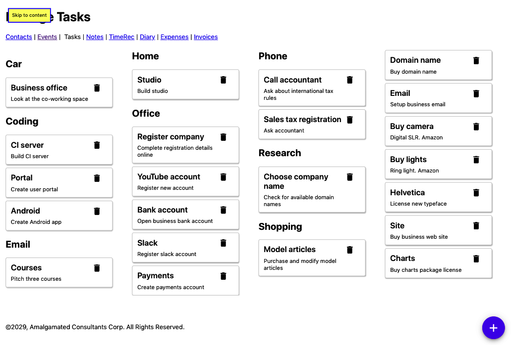
Figure 9-18. The skip button appears over the main heading if you press the Tab key
Discussion
It’s a good idea to place the SkipButton within three Tabs of the start of the page, and it’s helpful if the number of Tabs
needed is the same on every page in your application. The user will then soon learn how to skip to the critical part of each page.
We’ve found that SkipButtons are also popular with people who find using a keyboard more productive.
You could create a standard SkipButton for each page that also moved the focus to the first tabbable item on the main section
of the page.8
You can download the source for this recipe from the GitHub site.
Add Skip Regions
Problem
We saw in the previous recipe that skip buttons are helpful if a user wants to quickly get past all of the headers and navigation at the start of a page and get into the main content.
However, even within the main content, there may be times where it would be helpful for a user to skip past a set of components. Consider the example tasks application that we are using throughout this chapter. A user can create a reasonably large number of tasks in different groups (see Figure 9-19).
Figure 9-19. The example application displays a set of tasks, broken into groups
If they want to get to the Shopping tasks, they would potentially have to skip past 14 other tasks. And each one of those tasks
would have two focus points: the task itself and the task’s delete button. That means skipping past 28 focus points, even after
getting into the content of the page.
What can we do to make it easier for a user to skip past a collection of components?
Solution
We’re going to use the SkipButton component we created in the previous recipe to create skip-regions.
If we tab forward into some section of the main content of the page, such as the Office tasks, we want a button to appear that allows the user to skip past the Office tasks entirely (see Figure 9-20).

Figure 9-20. We want a skip button to appear when we tab forward into a group
Conversely, if they are tabbing backward into the Office section, we want a button to appear that allows them to skip before the Office tasks (see Figure 9-21).
We only want these buttons to appear when entering a region and not when we’re leaving. That means the Skip Office button appears only when we tab forward, and the Skip before Office appears only when we tab backward.
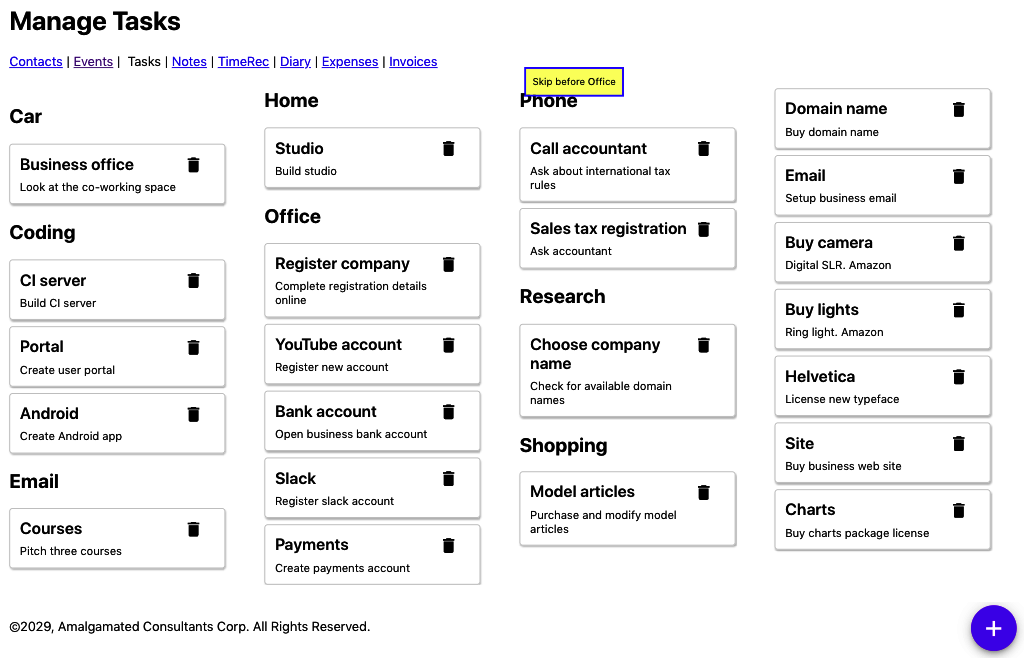
Figure 9-21. A skip button should also appear when we tab back into a group
Before looking at the implementation, let’s look at how we will use a skip-region before getting into the gory details of the
implementation. Our task application renders a series of groups of tasks using the TasksContexts component:
importTaskListfrom'../TaskList'import'./TaskContexts.css'functionTaskContexts({contexts,tasks,onDelete,onEdit}){returncontexts.map((c)=>{consttasksForContext=tasks.filter((t)=>t.context===c.value)if(tasksForContext.length===0){return<divclassName="TaskContexts-context"> </div>}return(<divkey={c.value}className="TaskContexts-context"><h2>{c.name}</h2><TaskListtasks={tasksForContext}onDelete={onDelete}onEdit={onEdit}/></div>)})}exportdefaultTaskContexts
Each “context” (group of tasks, for shopping, office, research, etc.) has a heading and a list of tasks. We want the user to be able
to skip over each of the groups. We’ll wrap each of the task-groups in a new component called Skip, like this:
importTaskListfrom'../TaskList'importSkipfrom'../Skip'import'./TaskContexts.css'functionTaskContexts({contexts,tasks,onDelete,onEdit}){returncontexts.map((c)=>{consttasksForContext=tasks.filter((t)=>t.context===c.value)if(tasksForContext.length===0){return<divclassName="TaskContexts-context"> </div>}return(<divkey={c.value}className="TaskContexts-context"><Skipname={c.name}><h2>{c.name}</h2><TaskListtasks={tasksForContext}onDelete={onDelete}onEdit={onEdit}/></Skip></div>)})}exportdefaultTaskContexts
If we wrap some tasks in our (as yet nonexistent) Skip component, the user will see the SkipButtons magically appear and
disappear each time they enter the group of tasks.
All we need to pass to the Skip component is a name, which it will use in the “Skip…” and “Skip before…” text.
Now, to create the Skip component, let’s begin with a simple component that renders two SkipButtons and any child components
it’s been given:
import{useRef}from'react'importSkipButtonfrom'../SkipButton'import'./Skip.css'constSkip=({children,name})=>{conststartButton=useRef()constendButton=useRef()return(<divclassName="Skip"><SkipButtonref={startButton}>Skip{name}</SkipButton>{children}<SkipButtonref={endButton}>Skipbefore{name}</SkipButton></div>)}
We have created two references that will allow us to keep track of each of the buttons. When a user clicks the startButton, the
focus will skip to the endButton, and vice versa:
import{useRef,useState}from'react'importSkipButtonfrom'../SkipButton'import'./Skip.css'constSkip=({children,name})=>{conststartButton=useRef()constendButton=useRef()constskipAfter=()=>{if(endButton.current){endButton.current.focus()}}constskipBefore=()=>{if(startButton.current){startButton.current.focus()}}return(<divclassName="Skip"><SkipButtonref={startButton}onClick={skipAfter}>Skip{name}</SkipButton>{children}<SkipButtonref={endButton}onClick={skipBefore}>Skipbefore{name}</SkipButton></div>)}
If we run this code, we will see the SkipButton when we enter a set of tasks, and we click Enter, the focus will shift to the
SkipButton at the end of the list of tasks.
However, instead of jumping to the endButton, we want to focus on whatever comes after the endButton. It’s as if we want to
jump to the button at the end of the list and then immediately press Tab to get to the next thing. And we can do that if we create a function that will programmatically perform a Tab operation:9
constfocusableSelector='a[href], ..., *[contenteditable]'functionfocusNextElement(){varfocusables=document.querySelectorAll(focusableSelector)varcurrent=document.querySelectorAll(':focus')varnextIndex=0if(current.length===1){varcurrentIndex=Array.prototype.indexOf.call(focusables,current[0])if(currentIndex+1<focusables.length){nextIndex=currentIndex+1}}focusables[nextIndex].focus()}
This code finds all of the elements in the DOM that we can navigate to with the Tab key. It then searches through the list until it finds the element that currently has focus, and then it sets the focus to the next element.
We can write a similar function called focusPreviousElement, which programmatically performs a back-Tab. We can then add our
Skip component:
import{useRef,useState}from'react'import{focusNextElement,focusPreviousElement,}from'./focusNextElement'importSkipButtonfrom'../SkipButton'import'./Skip.css'constSkip=({children,name})=>{conststartButton=useRef()constendButton=useRef()constskipAfter=()=>{if(endButton.current){endButton.current.focus()focusNextElement()}}constskipBefore=()=>{if(startButton.current){startButton.current.focus()focusPreviousElement()}}return(<divclassName="Skip"><SkipButtonref={startButton}onClick={skipAfter}>Skip{name}</SkipButton>{children}<SkipButtonref={endButton}onClick={skipBefore}>Skipbefore{name}</SkipButton></div>)}
When we enter a group of tasks—such as Office—we see a SkipButton, which will let us skip past the group entirely, onto whatever
follows.
We have just one more feature to add. We only want the SkipButtons to appear when we are entering a skip-region, not when
we’re leaving one. We can do this by keeping a state variable called inside updated with whether the focus is currently inside or
outside the current component:
import{useRef,useState}from'react'import{focusNextElement,focusPreviousElement,}from'./focusNextElement'importSkipButtonfrom'../SkipButton'import'./Skip.css'constSkip=({children,name})=>{conststartButton=useRef()constendButton=useRef()const[inside,setInside]=useState(false)constskipAfter=()=>{if(endButton.current){endButton.current.focus()focusNextElement()}}constskipBefore=()=>{if(startButton.current){startButton.current.focus()focusPreviousElement()}}return(<divclassName="Skip"onFocus={(evt)=>{if(evt.target!==startButton.current&&evt.target!==endButton.current){setInside(true)}}}onBlur={(evt)=>{if(evt.target!==startButton.current&&evt.target!==endButton.current){setInside(false)}}}><SkipButtonref={startButton}tabIndex={inside?-1:0}onClick={skipAfter}>Skip{name}</SkipButton>{children}<SkipButtonref={endButton}tabIndex={inside?-1:0}onClick={skipBefore}>Skipbefore{name}</SkipButton></div>)}
Our skip-region is now complete. If a user tabs into a group of tasks, a SkipButton appears. They can use the button to skip past
that group and on to the next.
Discussion
It would help if you were careful about applying skip-regions too often. They are best used to skip past many components that the user would otherwise need to tab through.
There are other approaches you can take. For example, suppose your page contains a series of headings and subheadings. In that
case, you might consider adding SkipButtons that allow the user to skip to the next heading (if they are tabbing forward) or the
previous heading (if they are tabbing backward).
Some users will have accessibility software that allows them to skip past groups and sections of components without any additional
code required in the application. In those cases, the SkipButtons will not appear on the page, and the user will ignore them
entirely.
You can download the source for this recipe from the GitHub site.
Capture Scope in Modals
Problem
React applications frequently display pop-ups. For example, the example tasks application used in this chapter displays a pop-up dialog box when you click a task. The dialog box allows the user to edit the task’s details (see Figure 9-22).
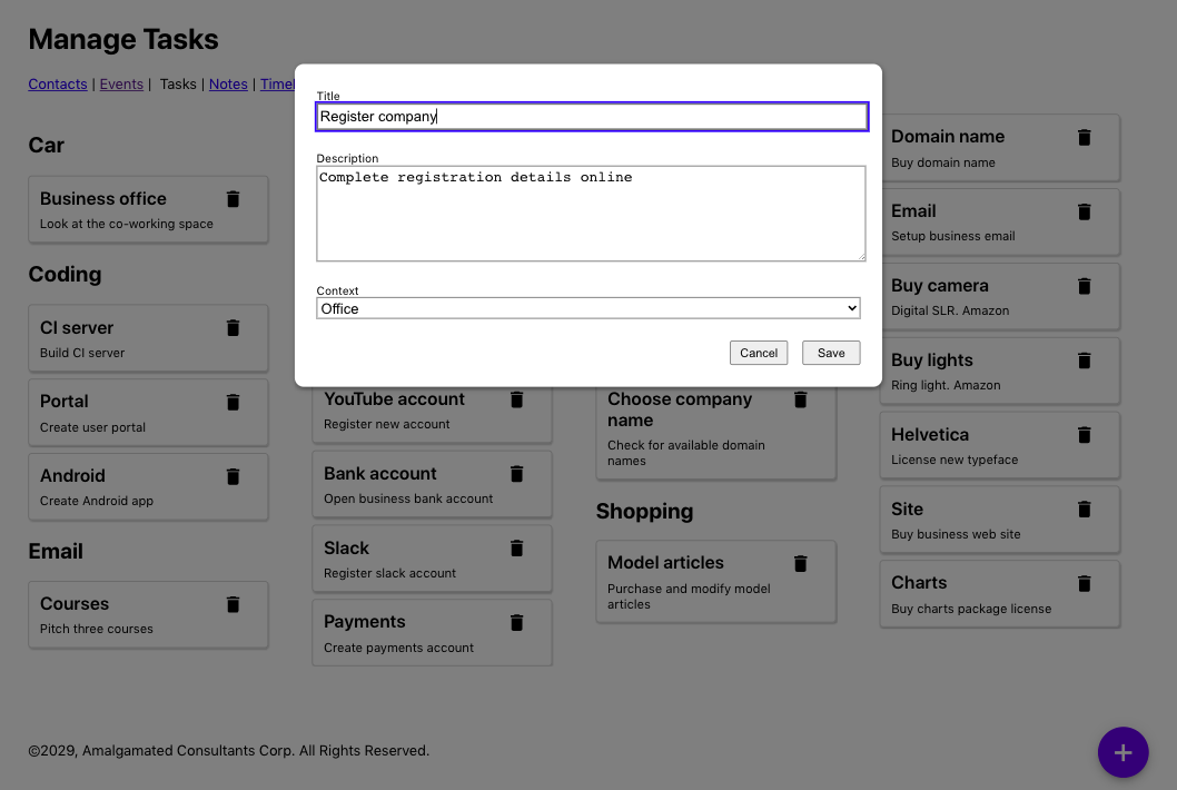
Figure 9-22. A edit dialog appears when the user clicks a task
These pop-ups are frequently modal, which means we will either interact with them or dismiss them before returning to the rest of the application. However, there can be a problem with custom modal dialogs: the focus can escape from them.
Let’s look at the task form from the example application. An earlier version of the code suffered from this leaky-focus problem. If the user clicked a task, they would see the task form, and the first field would instantly grab the focus. But if the user then pressed back-Tab, the focus would shift into the other items in the background (see Figure 9-23).
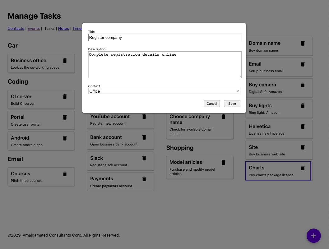
Figure 9-23. Pressing back-Tab moves the focus out of the dialog and on to the Charts task
If you can see where the focus has gone, then this is a slightly odd feature. But this would be a significant source of confusion for anyone using accessibility software, who might be completely unaware that the modal dialog is still on the screen. If someone can see the screen but cannot use a mouse, the experience might be even stranger. The user might be able to focus on a component that is hidden by the dialog.
We need a way of trapping the focus within a set of components so that the user cannot accidentally move into components that are supposed to be out of reach.
Solution
We will install the React Focus Lock library, which will trap the focus into a small subset of components. We will install it with this command:
$ npm install react-focus-lockThe React Focus Lock library works by wrapping a set of components inside a
ReactFocusLock, which will watch the focus, waiting
for it to move outside of itself. If that happens, it will immediately move the focus back inside.
The modal in our example application is created with the Modal component:
import'./Modal.css'functionModal({open,onCancel,children,role,title}){if(!open){returnnull}return(<divrole="presentation"className="Modal"...><divclassName="Modal-dialog"role={role}title={title}...>{children}</div></div>)}
We pass the entire contents of the modal as child components. We can use the React Focus Lock library to trap the focus within those
child components by wrapping them in a ReactFocusLock:
importReactFocusLockfrom'react-focus-lock'import'./Modal.css'functionModal({open,onCancel,children,role,title}){if(!open){returnnull}return(<divrole="presentation"className="Modal"...><divclassName="Modal-dialog"role={role}title={title}...><ReactFocusLock>{children}</ReactFocusLock></div></div>)}
Now, if a user opens the TaskForm and starts hitting the Tab key, they will cycle through the buttons and fields within the dialog
box. If they Tab past the last button, they will move to the first field, and vice versa.
The library works by creating a hidden button with tabIndex set to 1, breaking the tabindex rule in axe-core, stating
that no tabindex should be greater than 0. If this causes a problem, then you can disable the tabindex rule. For example, in
cypress-axe, you can run cy.configureAxe({rules: [{ id: 'tabindex', enabled: false }]}) before performing an audit on the page.
Discussion
Our example application uses a custom-mode dialog box and, in so doing, demonstrates why that is often a bad idea. If you use dialog
boxes and other components from libraries like Material UI, you will often get many accessibility features for free. Also, libraries
will often create floating elements outside of the “root” div of the React application. They will then set the aria-hidden
attribute of the entire “root” div to true, which effectively hides the whole rest of the application from screen readers and
other accessibility software.
For an excellent example of an accessible modal, take a look at React Modal from the ReactJS team.
You can download the source for this recipe from the GitHub site.
Create a Page Reader with the Speech API
Problem
You can use many tools to check for accessibility, but it is hard to get a feel for what it is like for a person with particular needs to use your application. That is why the best way to create an accessible application is to involve people who have to use accessibility devices to build and test your code.
For the rest of us, getting a “feel” for the experience of using the application with accessibility software is still helpful. But there are problems. Braille readers rely on the ability of the user to read Braille. Software that reads out your application is a good option, but most screen readers are pretty expensive. The Mac comes with a built-in screen reader called VoiceOver, which has a whole host of features that allow you to skip around a screen. But not everyone uses a Mac.
Chrome has an extension called ChromeVox, which works well, but it’s available only for Chrome and no longer appears to be actively developed.
In addition to all of those issues, screen readers will want to tell you about everything. You might want to use the screen reader to see what some part of your application is like to use, but it will continue to read to you when you switch back to your IDE or some reference material in another browser tab.
Even with all of those issues, it is still worth trying to experience an audio version of your application. If nothing else, it will give you some sense of what a poor job most of us do at writing software that people can use.
What can we do to try our application with a screen reader?
Solution
We’re going to create a simple screen reader—a very, very simple screen reader. It won’t be professional quality, but it will provide some sense of using our application with only a keyboard and audio feedback. It will also work on our local React application and won’t affect our machine’s other pages or desktop applications. It’s called TalkToMe.10
We will add a small amount of code to the example tasks application we are using throughout this chapter. We don’t want the screen reader code to be included in the production version of our code, so we’ll begin by adding a file called talkToMe.js to the main source folder:
functiontalkToMe(){if(process.env.NODE_ENV!=='production'&&sessionStorage.getItem('talkToMe')==='true'){...}}
By checking the NODE_ENV value, we can limit the code to our development environment. We’re also checking for the session-storage
variable called talkToMe. We will run the screen reader only if this exists and has the value "true".
We need the code to read out the details of the current element that has the focus. Focus events don’t bubble, which means we cannot
simply attach an onFocus event handler to a high-level element and start tracking focus.
However, we can listen to focusin events. We can attach a focusin listener to the document object, and it will be called
every time the user moves to a new component:
functiontalkToMe(){if(process.env.NODE_ENV!=='production'&&sessionStorage.getItem('talkToMe')==='true'){document.addEventListener('focusin',(evt)=>{if(sessionStorage.getItem('talkToMe')==='true'){....}})}}
Notice that we do an additional check for the talkToMe item, just in case the user has switched it off while using the
application.
We need some way of describing the currently focused element. This function will provide a rough description of the current element, based upon its name, its role, and so on:
functiongetDescription(element){constnodeName=element.nodeName.toUpperCase()constrole=element.role?element.role:nodeName==='BUTTON'?'button':nodeName==='INPUT'||nodeName==='TEXTAREA'?'text field '+element.value:nodeName==='SELECT'?'select field '+element.value:element.getAttribute('role')||'group'consttitle=element.title||element.textContentconstextraInstructions=nodeName==='INPUT'||nodeName==='TEXTAREA'?'You are currently in a text field. To enter text, type.':''returnrole+'. '+title+'. '+extraInstructions}
We can get now get a description of the currently focused element:
functiontalkToMe(){if(process.env.NODE_ENV!=='production'&&sessionStorage.getItem('talkToMe')==='true'){document.addEventListener('focusin',(evt)=>{if(sessionStorage.getItem('talkToMe')==='true'){constdescription=getDescription(evt.target)....}})}}
Now we need to convert the text of the description into speech. For this, we can use the Web Speech API, which most browsers now include. The speech synthesizer accepts an object called an utterance:
window.speechSynthesis.speak(newSpeechSynthesisUtterance(description))
Before we start to read out a piece of text, we first need to check if we are already in the process of reading something else. If we are, we will cancel the old utterance and begin the new one, which will allow the user to quickly skip from component to component as soon as they have heard enough information:
if(window.speechSynthesis.speaking){window.speechSynthesis.cancel()}window.speechSynthesis.speak(newSpeechSynthesisUtterance(description))
This gives us the final version of talkToMe:
functiontalkToMe(){if(process.env.NODE_ENV!=='production'&&sessionStorage.getItem('talkToMe')==='true'){document.addEventListener('focusin',(evt)=>{if(sessionStorage.getItem('talkToMe')==='true'){constdescription=getDescription(evt.target)if(window.speechSynthesis.speaking){window.speechSynthesis.cancel()}window.speechSynthesis.speak(newSpeechSynthesisUtterance(description))}})}}
We can now add talkToMe to our application, by calling it from the index.js file at the top of our application:
importReactfrom'react'importReactDOMfrom'react-dom'import'./index.css'importAppfrom'./App'importreportWebVitalsfrom'./reportWebVitals'importtalkToMefrom'./talkToMe'talkToMe()ReactDOM.render(<React.StrictMode><App/></React.StrictMode>,document.getElementById('root'))// If you want to start measuring performance in your app, pass a function// to log results (for example: reportWebVitals(console.log))// or send to an analytics endpoint. Learn more: https://bit.ly/CRA-vitalsreportWebVitals()
If you now open your application in a browser, open the developer console, and create a new session-storage variable called
talkToMe set to the string “true,” you should now hear elements described as you Tab between them.
Discussion
The talkToMe screen reader is little more than a toy, but it will help you create concise titles and other metadata in your code, stressing how important it is to “front-load” information in descriptions. The sooner the user can decide that an element is not what they’re looking for, the sooner they can move on. It will also make it abundantly clear which parts of your application are challenging to navigate and allow you to try your application without looking at the screen.
You can download the source for this recipe from the GitHub site.
1 For an interesting discussion on the issues surrounding menus and menu items, see this article by Adrian Roselli.
2 We found this ourselves while writing this chapter. As a result, we have undoubtedly missed many, many accessibility issues in the example application.
3 Particularly useful if you want to check your code in pre-commit Git hooks or on an integration server.
4 See “Apply Roles, Alts, and Titles” for details on roles and their uses.
5 See the issues involving values greater than zero in “Capture Scope in Modals”.
6 By the time you read this book, such a rule might exist.
7 You can call this file whatever you like, so long as it has a .js extension and is inside the integration directory.
8 See “Use Landmarks” for more information about main sections.
9 This is based on an answer to a question on StackOverflow by user Radek.
10 Thanks to Terry Tibbs for his help in writing this tool.